Creating human-friendly and audience-centric visualizations can significantly improve the effectiveness of data storytelling. By focusing on the needs and preferences of your audience, you ensure that your visualizations are engaging, informative, and easy to understand. Here are some factors to consider and examples of how to create effective and impactful visualizations.
- Understand your audience: Consider who will be viewing your visualization and what knowledge or background they bring to the conversation. For instance, if you’re presenting sales data to a team of sales professionals, they’re likely well-versed in industry metrics, allowing you to tailor your visualization to their expertise.
- Choose the appropriate chart type: Select a chart type based on the type of data and the relationships you want to emphasize. For example, if you’re showing the distribution of household incomes in a city, a histogram would illustrate the spread effectively. On the other hand, a line chart would be more appropriate if you’re comparing the performance of different products over time.
- Focus on readability: Use clear labels, legends, and axis titles to ensure that your visuals are easy on the eyes. Choose colors that are easily distinguishable, and avoid overly cluttered designs. For instance, if you’re showing the proportion of smartphone users by age group, a bar chart with labeled percentage values would be more readable than a pie chart with many small slices.
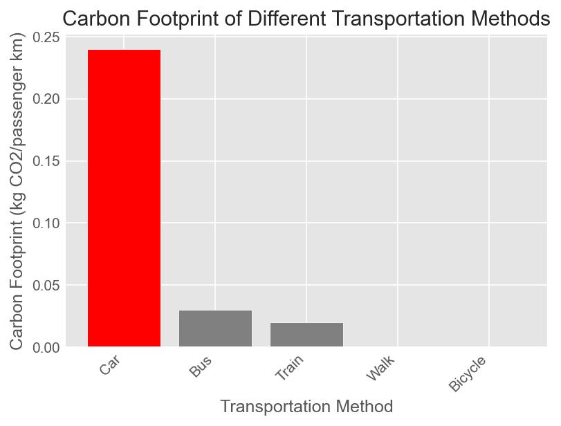
- Use visual hierarchies: Emphasize important data points or relationships by strategically using size, color, and position. For example, if you’re presenting the carbon footprint of different transportation methods, you can use a bar chart with descending bars and highlight the method with the highest footprint using a distinct color.
- Optimize for context: Consider how and where your visualization will be viewed. If you’re creating a visualization for a presentation, keep text to a minimum; if it’s for a report, provide more detailed information. Moreover, if you’re designing for mobile devices, use a simple layout that works on small screens.
- Provide clear takeaways: Make your visualization more memorable by emphasizing key insights or conclusions. For instance, if you’re presenting data on customer satisfaction for a restaurant chain, you can add a callout to highlight the region with the highest satisfaction score.
Human-friendly and audience-centric visualizations make data storytelling more engaging, accessible, and memorable. By understanding your audience, choosing the right chart type, ensuring readability, using visual hierarchies, optimizing for context, and providing clear takeaways, you can create effective visualizations that resonate with viewers and strengthen your data stories.