 Imagine you’re in an electronics store, standing in front of two laptops that caught your eye.💻🌟💻 One laptop boasts its high-performance graphics card, while the other brags about its long-lasting battery life. One has a detailed chart displaying its RAM capacity, while the other showcases a comparison of processor speeds. Faced with these two options, you’re confronted with a crucial decision to make: Which laptop is the better choice for your needs?🤔
This situation might seem like a simple choice between two products, but it reflects the significance of data interpretation in our lives, especially when making important purchasing decisions.🤑🛒 Every day, we encounter various types of data that influence our choices, whether it’s about the products we buy or the services we use.
Data interpretation plays a crucial role in shaping our decisions and perceptions. In this case, the data presented on each laptop’s specifications provides us with valuable information to assess the laptops’ capabilities and determine which one suits our requirements best.🎯
However, it’s essential to recognize that data representation isn’t just about raw numbers and figures; it’s about telling a story. Each piece of data can guide and inspire us, but it can also confuse or mislead if not interpreted correctly.
As someone looking to make the right choice, it becomes vital to be more aware and critical of the way data is encoded and presented when trying to make a decision. By understanding the underlying stories behind the data, you can make a well-informed decision and avoid falling for misleading marketing tactics.
What is Chart Data Encoding, and How Does it Help Us?
Imagine you’re trying to share the latest scores from your school’s sports teams with a friend. You could just read off a long list of numbers, but that’s not fun, and it’s hard to understand. Instead, you might draw a bar chart where the height of each bar shows the scores of each team. That’s chart data encoding in action!
Chart data encoding uses symbols, colors, shapes, sizes, and other visual parts to show data in a chart. It’s like using secret language to share important information quickly and clearly.
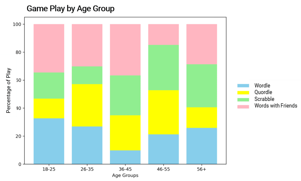
Let’s say you want to know what kind of word games people play. You find a chart with different colored bars for different amounts of playtime for different groups of people. This is easier to understand than a list of numbers, right? It can show you who’s playing what, how much, and what’s the difference between groups.
Understanding chart data encoding helps us make sense of the patterns and connections in the data shown in the chart. By knowing what different visual elements like colors, shapes, and sizes mean, we can quickly understand important findings and trends in the data. And here’s the big thing – understanding chart data encoding also helps you check if the data is being shown honestly. Maybe someone uses a tricky scale to make one game look more popular than it really is. If you know the secret language, you can spot this and keep things fair!
Reading Chart Data Encoding: A Handy Guide
Reading chart data encoding is like being a detective. You’re trying to figure out what all the colors, shapes, and symbols in the chart mean. Here’s a simple step-by-step guide:
- Identify the elements: Look at the chart and note all the colors, shapes, symbols, or sizes being used. What does each one represent? For example, in our gaming score chart, each color might represent a different player.
- Understand the changes: Notice how these visual elements (symbols, colors, or shapes) might change based on different data values. A taller bar might mean a higher score, or a darker color might represent more of something. In a chart of the number of hours you spend on homework each day, each bar might represent a different day, and the height of the bar shows the hours you spent.
- Spot the patterns: Look for connections or trends in the data. Are you spending more time on homework on certain days? Is one player consistently getting high scores in the game? Understanding chart data encoding lets you spot these patterns quickly.
So there you have it! Understanding chart data encoding is like learning a secret language that helps you quickly understand data, spot important patterns, and keep things honest. Now you’re ready to be a data detective in your everyday life, whether you’re comparing gaming scores, planning your homework time, or figuring out the best times to chat with friends online. Happy investigating!
Decoding Success: How Chris Mastered the Chart Data Encoding Game!
 Chris was part of the student council, responsible for assessing and improving various aspects of student life, including academics. To better understand their school’s performance, the council decided to compile data on students’ grades, course enrollments, study hours, and extracurricular activities. The problem? It was just a mountain of numbers.
That’s when Chris brought his secret weapon into play: chart data encoding.
With the help of his favorite software, Chris started converting the raw numbers into colorful charts. For grades and study hours, he used a scatter plot, with each dot’s size indicating the number of extracurricular activities the student was involved in. For course enrollments, he created bar graphs with different colors representing different academic fields.
The next council meeting was a revelation. Chris presented his charts, and suddenly, the data came alive. The scatter plot showed a positive trend between study hours and grades, but also highlighted that students heavily involved in extracurricular activities often had slightly lower grades. The bar graph revealed that science and arts subjects were equally popular, a surprise for the council.
But Chris didn’t stop at the presentation. He led his peers in interpreting the data, explaining what the size and position of the dots in the scatter plot meant and how the colors in the bar graph reflected different academic fields. He stressed the importance of chart data encoding, showing how it revealed patterns and trends that a simple table of numbers could not.
He also explained that understanding chart data encoding was a tool for honesty. If, for example, he had chosen a different scale for the grades or study hours, it could have made the relationship between those two variables appear different, possibly even misleading the council. His knowledge of encoding allowed him to present a truthful picture of the student body’s academic performance.
Chris’ understanding and application of chart data encoding transformed the way the student council approached their improvement plans. They started allocating resources more efficiently, balancing support between academics and extracurricular activities, and appreciating the diverse interests of the student body. The chart data encoding skills Chris employed did not just decode their school’s academic data but also paved the way for more informed and effective decisions.
And that’s how Chris, a high school student, became Parkville High’s very own ‘Chart Champion,’ showing everyone that understanding the language of data is not just about graphs and numbers, but about unveiling the hidden narratives that drive success.