Picture this: you’re in the supermarket, and you have two brands of cereal in your hands. One is your go-to brand, while the other is a new one that claims to be healthier. On the sides of the boxes are nutritional charts, laden with numbers and terms such as “saturated fats,” “carbohydrates,” “sugar,” and so on. Your decision hinges on the interpretation of this data. Without realizing it, you’re reading and decoding chart data, and this decoding will directly impact your health and lifestyle.
Today, we’re not talking about cereal. But we are going to dive into something that has just as much, if not more, impact on your everyday lives. Today, we’re going to talk about the role of chart data encoding and why it’s so crucial to be able to read and interpret it.
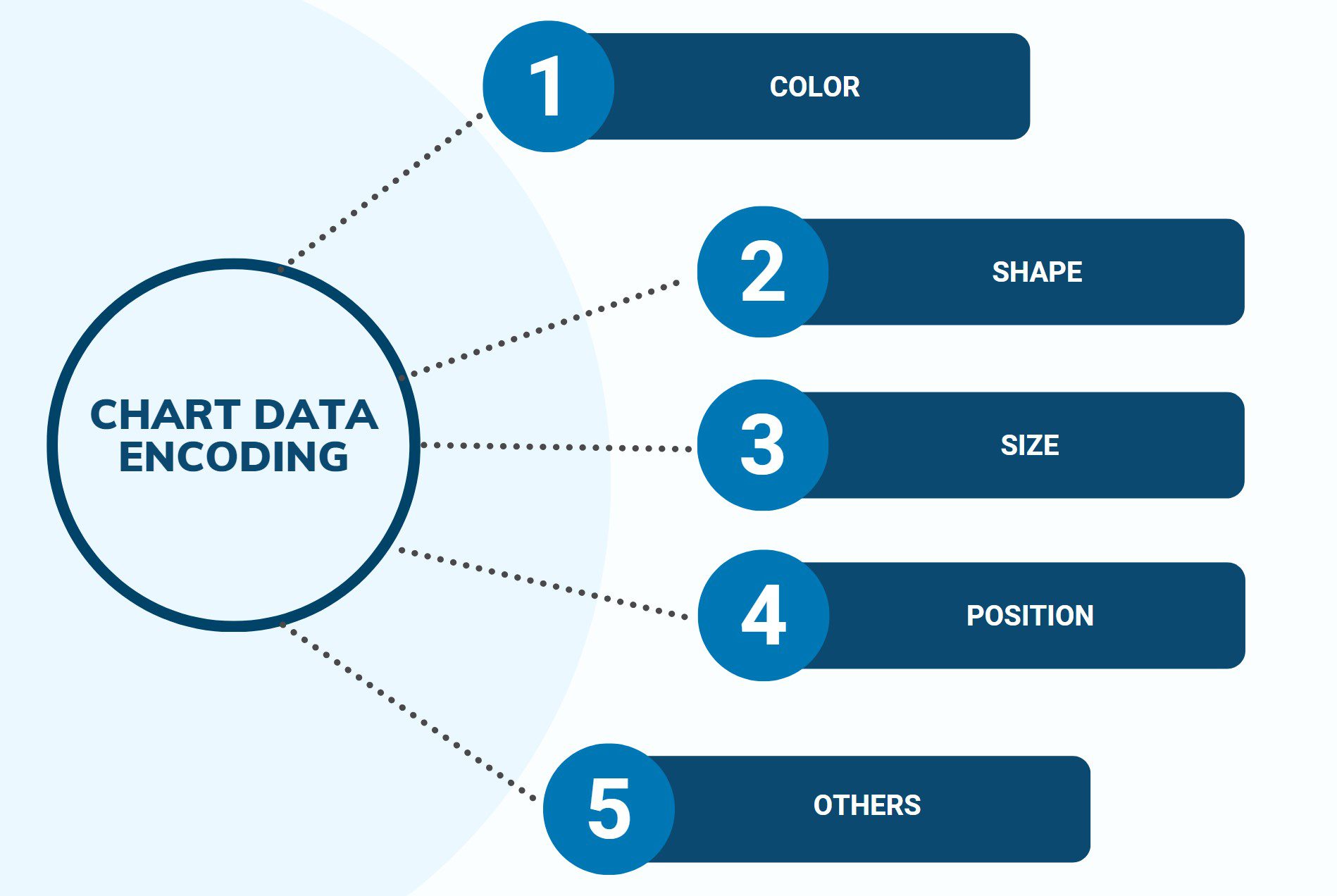
What is Chart Data Encoding?
Picture this: you’re playing a video game, and each character has a different color. The green character is the fastest, the red one is the strongest, and the blue one can jump the highest. Here, colors are being used to tell us something about each character. That’s a basic example of data encoding.
Similarly, chart data encoding uses symbols, colors, shapes, sizes, and other visual elements to represent different pieces of data in a chart. It’s like turning numbers into a cool picture!
How Do You Read Chart Data Encoding?
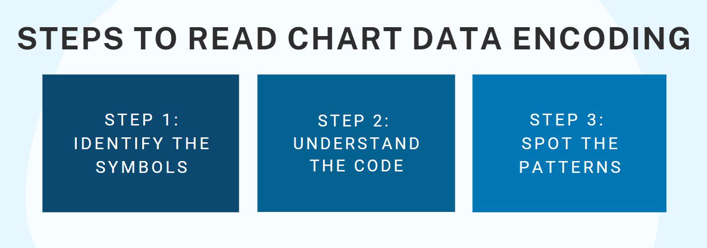
Reading chart data encoding might sound like a big job, but it’s a lot like solving a mystery, and who doesn’t love that? Here’s your detective toolkit:
- Identify the Symbols: The first step is to figure out what’s being used to show the data. Are there different colors or shapes for each category? Are the sizes of the shapes changing based on the data values? Back to our lunch example, if we have bigger shapes for more popular lunch items, a giant square might mean that sophomores really, really love their pizza!
- Understand the Code: Once you’ve figured out the symbols, colors, and shapes, it’s time to understand what they mean. Usually, charts have a key or legend that tells us what each symbol represents. This is like your detective’s clue list!
- Spot the Patterns: The final step is to look for patterns and relationships. This is where you get to play detective! In our lunch chart, if you see lots of big shapes for pizza across all departments, that might tell you pizza is the favorite lunch item at the office.
So there you have it, folks! Understanding chart data encoding is like having a superpower that lets you see the story hidden in a sea of numbers. So, the next time you’re looking at a chart, remember, you’re a data detective, and it’s time to crack the code!
Case Study: Unveiling Chart Data Encoding in Blog Analytics
Meet Jessica Evans, a talented corporate professional who heads the Content Strategy team at DigitalInk, a leading digital marketing agency. Jessica’s role involves overseeing the creation and distribution of compelling blog content for clients across various industries. One day, Jessica received a comprehensive report detailing the performance of different blog articles over the past quarter. Recognizing the importance of understanding chart data encoding, Jessica embarked on a journey to unravel the insights hidden within the data.
The report presented several charts that showcased the performance metrics of different blog articles. Each chart utilized various data encoding techniques to convey information visually. Jessica understood that the way data was encoded—through color, size, position, and shape—played a crucial role in her ability to extract meaningful insights from the analytics.
One of the charts displayed the engagement levels of blog articles over time. It used color data encoding to represent different categories of articles. Jessica realized that this encoding allowed her to identify trends quickly:
- Color Coding: Each category of articles was assigned a distinct color. Jessica recognized that this color coding enabled her to distinguish between different types of content at a glance, making it easier to identify which topics resonated most with the audience.
- Engagement Levels: The size of data points within each category varied based on engagement levels. Jessica understood that larger data points indicated higher levels of interaction, helping her pinpoint the most successful articles.
- Time Periods: The chart scaffolded time periods using labeled segments, allowing Jessica to identify peaks and valleys in engagement and correlate them with specific events or campaigns.
Jessica’s understanding of chart data encoding empowered her to derive valuable insights from the analytics:
- Content Strategy Refinement: By examining the color-coded categories and engagement levels, Jessica identified that articles focusing on digital marketing trends consistently garnered higher engagement. This insight prompted her team to prioritize similar topics in their content strategy.
- Campaign Impact: Jessica’s ability to decode the color and size encoding revealed that a recent guest blog campaign had a significant positive effect on engagement. This encouraged her to explore collaborations with industry influencers further.
- Audience Preferences: The chart’s data encoding helped Jessica discern patterns in audience preferences. She realized that infographics and data-driven articles, represented by larger data points, were particularly popular, prompting her team to produce more of these types of content.
- Measurement of Goals: By interpreting the chart’s data encoding, Jessica evaluated the success of her team’s efforts in promoting long-form guides. She observed that these articles had smaller data points but consistent engagement over time, aligning with the goal of providing comprehensive, evergreen resources.
Jessica’s adeptness at reading and interpreting chart data encoding enabled her to optimize DigitalInk’s blog content strategy. By unraveling the insights hidden within the visual representations, she harnessed the power of analytics to enhance audience engagement, make informed decisions, and drive meaningful results for her clients. Her skillful analysis underscored the importance of chart data encoding in the context of blog writing and digital marketing.