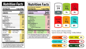
 Picture this: you’re in the supermarket, and you have two cereal brands in your hands. One is your go-to brand, while the other is a new one that claims to be healthier. On the sides of the boxes are nutritional charts laden with numbers and terms such as “saturated fats,” “carbohydrates,” “sugar,” and so on. Your decision hinges on the interpretation of this data. Without realizing it, you’re reading and decoding chart data, and this decoding will directly impact your health and lifestyle.
Today, we’re not talking about cereal. But we are going to dive into something that has just as much, if not more, impact on your everyday lives. Today, we’re going to talk about the role of chart data encoding and why it’s so crucial to be able to read and interpret it.
You see, charts are everywhere – in newspapers, on social media, in business reports, in scientific research, and yes, even on cereal boxes. They are powerful tools used to condense complex data into simple, understandable visuals. Yet, if you’re not well-versed in chart data encoding – that is, how data is represented within these charts – you may not be getting the whole picture, or worse, you might be getting the wrong picture.
What is Chart Data Encoding?
Picture this: you’re playing a video game, and each character has a different color. The green character is the fastest, red is the strongest, and blue can jump the highest. Here, colors are being used to tell us something about each character. That’s a basic example of data encoding.
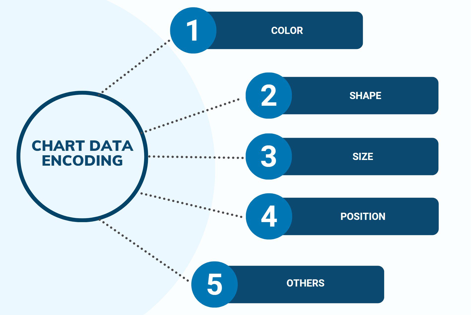
Similarly, chart data encoding uses symbols, colors, shapes, sizes, and other visual elements to represent different pieces of data in a chart. It’s like turning numbers into a cool picture!
Understanding this encoding is like having a secret decoder ring. It helps us make sense of the patterns and connections in the data. For example, let’s say you’re on the student council and have data about the favorite lunch items for each grade. If you use a chart with different shapes for each grade (triangles for 9th, squares for 10th, and so on), you can quickly see if sophomores really love pizza or if first-year students prefer salad.
How Do You Read Chart Data Encoding?
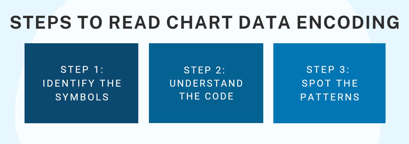
Reading chart data encoding might sound like a big job, but it’s a lot like solving a mystery, and who doesn’t love that? Here’s your detective toolkit:
- Identify the symbols: The first step is to determine what’s being used to show the data. Are there different colors or shapes for each category? Are the sizes of the shapes changing based on the data values? Back to our lunch example, if we have bigger shapes for more popular lunch items, a giant square might mean that sophomores really, really love their pizza!
- Understand the code: Once you’ve figured out the symbols, colors, and shapes, it’s time to understand what they mean. Usually, charts have a key or legend that tells us what each symbol represents. This is like your detective’s clue list!
- Spot the patterns: The final step is to look for patterns and relationships. This is where you get to play detective! In our lunch chart, if you see lots of big shapes for pizza across all grades, that might tell you pizza is the favorite lunch item at school.
So there you have it, folks! Understanding chart data encoding is like having a superpower that lets you see the story hidden in a sea of numbers. So, the next time you’re looking at a chart, remember you’re a data detective, and it’s time to crack the code!
Case Study: Alex and the School’s Music Taste Mystery
 Alex was a member of the student council and had a particular interest in music. Being an active member of the school’s band and an avid music listener, he wanted to understand the music tastes of his peers. The school organized an annual event called the “Music Fest,” and Alex thought it was the perfect opportunity to create a playlist that truly reflected the preferences of the students.
To do this, Alex sent out a school-wide survey, asking everyone to choose their favorite music genres from a list. The genres included Pop, Rock, Country, Hip-hop, and Classical. He collected hundreds of responses, which he then decided to present in a chart for the student council meeting.
Using a software program, he created a pie chart, with each slice representing a music genre and the size of each slice representing the popularity of that genre. To make it more visually appealing, he encoded each genre with a different color: Pop was pink, Rock was red, Country was blue, Hip Hop was yellow, and Classical was green.
Alex understood that the chart’s color coding, the representation of each music genre, was critical to quickly grasp the data. Without knowing that pink meant Pop or blue meant Country, the chart was just a colorful wheel. But with the key, it transformed into a snapshot of the school’s musical tastes.
When Alex presented the chart in the student council meeting, he was able to explain his findings easily. The largest slice of the chart was red—Rock—which indicated that most students favored Rock music. The smallest slice was green—Classical—showing that only a handful of students preferred this genre. The other genres fell somewhere in between.
By reading and interpreting the chart data encoding, Alex could clearly understand and communicate the preferences of the school’s student body. The student council appreciated his effort and used his findings to plan the music playlist for the upcoming “Music Fest.”
In the end, Alex’s understanding of chart data encoding was not only vital for his presentation but also ensured that the “Music Fest” was a hit. His ability to decipher the colorful pie chart allowed him to cater to the music tastes of his peers, turning the event into a memorable night of music and dance. And that’s the power of understanding chart data encoding in action!