Designing charts that include multiple series of data is an important skill to have because it allows us to gain insights and compare different data series at a glance.
First of all, let’s define what a multiple-series chart is. It is simply a chart showing two or more data series on the same visual. This helps us to see the relationships, patterns, and trends between these data series.
There are several ways to encode multiple series in our chart designs. Let’s look at some of the most common methods:
Use Different Colors
One common approach is to use different colors to represent different data series. Let’s say we want to compare the sales of apples, oranges, and bananas in a grocery store. We can use a bar chart with different colors for each fruit. This way, it becomes easy to distinguish between the different fruits’ sales.
Use Different Symbols or Shapes
Colors might become confusing when we have more than two variables or categories. In this instance, using unique symbols or shapes for each series is a great alternative. For instance, if we want to visualize the energy consumption of various appliances in a house, we can use a line chart with each appliance represented by its unique symbol, like a circle for the fridge, a square for the air conditioner, and a triangle for the television.
Chart Selection
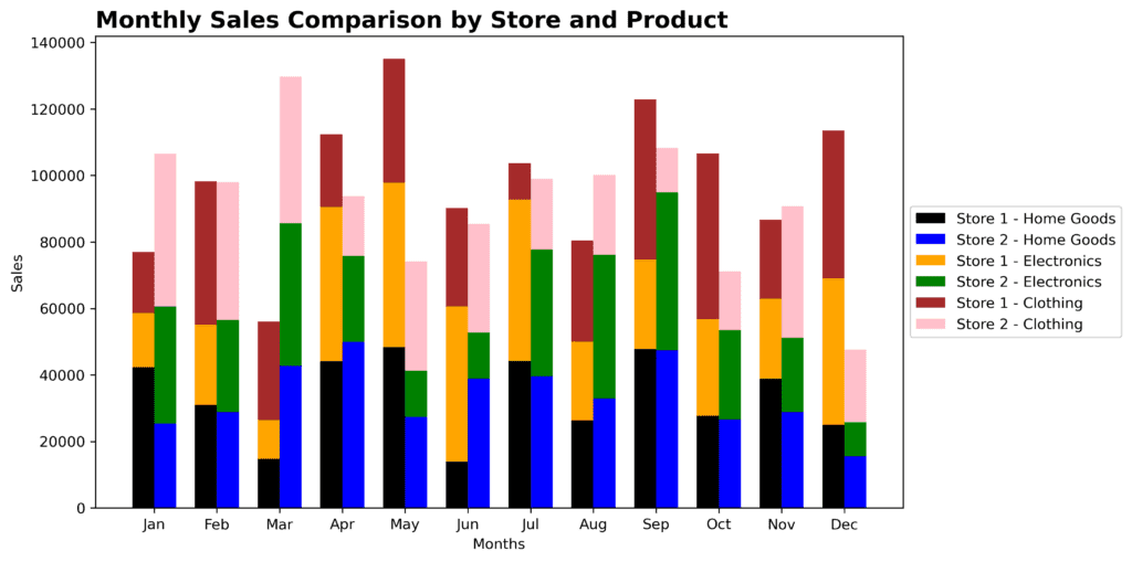
- Stacked bar/column chart: A stacked bar or column chart can effectively display the data when multiple series belong to the same category and contribute to a total. For example, if we have data on monthly sales of different electronic products, we can use a stacked column chart to show how much each product contributed to the total monthly sales.
- Clustered bar/column chart: A clustered bar or column chart works well if the data series are independent. This kind of chart shows each data series side-by-side for each category. For instance, if we want to compare the monthly sales of two different stores, we can create a clustered column chart where each month has two columns, one for each store’s sales.
- Small multiples: Small multiples are multiple small charts arranged in a grid pattern. Each chart represents a different data series and shares the same axes. This approach is useful when we want to compare trends and patterns across various data series. An example would be if we want to compare the growth of various plants over time, with each grid displaying a different plant’s growth.
Remember, one key principle in data visualization is to keep things as simple and clear as possible. Some charts might seem fancy or fun, but they aren’t doing their job well if they don’t convey the needed information effectively. As you practice designing multiple series charts, aim to create visuals that are both engaging and easy to understand.