Color is an essential visual element in charts and diagrams, as it can dramatically impact the success and effectiveness of your data visualization. By making thoughtful choices in your color palette, you’ll be able to create visuals that are aesthetically pleasing and easy to understand.
There are two main reasons color is critical to chart design: First, color can help differentiate between data sets, making it easier to identify patterns and trends in your data. Second, color provides visual cues that can aid in the comprehension of complex information.
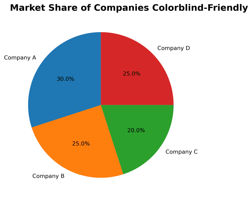
Imagine you are creating a pie chart to show your company’s market share relative to its main competitors. Using distinct colors for each slice of the pie will help your viewers quickly recognize the different market players and their respective shares. If you were to use only one color, the chart would be confusing and less informative.

Here are some general guidelines to help you choose the right color palette for different data types and chart purposes.
Color Selection
Choose a color palette that works well with your data: It’s important to select colors that complement your data and bring attention to the most critical or relevant aspects. For example, if you’re comparing multiple data points or time periods, consider using shades from the same color family to maintain consistency and ease of comparison.
Contrast
Use high-contrast colors for clear differentiation: When displaying multiple data sets or categories, it’s essential to use different colors that can be easily distinguished from one another. High-contrast colors can help prevent misinterpretation of the data.
Perception of Color
Consider color psychology: Colors have specific associations and meanings, which might influence how your audience perceives your chart. For example, red is generally associated with warning or danger, while green conveys growth or positivity. Be mindful of the cultural context in which your visual will be viewed, as color associations can vary across different cultures.
Accessibility
Keep accessibility in mind: When designing your chart, consider viewers with color vision deficiencies; use color palettes that are easily distinguishable for those with conditions like color blindness. There are online tools, such as ColorBrewer, to help you choose inclusive color palettes.
Amount of Color
Use color sparingly: In general, it’s best to limit the number of colors in your chart to prevent visual clutter and confusion. Stick to a few key colors, and if necessary, use shades or tints of those colors to differentiate groups or categories.
Let’s say you’re designing a bar chart to display monthly sales data for multiple products. You opt for a color palette that uses different shades of blue for each product. This choice helps maintain consistency throughout the graph and allows easy comparison between product sales across different months. Additionally, you’d use darker shades for higher sales figures and lighter ones for lower sales figures, which creates a visual hierarchy that can help viewers spot patterns and trends.

By considering these guidelines, you can ensure that your color palette will effectively enhance your chart design, making your visualizations more informative, engaging, and accessible for your audience.