Here, we will explore different color palettes used in designing charts and how to choose the right one for your data. We’ll also learn about creating qualitative, sequential, and diverging color palettes.
The key to selecting the right color palette is understanding the nature of your data and what you want to convey through your visualization. There are mainly three types of color palettes:
- Qualitative palettes
- Sequential palettes
- Diverging palettes
Let’s dive into each of these and learn how to design them effectively.
Qualitative Palettes
Qualitative palettes are used when you want to represent discrete or categorical data. These could be different categories or groups in the dataset where the order is not significant. Imagine we’re visualizing the proportion of people who prefer different types of pizza toppings, like pepperoni, mushrooms, or onions. In this case, we need distinct colors to differentiate between the categories without implying any particular order.
To design a qualitative palette, choose visually distinct colors that are easy to differentiate. Avoid using colors that are too close in hue or saturation, as it might become difficult for your audience to distinguish between categories. Remember to consider accessibility and choose colors that are well-distinguishable for colorblind individuals.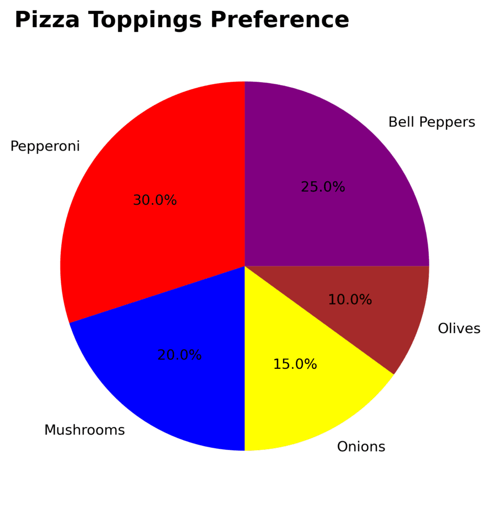
Sequential Palettes
Sequential color palettes are suited for continuous data, like representing a region’s average temperature or a city’s population density. These palettes typically use a single hue which varies in saturation and/or brightness, indicating an increase or decrease in the data value. In our temperature example, a light blue could represent low temperatures, and a deep, saturated blue for high temperatures.
To design a sequential palette, start with a single hue and create a gradient that varies either in saturation or brightness. This will make it easy for your audience to understand the progression of the value. Make sure the color range covers light and dark shades for contrast.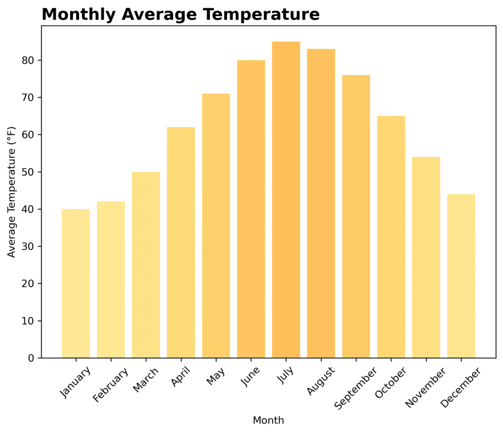
Diverging Palettes
Diverging palettes are perfect for conveying data that has a midpoint or a critical value, such as variables with positive and negative values or deviation from a specific standard. Think of a survey where people rate a product from very unsatisfied to very satisfied, with neutral in the middle. In this case, a diverging palette can help differentiate between the two extremes and emphasize the central value.
Designing a diverging palette involves using two contrasting hues that diverge from a midpoint color, typically a neutral or lighter color. The contrast between the hues communicates the difference between the two ends of the data scale. Be sure to keep a consistent saturation level for both hues and make the transition from the center smooth.
In conclusion, effectively designing and choosing the right color palette is essential for clear and powerful data visualization. Remember to consider your data type, the message you want to convey, and the accessibility requirements when designing color palettes. We hope this learning helped you understand how to make well-informed and visually appealing decisions for your chart designs.