Below we discuss several different encoding features and how to determine which to use when designing charts. Encodings are the visual cues we use to represent data on a chart. They can be shape, size, color hue, color intensity, position, angle or orientation, icons, isotype, and text. Choosing the right encoding is essential for creating accurate and easy-to-understand visualizations.
Shape
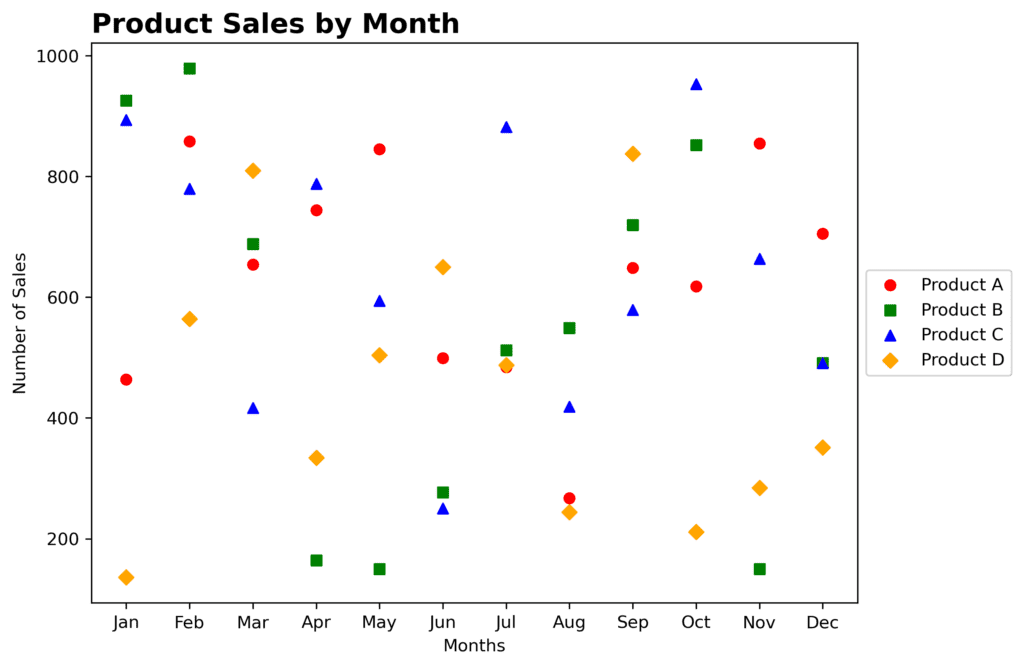
Consider using shape encoding when you need to distinguish between different categories or groups within your data. Different shapes help viewers quickly differentiate and identify various groups or classes of data points. Use shape encoding by assigning different shapes to each category or data attribute. For example, when comparing the sales of different products in a scatter plot, you can use different shapes, such as circles, squares, and triangles, for each product category. This will help viewers quickly identify the different products on the chart.
Size
Size encoding works best for representing continuous variables, such as population or revenue. Varying the size of visual elements effectively communicates differences in magnitude or quantity by assigning different sizes to represent different values. For example, in a bubble chart showing the populations of various countries, larger bubbles can represent larger populations. Similarly, taller bars would correspond to higher revenues in a bar chart depicting company revenues. Remember, using size can be tricky as humans tend to perceive differences in area rather than radius or length.
Color Hue
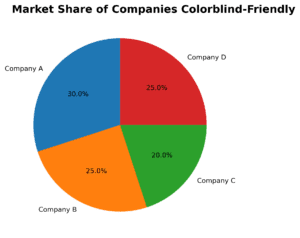
Color hue encoding is particularly useful when there is a need to represent categorical or qualitative data. Assigning different colors helps viewers quickly identify and distinguish between different groups or classes. Use a color palette and assign unique colors to each category or data attribute. For instance, in a pie chart that represents market share, each segment can be a different color to represent a different company. Be mindful of color blindness, and choose distinguishable colors that don’t confuse the viewers.
Color Intensity
Color intensity can represent continuous variables when you have a single color and want to show changes in intensity or value. Varying the intensity or saturation of color visually represents different levels or values. By using shades or levels of a specific color you can indicate different data values. For example, in a heatmap showing temperature variations, you could use a gradient from light blue (low temperature) to dark blue (high temperature). This encoding helps to show the relative difference between data points.

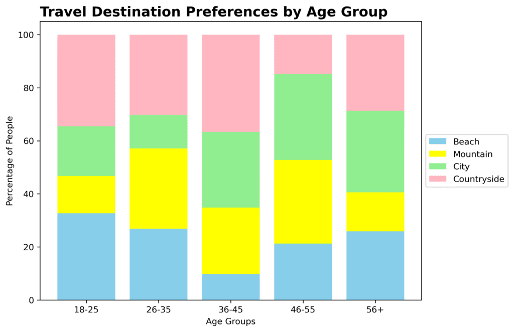
Position
Position encoding is most helpful when there is a need to represent the relationship or distribution of continuous data. Placing visual elements in different positions within a chart or graph enables viewers to understand patterns, trends, and comparisons. Arrange elements spatially, such as using the x and y-axis coordinates, to represent data values or categories. For example, bar charts utilize the position of bars along the vertical or horizontal axis to represent values. Line charts use position to represent changes in a variable over time. The position of data points on an axis determines their value, making it easy for viewers to grasp quantitative differences between data points.
Angle or Orientation
Angle encoding can be useful for showing proportions in a pie chart, where the angle represents the percentage of each category. Additionally, angle encoding is beneficial when there is a need to represent directional or cyclical data. Angles can be used to illustrate changes in direction, rotation, or cyclical patterns. Use the rotation or orientation of visual elements, such as lines or wedges, to indicate specific data attributes or trends. Similarly, on a slope graph, the orientation of the lines connecting the two points gives a clear view of whether the value is increasing or decreasing.
Icons
Icons can help represent qualitative data and there is a need to represent specific concepts or objects through standardized and recognizable symbols. Icons allow for quick and concise visual communication of information. Select appropriate icons or symbols that represent the intended concepts or objects and associate them with relevant data.
Isotype
Isotype encoding is helpful when there is a need to communicate information or data through a system of simplified, standardized pictograms or symbols. Isotypes enable clear and intuitive representation of information, particularly in infographics and visual communication. Utilize pre-defined and widely recognized isotype symbols to represent different data or concepts, ensuring consistency in their usage.
![]()
Text
The last but equally important encoding is the use of text. Labels, legends, and annotations provide additional context to your chart, helping viewers understand the data better. The text complements visual elements and provides additional context or clarification. For example, adding axis labels and a chart title can significantly improve the overall interpretability of a bar chart.