When choosing the number of metrics to encode in a chart, it’s important to consider the following factors:
Clarity
Your primary goal in creating any chart is to convey information as clearly as possible. Trying to cram too many metrics into a single chart might become confusing or difficult to read. Stick to a few key metrics that directly relate to the story you’re trying to tell with your data. For example, imagine you’re creating a chart to show the trend in annual carbon emissions over time. A clear and effective way to visualize this information would be to use a line chart with just one metric – the annual carbon emissions.
Relevance
Make sure that each metric you include in your chart is relevant to the story you’re trying to tell. Including irrelevant details might distract your readers and make it harder for them to understand the main message of your chart. Consider a chart comparing the revenue of two different products. In this case, you’d want to focus on metrics that directly relate to revenue, such as the total sales, average price, and units sold. Including additional metrics like customer demographics or marketing budget might not support your story and could distract from the main message.
Simplicity
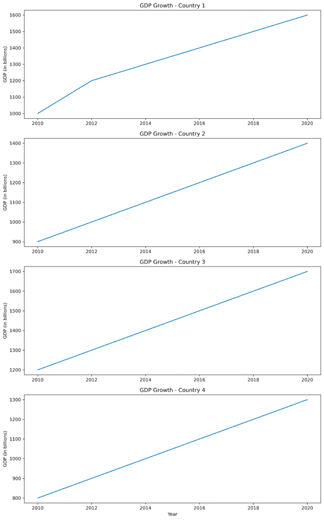
A simple chart is often more effective than a complex one, especially when working with a non-technical audience. If a chart becomes too complex, it might be difficult for your audience to decipher the information, which could decrease its impact. For instance, if you want to present data on multiple countries’ GDP growth over time and avoid focusing on the relative size of each countries GDP, it’s better to use a few simple line graphs — one for each country — rather than trying to encode all of this information into a single chart which would then focus on both the growth and relative size of each countries GDP.
Remember that it’s better to create multiple focused charts, each with a smaller number of metrics than to try to include everything in a single, overly complex chart.
In conclusion, prioritize clarity, relevance, and simplicity when choosing the number of metrics to encode in a chart. Stick to a few key metrics that directly relate to the story you’re trying to tell, and make sure each metric you include is relevant and supports your main message. Keeping your charts simple and focused will make it easier for your audience to understand and engage with your visual information.