Data encoding means translating raw data or information into visual elements, such as bars, lines, or bubbles, which make up a chart. So, why is data encoding essential for effective chart design? Well, there are three main goals of data encoding: clarity, accuracy, and efficiency.
Clarity
The first goal is to make the data easy to understand for people with different backgrounds and experiences. When we create a chart, our main aim is to communicate the essential information as clearly as possible.
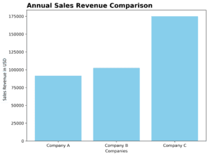
For example, let’s imagine we want to compare the annual sales revenue of three different companies. A simple and clear way to represent this information would be to use a bar chart, where each bar represents one of the companies, and its height corresponds to the sales revenue. In this way, even someone who knows nothing about the subject can quickly grasp the differences between the companies.
Accuracy
The second goal is to ensure that the data is represented accurately so that viewers can draw the right conclusions from the chart. This means choosing the appropriate visual elements to represent the data and ensuring that the scale and labels are correct.
For instance, if we wanted to showcase the percentage of people of different age groups using smartphones, using a pie chart would accurately represent the data, as it would clearly show the proportional share of each age group.

Efficiency
The last goal is to make the chart effective in conveying the desired message as quickly and efficiently as possible. This means choosing the right chart type, optimizing the use of colors, and avoiding clutter or unnecessary elements.
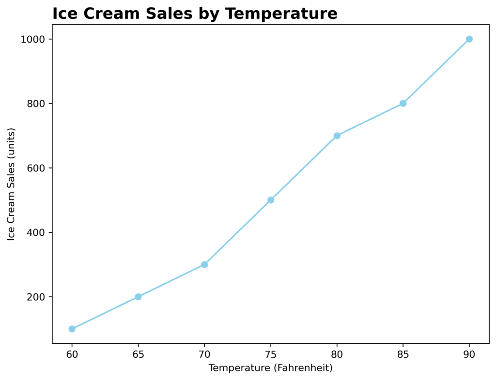
A great example of efficient chart design would be using a line chart to showcase trends over time. The simple shapes, colors, and lines can make it easy for the viewer to understand how the data has changed over time.