When choosing charts to display your data effectively, it is important to consider the encoding of the visual elements.
Encoding is how the data is represented using visual elements such as lines, bars, and colors in a chart. Different types of charts use various encoding strategies, which in turn affect how well they portray broad patterns or accurate details.
What to Consider When Encoding Data on a Chart
- Scale: The scale of your chart can play a significant role in determining how effectively it represents the data. For example, if you have a bar chart displaying revenues for several years, choosing an appropriate scale is crucial to capture the differences and trends effectively. A linear scale is suitable when the data range is not too wide, while a logarithmic scale is helpful when data have wide ranges like populations, earthquakes, or stock prices.
- Color: Using color can help you distinguish between different categories or levels of data. However, choosing a perceptually consistent color palette that is easy for your audience to interpret is essential. For example, when representing temperatures, using a sequential color palette with varying shades of blue to red could help depict cold to hot temperatures. When representing categories like different regions, choose an appropriate categorical color scheme with distinct colors.
- Shape and size: Using different shapes and sizes for data points can also help encode additional information or categories in a chart. For instance, consider a scatter plot displaying the relationship between the average income and life expectancy in different countries. By representing each country with a circle and varying the size of the circle based on the population, you can communicate additional information without cluttering the chart.
- Sorting and ordering: How you present the data can affect how effectively the patterns are perceived. For example, sorting the bars in a bar chart from highest to lowest values can make it easier to spot trends and compare data points. Ordering the lines based on their overall pattern or trend in line charts can make the chart easy to understand.
- Complexity: The complexity of a chart should depend on the audience and the purpose of the visualization. Simple charts like bar and line charts are useful for displaying broad patterns, while more complex charts like scatter plots or treemaps can be effective for showing accurate details. If your audience is unfamiliar with charts or your goal is to provide a quick understanding of the data, opt for simpler chart types.
To illustrate these points, let’s consider two popular chart types:
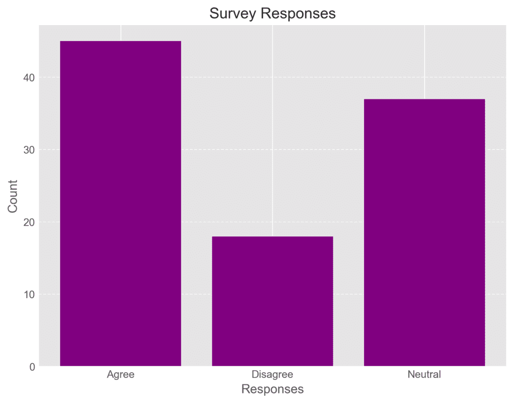
Encoding Data on a Bar Chart
A bar chart is excellent for comparing values across categories. The length of each bar encodes the value, making it easy to identify patterns and make comparisons. Its simplicity is ideal for most audiences and is suitable for showing broad patterns in sales figures or survey responses.
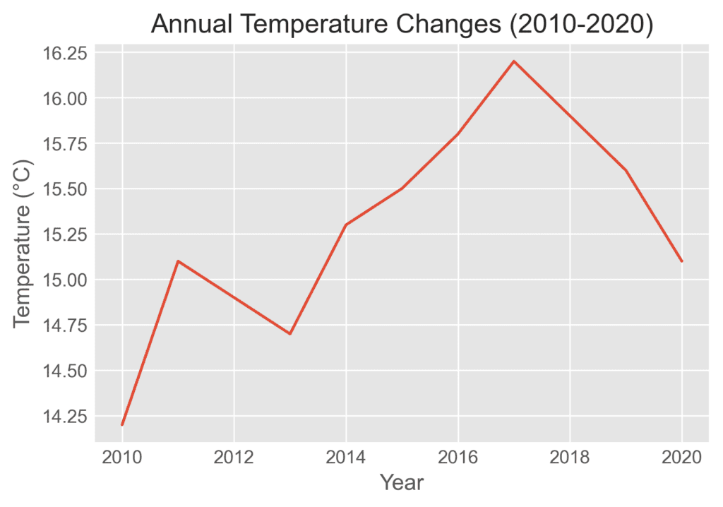
Encoding Data on a Line Chart
A line chart connects data points with lines, making it an excellent choice for displaying trends over time. The position of each point along the vertical axis encodes the value, while the horizontal axis organizes the data chronologically. Line charts are useful for spotting trends and changes in data over time, such as stock prices or annual temperatures.