I want you to think about something. Consider the time you followed a recipe to bake a cake. 👩🍳🍰There were ingredients listed out in a specific order, and you had to add them in that same order.🗒️ The flour had to be sifted, the butter had to be melted, the eggs 🥚needed to be beaten… and all these steps you had to follow in a particular sequence to create that perfect cake. 🎂
Well, guess what? This is a perfect real-world example of processes and flows.
Just like how a clear recipe leads to a delicious cake, these charts guide us through complex systems, data, and ideas, helping us understand and navigate them with ease.
But just as it is crucial to identify whether you’re baking a chocolate cake or a lemon tart,🍋🥧it’s equally important to understand and identify different types of charts that show processes and flows.
It’s a skill you might not know you need. But once you learn it, you’ll start to see its application everywhere – in your job, in the news you read, and even in the studies you analyze.
 Flow Chart
 Flow Chart
Imagine you’re organizing a school dance. There are many steps to follow – from choosing a theme to cleaning up after the last song. A flow chart is perfect for this task! It uses boxes and arrows to display each step in order. You can also show choices or decisions with differently shaped boxes. Be careful, though – if your dance planning is too complicated, your flow chart might become a maze!
Important facts about flow charts:
- A flow chart uses boxes and arrows to display a process’s step-by-step flow.
- It can show sequential steps, decisions, and branches in a process.
- Flow charts are unique in displaying decision-based processes, which other charts do not.
Be aware that complex processes can result in large, complicated flow charts.
Funnel Chart
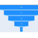 Funnel Chart
Now, picture yourself trying to convince your parents to let you stay up late on a school night. You start with a broad argument, like discussing the importance of relaxation time, and slowly narrow it down to why it’s okay for you to stay up late tonight. A funnel chart works similarly. It shows a process that starts broadly and narrows down over time, kind of like a sales process or a website visit. Just remember each stage in the funnel represents a different event or argument.
Essential facts about funnel charts:
- A funnel chart displays a process that starts broadly and narrows over sequential stages, often used to represent stages in a sales process or website traffic.
- Funnel charts are unique in visualizing reduction over stages in a process.
- They are easy to read but specific in their use.
Make sure to understand that the funnel stages represent a sequence of events.
Gantt Chart
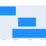 Gantt Chart
Ever worked on a group project where everyone has a different task to finish by a specific date? A Gantt chart is your best friend here. It shows tasks or events against time. Each task is a bar with its start and end dates. Be cautious, though – when there are too many tasks, your Gantt chart can look like a game of Tetris!
Important facts about Gantt charts:
- A Gantt chart displays tasks or events displayed against time.
- Each task is represented by a horizontal bar spanning the start and end dates.
- Gantt charts are used specifically for scheduling tasks over time.
- They provide a clear visual of a project’s timeline.
Watch out as Gantt charts can become quite complex with many tasks and dependencies.
Sankey Diagram
 Sankey Diagram
Imagine tracking the journey of your lunch money as you spend it throughout the week. Some money goes to sandwiches, some to fruit, and some maybe to that ice cream you love. A Sankey diagram is perfect for visualizing this kind of flow. The width of each link shows the quantity of flow. Be aware – it can become a spaghetti mess with many nodes and flows!
Important facts about Sankey diagrams:
- Sankey diagrams visualize the flow of energy, material, or information as it changes from one state or condition to another.
- The width of each link is proportional to the quantity of flow.
- Sankey diagrams are unique in their ability to illustrate flows and their quantities in a network.
Be aware that Sankey diagrams can become overwhelming with many nodes and flows.
Waterfall Chart
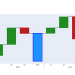 Waterfall Chart
Let’s say you are saving for a new video game. You start with your birthday money, then add some cash from mowing lawns, but then subtract what you spent on snacks. A waterfall chart is designed to show these types of changes, illustrating how your money pool increases and decreases over time. Be sure to read the chart correctly – the real value is in the heights of the bars, not their tops!
Important facts about waterfall charts:
- A waterfall chart illustrates how an initial value increases or decreases through a series of changes.
- The chart visualizes the cumulative effect of sequential positive and negative values.
- Waterfall charts are unique in visually explaining the transition from one value to another.
Be aware that reading the chart correctly depends on correctly interpreting the starting and ending points of each bar.
Chord Diagram
 Chord Diagram
Now, think about how you and your friends interact on social media – who likes whose posts, who tags whom, and so on. A chord diagram can illustrate these complex relationships. Each arc, or ‘piece of the pie,’ represents a friend, and the size of the arc shows the amount of interaction. It can get confusing, though, with lots of friends and interactions – and the direction of the flow isn’t always clear.
Important facts about chord diagrams:
- A chord diagram represents flows or connections between nodes in a network.
- Each arc represents a node, and the size of the arc shows the quantity of flow.
- Chord diagrams are excellent for showing complex inter-relationships between entities in a network.
The diagram can become visually confusing with many nodes and connections. Also, the flow direction might not be clear in a chord diagram.
Tree Diagram
 Tree Diagram
Picture your favorite book series. There’s the main storyline, but there are also many side stories branching off from it. A tree diagram helps you visualize this, starting from the root (main story) and branching into different nodes (side stories). Be careful – a tree diagram can look more like a jungle with too many levels and branches!
Important facts about tree diagrams:
- A tree diagram represents hierarchical information in a tree-like structure, starting with a single item (the “root”) and branching into connected nodes.
- Tree diagrams are unique in displaying hierarchy and branching processes.
Be aware that tree diagrams can become complex and hard to read with many levels and nodes.