I want you to take a moment and imagine yourself walking into your favorite restaurant. Picture the room bustling with chatter, the appetizing aroma of food in the air, and most importantly, the menu in your hand. Now, this menu, with its enticing pictures and descriptions, it tells a story, doesn’t it? A story of flavors, of ingredients and, ultimately, a promise of the experience that awaits you.
Well, did you know that there is another kind of menu – one that we encounter every day in our data-driven world – that offers an equally exciting and essential narrative? A menu of visual representation, a menu of… charts. Yes, you heard it right, charts.
When you read a menu, you rely on the descriptions, ingredients, and presentation of dishes to make informed decisions about what to order. Similarly, when reading a chart, you analyze the visual elements, labels, and data points to understand the patterns, relationships, and trends within the data.
Both menus and charts provide a structured format that organizes information in a digestible manner. They guide your attention, highlight important details, and present data in a coherent and meaningful way. Just as a menu helps you navigate through various food options, a chart guides you through data insights and facilitates data-driven decision-making.
Charts that demonstrate relationships.
When chosen and interpreted correctly, these charts have the power to make unseen connections visible, to illuminate hidden trends, to give voice to silent patterns.
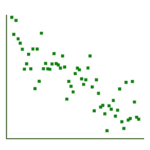
Scatterplot
- A scatterplot shows the relationship between two numerical variables, with each point representing an observation.
- It allows you to see correlations, trends, and outliers between the two variables.
- They are one of the simplest ways to visualize relationships between numerical variables.
- Scatterplots don’t handle large amounts of data as well as some other plot types.
Watch out for overplotting when the dataset is large or when many data points have similar values. Also, remember, just because a scatterplot cans show two things seem to move together doesn’t mean one causes the other–correlation is not the same as causation.

Bubble chart
- A bubble chart is a scatterplot with a third dimension: each point is also represented with a size (and sometimes color), allowing you to understand an additional quantitative variable.
- Bubble charts can show more complex relationships than scatterplots by introducing additional dimensions.
- They can be harder to read and interpret.
Be careful though, as bigger bubbles can sometimes overlap smaller ones, hiding their information. Additionally, the size of the bubbles can be misleading because our eyes perceive the area, not the radius of the bubble.
![]()
Heatmap
Suppose your school cafeteria wants to know what food students eat most on different days of the week. A heatmap could help. This chart has cells that change color based on the amount of a third thing – in this case, the number of students eating each food item. It’s like a colorful table where patterns are easier to see. But, remember, the colors we choose can make a big difference in understanding what’s going on.
Important facts about heatmaps:
- A heatmap shows the relationship between two categorical variables, with cells colored based on the count or value of a third variable.
- It allows you to see patterns, correlations, and clusters.
- They can handle large datasets and show more complex relationships than scatterplots or bubble charts.
- Heatmaps are limited to categorical variables and are not well-suited for displaying individual-level data, quantitative counts, or complex categorical information.
Remember, the colors we choose can make a big difference in understanding what’s going on. Understand how the choice of color scale can greatly affect your interpretation of a heatmap. Also, with many categories, heatmaps can become overwhelming.
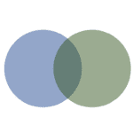
Venn diagram
Have you ever wondered what common traits you share with your friends? A Venn diagram can show this. When thinking about the similarity between your group of friends, the circles in this diagram represent groups (like you and your friends), and the areas where the circles overlap represent the traits you and your friends share.
Important facts about Venn diagrams:
- A Venn diagram shows the relationships and intersections between different groups or sets.
- Overlapping areas indicate shared characteristics between groups.
- They are unique in showing intersections, which other charts don’t usually display.
- Venn diagrams are not suited to quantitative analysis.
Keep in mind, when you add more groups, things can get messy and harder to understand. Also, the size of the circles and overlaps do not usually accurately represent the sizes or intersections of the sets.
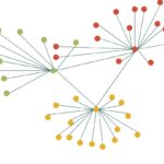
Network graph
Imagine your social media connections as a chart. Each person is a node, and each friendship is an edge connecting two nodes. This chart, called a network graph, shows the web of your friendships, helping you visualize who knows whom.
Important facts about network graphs:
- A network graph (or graph diagram) visualizes relationships in terms of nodes (individual entities) and edges (relationships).
- It allows you to see complex interconnected relationships and structures.
- They can represent more complex and non-linear relationships than most other chart types.
- Network graphs can become visually overwhelming and confusing with many nodes and edges.
Watch out for how the placement of nodes in a network graph affect its interpretability. Also, dense graphs with many nodes and edges can be hard to interpret.