Here are some common issues with dual Y-axis charts and how to address them effectively.
Challenges of using dual Y-axis charts:
- Confusion about which axis to read: In a dual Y-axis chart, viewers may have trouble understanding which axis corresponds to which data series, especially if the chart is cluttered.
- Patterns dependent on scales: The visual relationship between the two data series depends on the chosen scales for each Y-axis. Changing the scale can alter the perceived correlations or trends.
- Scales are arbitrary: Choosing appropriate scales for dual Y-axis charts can be subjective and arbitrary, potentially leading to misinterpreted data.
- Magnitude exaggeration or compression: Different scales can magnify or compress the values being represented. If one chart has a larger scale, the differences between values will be magnified, potentially making small differences more pronounced. Conversely, a smaller scale can compress the values, making differences seem smaller than they are.
- Baselines at different heights: Having different zero baselines and non-zero baselines on each Y-axis can make it challenging to compare the starting points of both series.
- Relative height perception: Humans tend to rely on the visual perception of relative heights or lengths to compare quantities. When the y-axis scales differ, the relative heights of the bars can be distorted. A bar that appears taller in one chart may represent a smaller value compared to a shorter bar on another chart due to the difference in scaling.
- The implied relationship between data series: Dual Y-axis charts may imply a relationship between two data series when there may be none, potentially creating a false narrative. For example, bar charts are designed to visually represent the magnitude or proportion of data using the length or height of the bars. When the scales are inconsistent, the visual comparison becomes misleading, as the differences in the bars may not accurately reflect the actual differences in the data.
Ways to address these issues and create effective, easy-to-understand charts:
- Shared X-axis: Use a shared X-axis for both data series to establish a standard reference point and ensure comparability.
- Use the same unit of measurement: If possible, convert the two data series to the same unit of measurement, allowing you to use a single Y-axis scale. For example, instead of comparing revenue in dollars and profit margin percentage, you could convert both to dollars to simplify the chart.
- Use an indexed chart: One way to address scale issues is by using an indexed chart, which shows the percentage change of each data series relative to a specific start point. This can help emphasize the trends rather than the absolute values.
- Replace the least important series with data labels: If one of the data series is less important or secondary, you can consider using data labels or annotations instead of a second Y-axis to emphasize the primary data series.
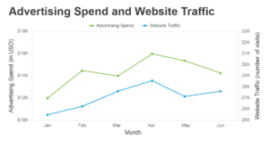
Example:
Suppose you want to visualize the relationship between a company’s advertising spend (in dollars) and website traffic (number of visits). A dual Y-axis chart may falsely suggest a correlation that isn’t there, depending on the chosen scales. Instead, you could use an indexed chart to show the percentage change in both advertising spend and website traffic over time, maintaining a shared X-axis for clarity. This way, your audience can focus on the trends without getting lost in the nuances of two different scales.