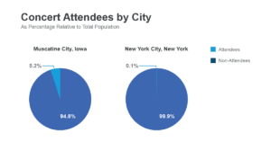
Normalizing popularity metrics by population is essential when designing chart scales because it allows for a more accurate and fair comparison across different categories, regions, or time periods. By normalizing the data, we can create visuals that truly reflect what’s happening and avoid misleading conclusions.
Imagine we want to compare the popularity of a music artist in two different cities – New York City and a small town. Let’s say that in New York City, 10,000 people attended the artist’s concert, while in the small town, 1,000 people attended. If we create a bar chart with raw numbers, it would seem like the artist is ten times more popular in New York City. However, this conclusion could be misleading.
Now let’s consider the population of the two cities. New York City has a population of around 8.4 million people, while the small town has a population of 20,000. If we normalize concert attendance by population, we’ll see a very different story. In New York City, about 0.12% of the population attended the concert, while in the small town, 5% of the population attended. Creating a chart with this normalized data reveals that the artist is actually more popular in the small town than New York City.
Let’s discuss another example. Suppose we wish to compare the popularity of a particular sport across different countries. Looking solely at the number of registered players would give us an inaccurate picture, as larger countries with more significant populations might naturally have more registered players. However, when we normalize this data by dividing the number of players by the country’s population, we can see the real popularity and penetration of the sport in each country.
In both cases, normalizing the data by population allows for a more accurate and fair comparison of the popularity metrics.

