When designing charts, it is crucial to consider accessibility to ensure that the information presented can be easily understood by individuals with varying levels of technical knowledge, people from diverse cultural backgrounds, and even viewers with visual impairments. In this article, we will explore the concept of accessible design and its importance in chart creation, as well as techniques and best practices for designing charts that are inclusive and accessible to all.
Understanding Accessible Design
Accessible design refers to the practice of creating charts and visual representations that can be easily understood by a diverse audience. This includes individuals who may not possess advanced technical knowledge, those from different cultural backgrounds, and viewers with visual impairments, such as colorblindness. By adopting accessible design principles, we ensure that the information presented in charts is accessible and comprehensible to as many people as possible.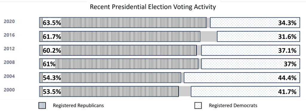
Techniques for Ensuring Accessibility in Chart Design
- Ensure clarity without colors:
Color should not be the sole means of conveying information in a chart. Important elements and data points should be discernible even in grayscale. Consider using different shapes, patterns, or textures to differentiate between elements or data categories.
Imagine you are designing a bar chart to represent the population of different countries. To ensure clarity without relying solely on colors, you can use diagonal lines for one country, horizontal lines for another, and dots for a third. This way, even when viewed in grayscale or by individuals with color vision deficiencies, the chart remains comprehensible as each country is visually distinct.
Consider a pie chart that represents the distribution of student grades in a class. Instead of relying solely on color variations to differentiate each grade category, you can use different patterns such as crosshatching, dots, or diagonal lines within each pie chart section to represent different grade levels.
- Include non-color indicators:
To enhance accessibility for individuals with visual impairments, include non-color indicators in your charts. For example, instead of relying solely on color-coded legends or icons, use additional visual cues such as arrows or plus/minus signs to represent different values or directions.
Let’s say you are creating a line chart depicting the year’s temperature changes. Instead of solely relying on color-coded lines to represent different cities, you can include arrows at the end of each line to indicate whether the temperature is increasing or decreasing. This provides a visual cue for viewers, including those with color vision impairments, to understand the trend without relying solely on color distinctions.
When creating a scatter plot to show the correlation between study time and test scores, including labels that explicitly mention “Study Time” and “Test Scores” along the respective axes. This ensures that individuals who may not be familiar with the chart’s conventions can easily understand the information being conveyed.
Best Practices for Designing Accessible Charts
- Consider cultural factors:
Recognize that individuals from diverse cultural backgrounds may have different reading directions or interpret colors differently. Design charts that accommodate different reading directions (e.g., left-to-right, right-to-left) and be mindful of the cultural significance of colors to avoid misinterpretation.
- Use clear and concise labels:
Ensure that the labels used in the chart are clear, concise, and easily understandable by a non-technical audience. Avoid jargon or technical terms, and use plain language to convey the information effectively.
- Provide alternative text and descriptions:
For individuals with visual impairments, provide alternative text or descriptions of charts when sharing them digitally. Screen readers can then read out the alternative text, allowing visually impaired individuals to access the information effectively.
- Test for accessibility:
Regularly test your chart designs for accessibility by seeking feedback from individuals who represent diverse backgrounds and abilities. This helps identify any potential barriers or areas for improvement.