There are various types of charts that effectively display association and correlation between variables. Understanding the relationships between different data points can provide valuable insights and help you make better decisions.
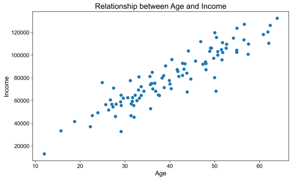
- Scatterplots are charts that display the relationship between two variables. Scatterplots help us identify trends and patterns in the data by plotting points at the intersection of their X and Y values. If a clear pattern emerges, it is likely the variables are related. For example, if we plot the relationship between age and income, we might see a positive trend, indicating that as one increases, so does the other.
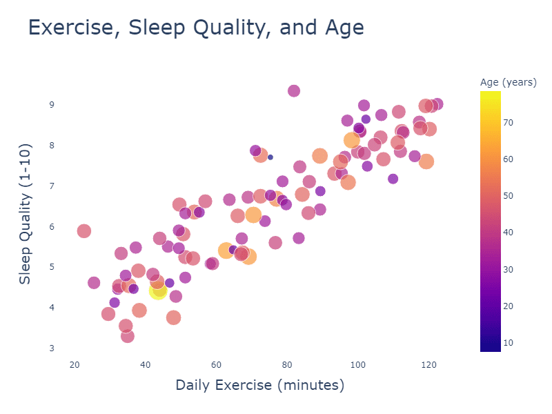
- Bubble charts are a type of scatterplot but with an added third variable represented by the size of the bubbles. This can help provide more context and reveal additional relationships. For example, if we wanted to examine the relationship between exercise and sleep quality in various ages, we could plot daily exercise on the X-axis and sleep quality on the Y-axis and use the size of the bubbles to represent the age of the individual. This might show an interesting relationship between exercise, sleep, and age.
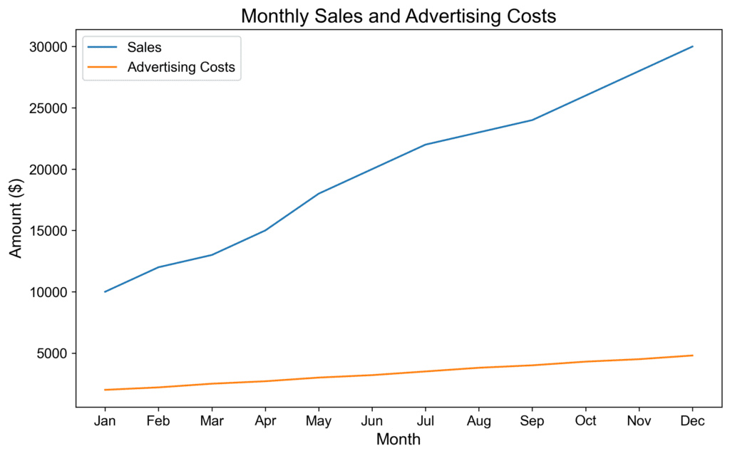
- Line charts are useful for visualizing the relationship between two variables over time. They display the data points as a series of connected points along a line, making it easier to identify trends and patterns. For example, let’s say we want to examine the correlation between monthly sales and advertising costs. Plotting these two variables as lines over time would reveal if higher advertising spending results in increased sales during the same period.
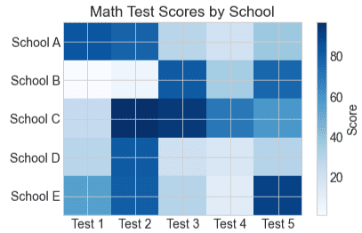
- Heatmaps use color to represent data values in a matrix, revealing patterns and correlations between two or more variables. In a heatmap, each cell represents an intersection between the two variables shown on the axes, and its color represents the value of the corresponding data point. For example, if we were comparing the performance of students on a series of math tests math test across various schools, we could create a heatmap where the vertical axis represents schools, the horizontal axis represents the different tests, and the color intensity represents the average score for each school test combination. A clear pattern or clustering of colors would indicate a correlation between the schools and the average math of test scores.
When designing visual information, selecting the appropriate chart type and style is crucial to help your audience quickly and easily understand the data you are presenting.