Charts for connection-based patterns are used to show how different elements are related or connected to each other. In these types of charts, the emphasis is on illustrating the relationships or links between various data points or entities. Network, chord, and arc diagrams are charts that effectively display connection-based patterns. Here is some information to help you understand their characteristics and benefits.
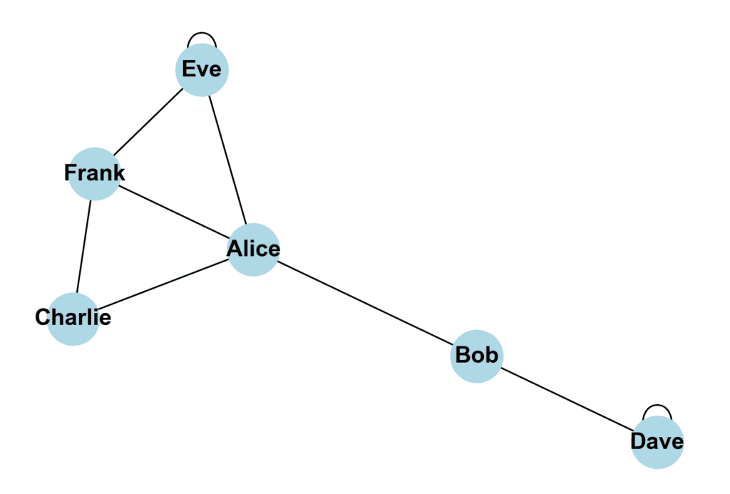
Network Diagrams
These diagrams are great for visualizing connections and relationships between entities, such as people, organizations, or concepts. They consist of nodes (the data points) and edges (representing the relationships between them).
For example, imagine you are studying employee relationships within a company. In a network diagram, you might represent each employee as a node and draw edges between nodes when employees have a working relationship. Doing this lets you quickly visualize which employees are closely connected and which are more isolated.
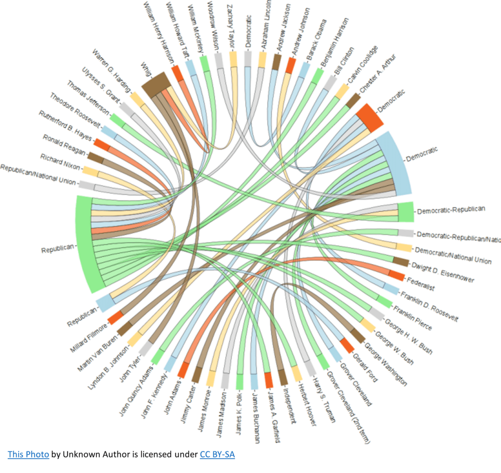
Chord Diagrams
Circular visualizations excel at showing the flow of information or relationships between different data points in a dataset. For instance, they can effectively illustrate the import/export relationships between countries, the flow of money between companies, or the connections between different websites.
Suppose you’re researching the political party affiliation of the U.S. President’s pre-2010. You can create a chord diagram with each President and political party represented as a segment of the circle. The chords within the circle would indicate the flow of people between the parties, and their thickness would represent the number of people. This way, you can immediately see which political parties have had the most Presidents elected.
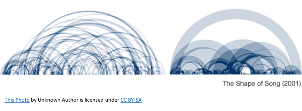
Arc Diagrams
Arc diagrams are a linear version of network diagrams. They can be used to illustrate connections between items with an underlying linear order. In an arc diagram, data points are placed along a single axis, and relationships between data points are visualized using arcs.
An arc diagram is effective in analyzing the lyrics of a song. Each word in the song would be represented along a horizontal line in the order they appear, and arcs would be drawn between words with a common theme – such as love or sadness. This visualization can help you quickly see the interconnections between song lyrics’ themes.