Histograms, Wilkinson dot plots, and box plots effectively display distributions.
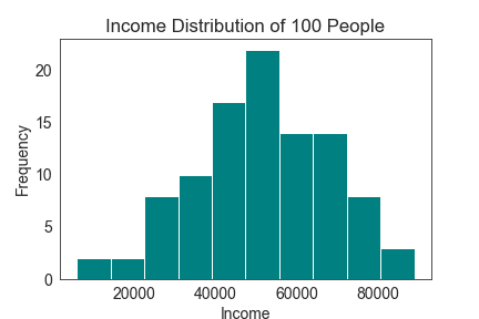
- Histograms are a graphical representation of the distribution of a dataset. They are an estimate of the probability distribution of a continuous variable. To create a histogram, you divide the data into equal intervals called “bins” and count the occurrences of the data points within each bin. The resulting bars show the frequency of the data points in the bin.
For example, let’s say you surveyed the annual income of 100 people in your community. A histogram would help you understand the distribution of the survey responses. You might see that there is a high frequency of people earning between $45,000 and $60,000, with fewer people earning higher or lower incomes. Overall, the histogram can give you a clear view of the income distribution within your community.
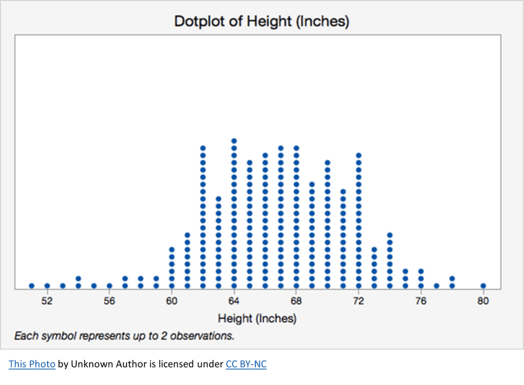
- Wilkinson dot plots, also known as strip plots, are a simple way to visualize distributional data. They represent data points as individual dots placed along a single line, often with a vertical layout. The dots are usually jittered, shifting slightly on the horizontal axis to avoid overlap and enhance readability.
Imagine you have a dataset of the height of all party attendees. Using a Wilkinson dot plot, you could plot each person as a dot, arranged by height. You might notice clusters of people with similar heights or identify outliers who are significantly taller or shorter.
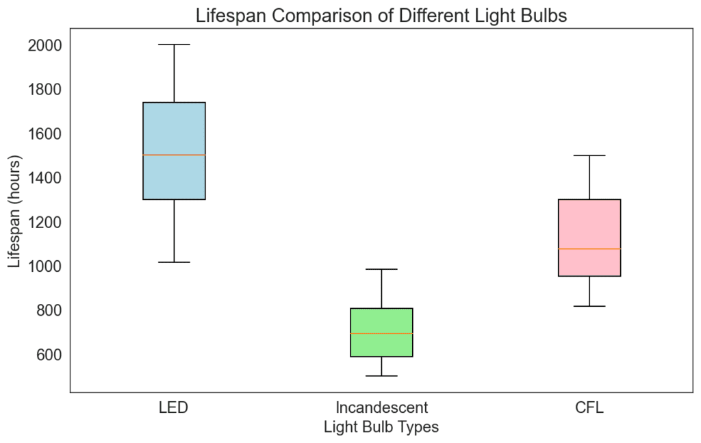
- Box plots, also known as box-and-whisker plots, are a great way to display the distribution of a dataset in a compact and visually informative way. In a box plot, the dataset is represented through several key summary statistics: the minimum, first quartile, median, third quartile, and maximum. The “box” represents the interquartile range (IQR), which spans from the first to the third quartile, effectively capturing the middle 50% of the data. The “whiskers” extend from the box to the minimum and maximum values, indicating the range of the entire dataset.
Suppose you have data on the lifespans of various types of light bulbs. A box plot could help you compare their lifespans efficiently. You could create multiple box plots representing different brands or technologies, like LED, incandescent, or compact fluorescent bulbs. By comparing the box plots’ medians and IQRs, you can quickly identify which type of light bulb typically lasts longer and has a more consistent lifespan.
Each of these methods has its own strengths and can provide valuable insights into your data when used correctly. Remember that choosing the most effective technique for your specific dataset and the story you want to tell is key.