Let’s explore some popular chart types that effectively display flows and processes. These types of visuals are often used to help people understand complex information, such as how a series of events or data points are connected or how things move from one stage to another over time.
Sometimes, we come across systems with a step-by-step flow, like tracking the stages of a buyer’s journey or understanding the flow of money in an economy. To visualize these flows and processes, we can use three main types of charts: funnel chart, Sankey diagram, and Gantt chart.
Funnel Charts
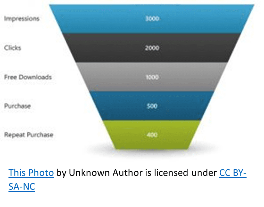
Funnel charts are a great way to visualize stages in a process, especially when each stage involves a reduction of items or values. As the name suggests, they look like a funnel narrowing down, with each stage represented by a horizontal bar, where the width corresponds to the quantity or percentage.
A funnel chart can support the visualization of the process of customers going through an online shopping experience. It could show the number of visitors at each stage, starting with total website visitors, then those who clicked the link, downloaded the free trial, made a purchase, and finally became repeat purchasers. By comparing the widths of each bar, we can easily identify where significant drop-offs occur and focus on improving those stages.
Sankey Diagrams
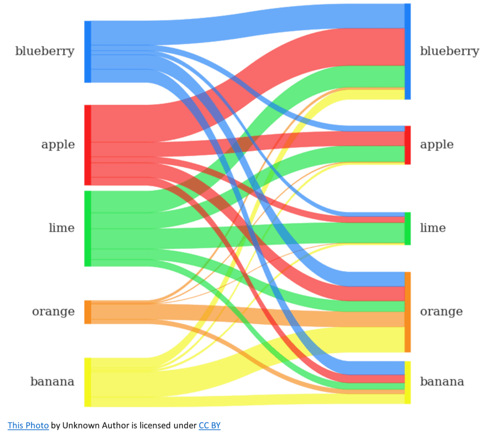
Sankey Diagrams are designed to show how values flow between different stages or categories, with the thickness of the connecting lines (or “links”) representing the quantity or proportion of the flow. They are a powerful way to visualize complex data in a simple and easy-to-understand format.
When analyzing how past purchases affect future purchases in a store, a Sankey diagram could show the breakdown of order history as input on the left side and their distribution among future purchase predictions shown as outputs on the right side. This would help us quickly understand how someone’s order history can be used to predict future purchases.
Gantt Charts
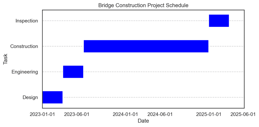
Gantt charts are used to visualize the duration and progress of tasks or projects over time. They are a widely used chart type in project management because they provide an at-a-glance view of tasks, their start and end dates, dependencies, and overall status.
For example, imagine we’re hired to build a bridge. Each task in the project (e.g., designing, engineering, constructing, and inspecting) would be represented as a horizontal bar, with the bar’s length corresponding to the task’s duration. These bars would be arranged vertically, showing how tasks overlap or depend on one another. This way, you can ensure that the project stays on schedule and that resources are allocated efficiently.
In conclusion, when it comes to visualizing flows and processes, be it for stage-based processes, complex flows, or time-bound projects, funnel charts, Sankey diagrams, and Gantt charts are powerful tools that can help you convey key insights in an accessible and engaging manner.