Here are some practical tips for designing effective charts to display ranks, such as leaderboards or performance comparisons. Three examples include leaderboards, bump charts, and Pareto charts.
Leaderboards
These charts are a simple and intuitive way to display ranks. Imagine a scoreboard showing the top performers in a sports tournament. Similarly, you can use leaderboards to present rankings in various contexts, such as sales performance, student grades, or website traffic.
To create a leaderboard:
- List the items or individuals you want to rank in a vertical or horizontal format.
- Sort the list based on the ranking metric (higher to lower, or vice versa).
- Provide a clear label for each item and include the rank value.
- Highlight the top performers or use different colors to show categories or groups.
Suppose you want to show the top 5 salespersons in a company. You can create a simple vertical leaderboard with names and corresponding sales figures. Use a different color for the highest performer to make them stand out. 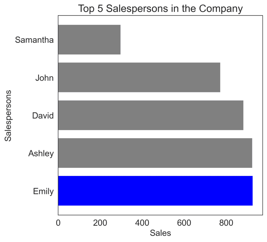
Bump Charts
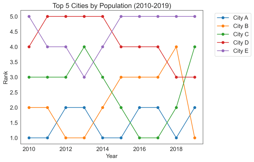
These charts help visualize rank changes over time, which can be valuable in highlighting trends and growth trajectories. It can be applied to contexts such as the rankings of smartphone brands over the years or the performance of sports teams across different seasons.
To create a bump chart:
- Define the time intervals (e.g., months, quarters, years) for which you want to show the rankings.
- Plot the ranks on the vertical axis and the time intervals on the horizontal axis.
- Use a separate line for each item, connecting its ranks at different intervals.
- Highlight or label the top performers for easier identification.
To display the evolution of the top 5 cities with the highest population over the last decade, create a bump chart with years on the horizontal axis and ranks on the vertical axis. Plot a line for each city showing their ranks each year.
Pareto Charts
They are designed to display the distribution and impact of different factors, often highlighting the 80/20 (Pareto) principle. They are useful for contexts such as identifying the most important causes of a problem or the main sources of revenue for a business.
To create a Pareto chart:
- Identify a set of categories or factors to rank and their corresponding values (e.g., causes of defects and their frequency).
- Arrange the categories in descending order based on the values.
- Plot a bar chart with the ranked categories on the horizontal axis and the values on the vertical axis.
- Add a cumulative line to show the accumulated percentages across categories.
When visualizing the most common reasons for late arrivals to work and the percentage of occurrences for each reason, creating a Pareto chart would be an excellent choice. Simply make a bar chart with the reasons on the horizontal axis, sorted by the number of late arrivals, and plot the cumulative percentage line to reveal the significant contributors to this issue. 
By thoughtfully applying these charts based on the context and purpose, you can communicate the performance of different elements and their changes over time, helping your audience make informed decisions with the insights provided.