When a chart shows a part-to-whole relationship, it means that it is displaying how individual pieces or segments of data make up a whole entity. This type of visualization helps in understanding the proportion or percentage each part contributes to the total. Here are charts that effectively display part-to-whole relationships.
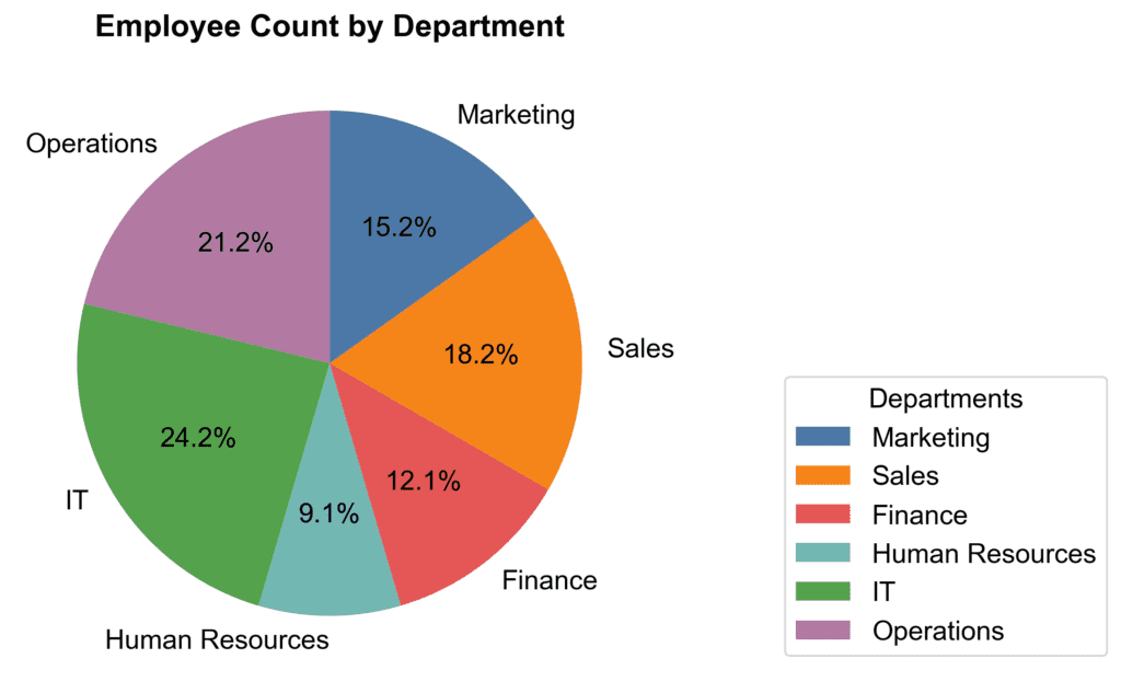
Pie Charts
Pie charts represent components of a whole as slices of a circular pie. For example, imagine you’re analyzing votes received by each candidate in an election. You can depict each candidate’s share of votes as a slice of the pie. Pie charts can provide a quick visual understanding of the distribution when only a few categories exist. However, with numerous categories, pie charts might become cluttered and difficult to read.
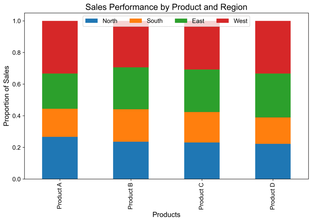
100% Stacked Bar Chart
In this chart type, a single bar is divided into segments representing the whole’s components. It’s an excellent choice for scenarios where you want to convey proportions while comparing multiple items or categories. For instance, say we want to understand the sales performance of different products across multiple regions. Each bar can represent a product, and the segments within the bar show the proportion of sales within a particular area.
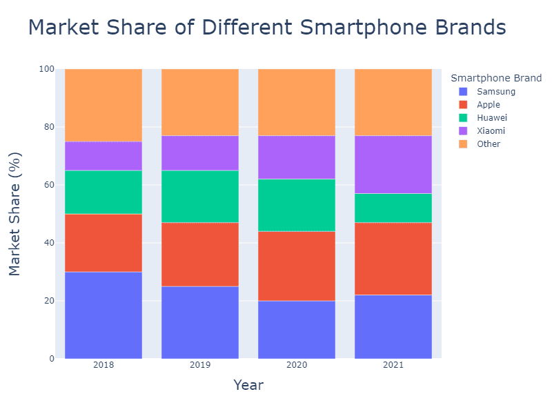
100% Stacked Area Chart
A 100% stacked area chart is similar to a stacked bar chart but uses areas instead of bars to display data. This chart can be useful when you want to reveal how different components contribute to the whole over time. For example, consider a company that wants to track the market shares of different smartphone brands, breaking down each year as a proportion of the total. The chart would provide an easy-to-read, at-a-glance visual of market share by phone brand each year.
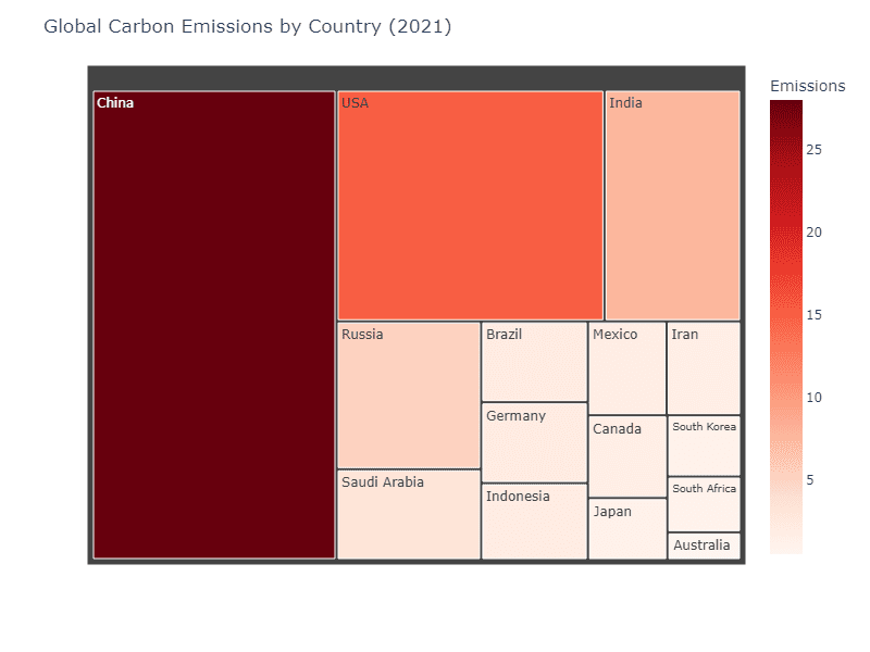
Tree Maps
These charts are rectangular representations of hierarchical data. Imagine a company wanting to visualize the carbon emissions by different countries in 2021. A tree map would be ideal in this scenario, as it can clearly show how each country contributes to the overall carbon emissions. The size of each rectangle represents its share of the whole, and you can further use color to emphasize differences in growth or decline.
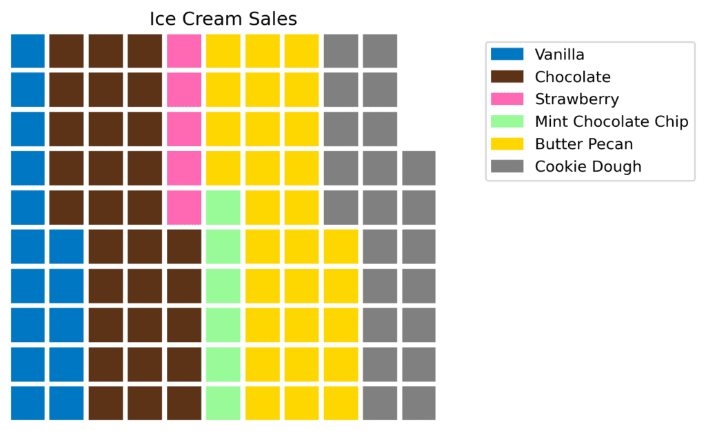
Waffle Charts
A fun name for a chart these use a grid of small squares representing a fixed portion of the whole. This chart is excellent for illustrating ratios and proportions in an easy-to-understand manner. For example, if you want to communicate how popular ice cream flavors are at the local store, a waffle chart would provide a straightforward way to visualize these proportions.
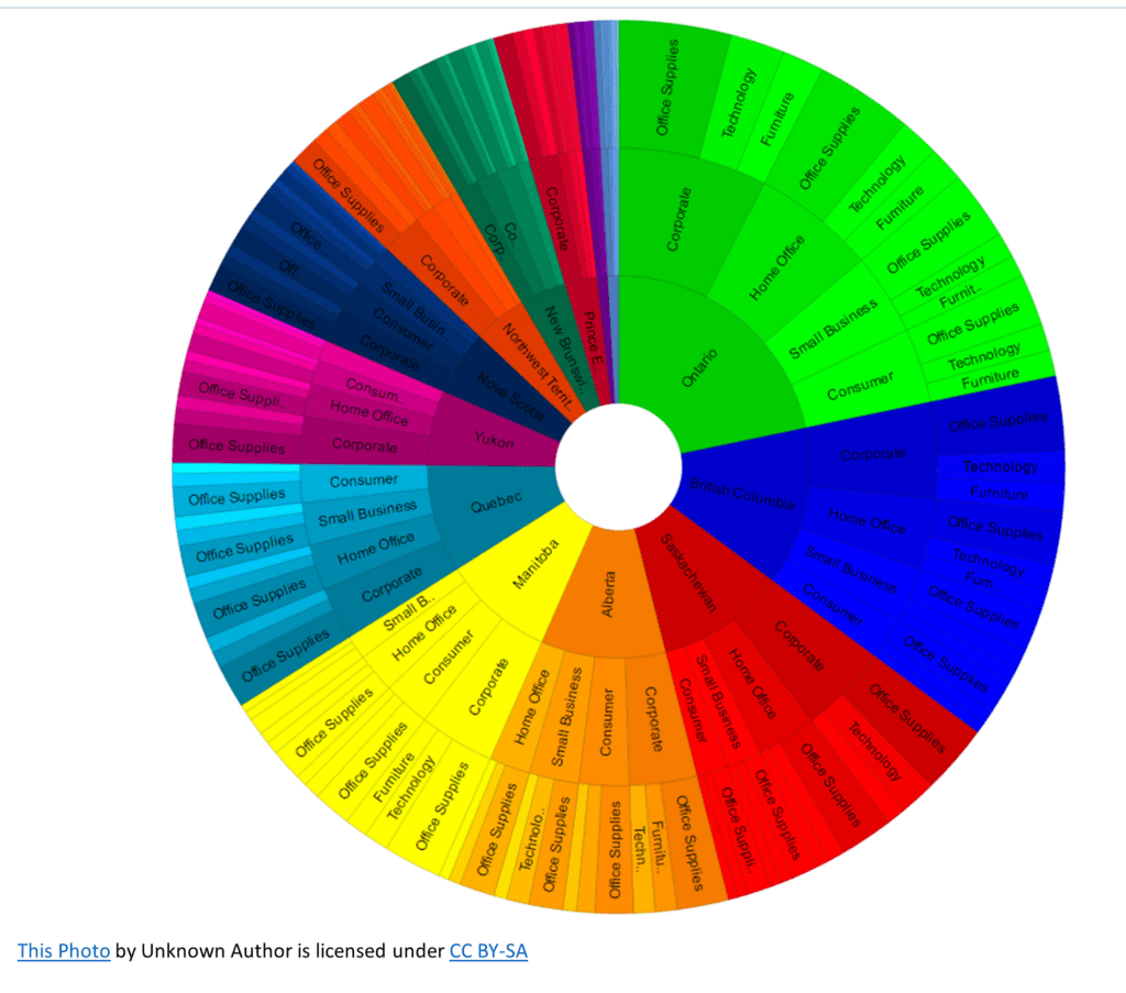
Sunburst Charts
Also known as radial tree diagrams, these charts depict hierarchical data with concentric circles or arc segments. This chart type can be an effective way to showcase part-to-whole relationships with multiple layers of a hierarchy. Suppose we have data on the sales from a Canadian office supply store chain across different territories and departments. A sunburst chart can easily depict this information while simultaneously showing each sub-department proportion within its department and the overall sales.
The specific chart type you select for your part-to-whole visualization will depend on factors such as the complexity of the data, the hierarchy involved, and the story you want to tell. Each chart type can effectively present data and help your audience understand the underlying relationships more clearly.