Understanding how to choose the right chart that aligns with the metrics you want to display is important. Picking the right chart not only helps you to understand your data better but also aids in communicating your findings to others effectively.
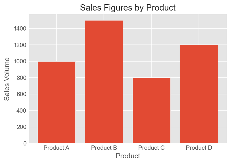
- Comparing values across categories: A bar chart or column chart works great when you want to compare values across different categories or examine their distribution. Example – If you want to showcase the sales figures for different products, you can use a column chart with each column representing a product and its height depicting the sales volume.
- Analyzing part-to-whole relationships: If you want to show the composition of a whole by its portions, pie charts or stacked bar charts can be used. Example – If you want to display the market share of different smartphone brands, a pie chart can effectively present the market share percentages.

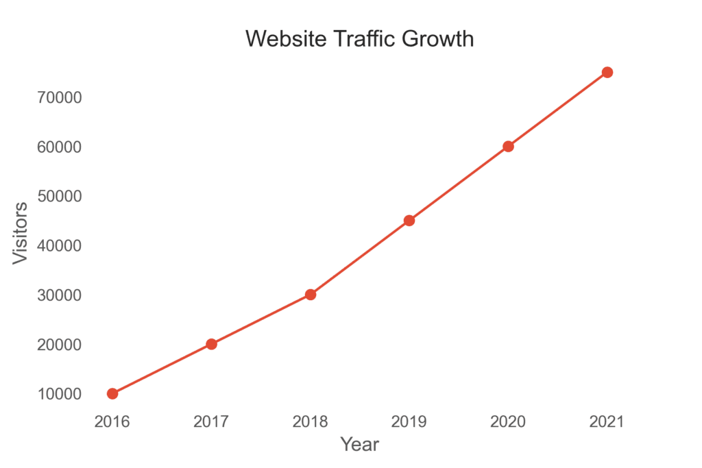
- Understanding trends over time: Line charts and area charts are ideal for displaying data that changes over time. Example – If you want to visualize the growth of your website traffic year over year, a line chart would be an efficient choice.
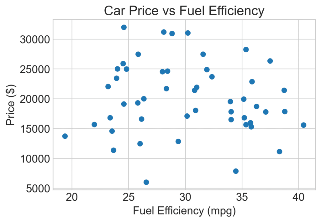
- Visualizing relationships between two variables: Scatterplots can be quite useful for highlighting the correlation between two variables or displaying a distribution. Example – If you want to explore the relationship between a car’s price and fuel efficiency, a scatterplot can help in identifying patterns or anomalies.
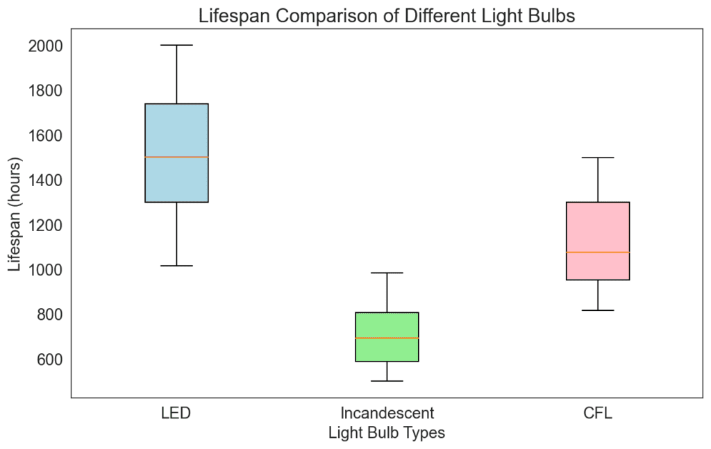
- Showing distribution and range: To display the distribution and range of a dataset, consider using a box plot or a histogram. Example – A box plot can provide valuable insights if you want to analyze the range of the lifespan of different light bulbs and identify outliers or groups.
Next, let’s talk about some typical metric combinations and their suitable charts.
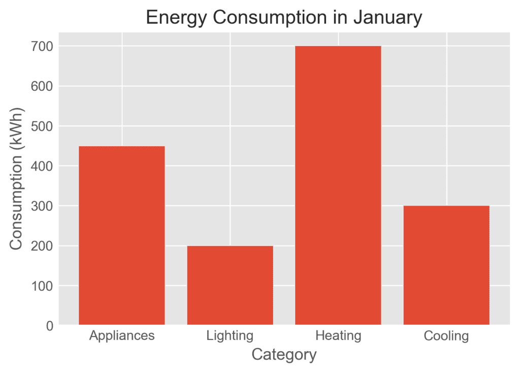
- Single metric – single time period: If you have a single metric to display for one time period, a number chart, gauge chart, or a simple bar or column chart might suffice. For example, showing energy consumption for the month of January in a bar chart.
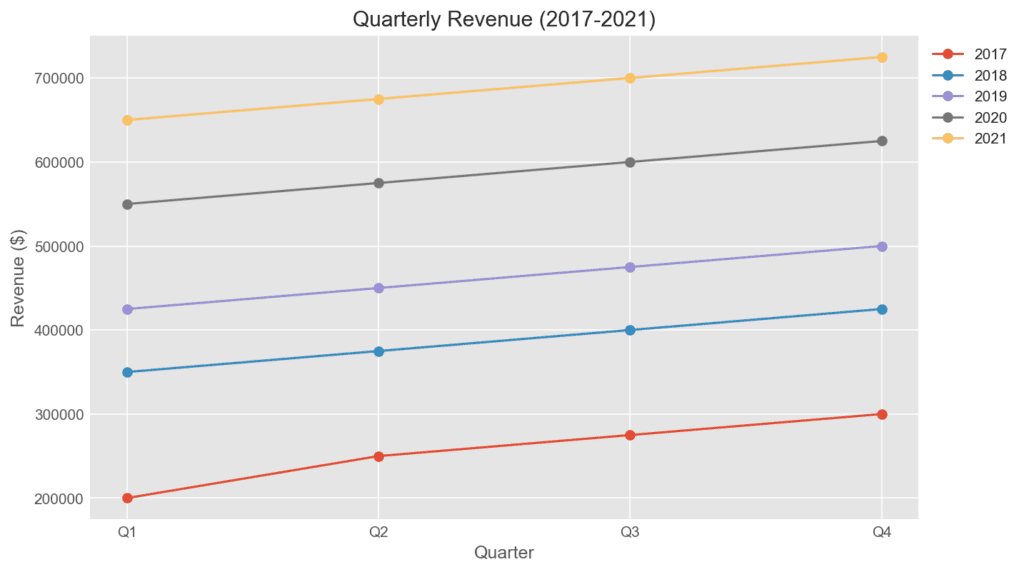
- Single metric – multiple time periods: Line charts or bar charts can effectively represent trends or changes when displaying a single metric over multiple time periods. Example – Visualizing the quarterly revenue of a company for the past five years using a line chart.
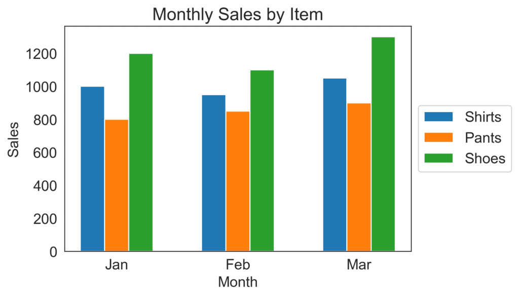
- Multiple metrics – single time period: Stacked bar charts or grouped bar charts can be used to compare multiple metrics within one time period. Example – Comparing the sales numbers for different types of clothes in three years using a grouped bar chart.
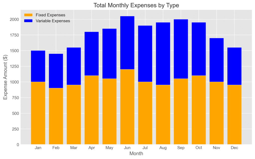
- Multiple metrics – multiple time periods: If you need to display multiple metrics for multiple time periods, choose between line charts or stacked bar charts depending on the metrics’ relationship. Example – Showing the breakdown of total monthly expenses into fixed and variable expenses over the past year, a stacked bar chart will suit you well.
Remember, there’s no one-size-fits-all approach, but understanding these fundamentals will help guide your decision-making process. While combining multiple metrics in a chart, ensure they have the same or related units of measurement to avoid confusion. Finally, make sure your chart is clean, easy to read, and effectively communicates the story you want to tell.