Categorical data refers to data that can be organized into categories or groups. Displaying this data type visually can help us quickly identify patterns, trends, and relationships. Here are some common chart types that can help us showcase categorical data.
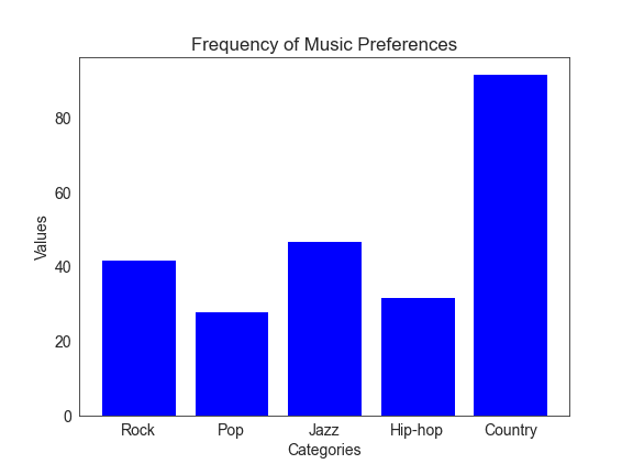
Bar Charts
Bar charts are an excellent way to compare the frequency or counts of different categories. Each bar represents a category, and the bars’ length or height represents each category’s value or count. For example, if we have data on the number of people who prefer different types of music, we can create a bar chart that represents the number of people who like Rock, Pop, Jazz, etc.
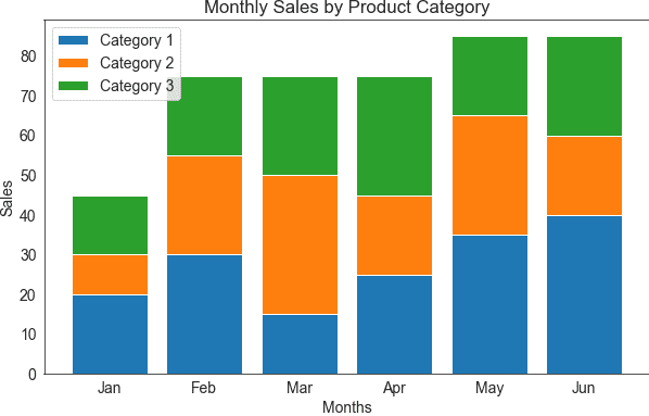
 Stacked Bart Charts
 Stacked Bart Charts
A stacked bar chart is a variation of the bar chart in which multiple values are stacked on top of each other within each bar. This creates a more efficient and compact display of data. For instance, if we’re examining sales data for different product categories over several months, we can stack the monthly data within each category bar to see the overall sales trends at a glance.
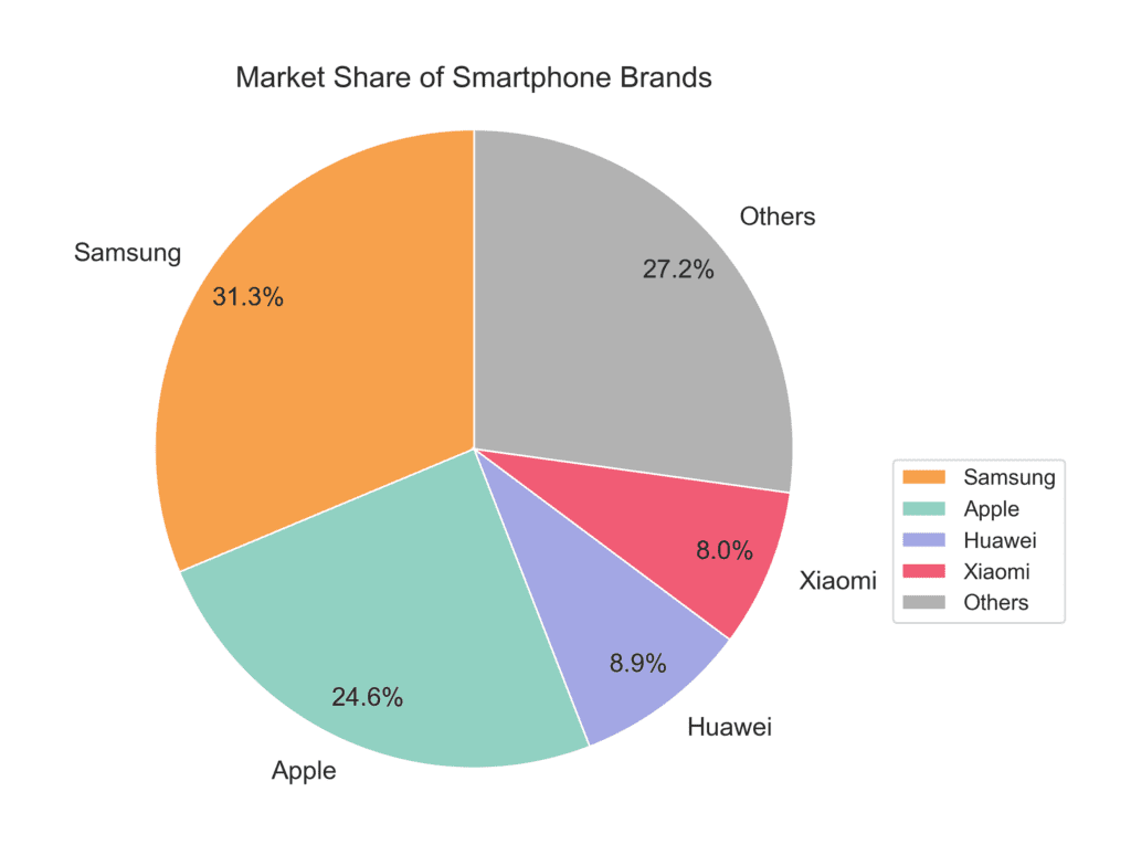
Pie Charts
Pie charts are excellent for displaying the proportions or percentages of different categories within a whole. The entire circle represents the total sum, and each slice or section represents a category. A popular example would be displaying the percentage of market share held by different smartphone brands.
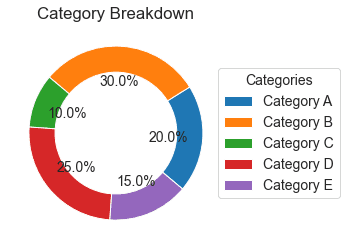
Donut Charts
A donut chart is very similar to a pie chart but has a hollow center, creating a “donut” shape. The main advantage of using a donut chart over a pie chart is that it can display multiple categories by having multiple concentric circles. This makes it easier to visualize the relative proportions of the various categories in a more compact space.
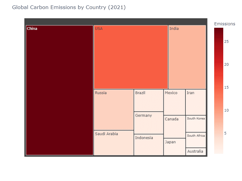
Treemaps (or Tree Maps)
A treemap is a space-filling visualization representing hierarchical data as a series of nested rectangles. A rectangle represents each category, and the size of the rectangle denotes the quantity or value of that category. Treemaps are great when you have many categories and need to show their relative size more effectively. For instance, a treemap can be used to display the global carbon emissions of different countries.
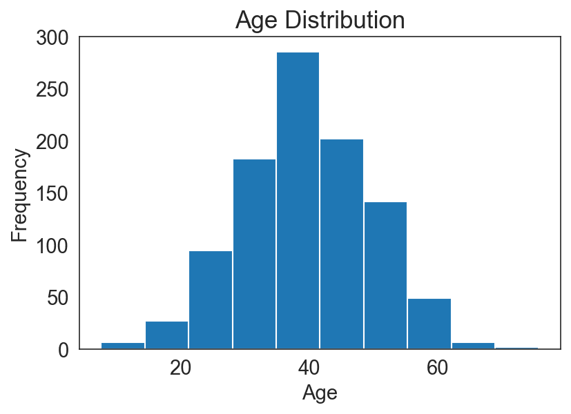
Histograms
A histogram is a bar chart that focuses on the distribution of continuous data by dividing it into discrete intervals or bins. Although histograms primarily deal with continuous data, they can also be used to visualize the underlying distribution (e.g., bell-shaped, skewed, bimodal) of categorical data. For example, a histogram can help us see the distribution of age groups in a population by binning the age data into specific ranges.