When displaying data associated with distinct categories, each category has a numerical value associated with it, charts focused on categorical-numeric data effectively support your data storytelling needs. Let’s dive into three common types of these charts: grouped, stacked, and multi-series charts.
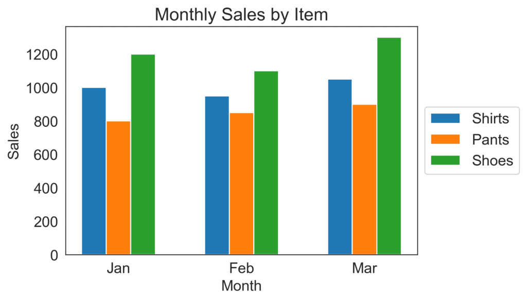
- Grouped Bar Charts work well when you have multiple categories, and each category contains sub-categories. For instance, imagine you have a clothing store, and you’d like to visualize your monthly sales for different types of clothes like shirts, pants, and shoes. A grouped bar chart will have separate bars for each clothing type, grouped alongside each other by a specific month.
To create this chart, you simply need to arrange your data in columns and then use the bar chart feature in your favorite charting tool. For instance, your data may look like this:
Month – Shirts – Pants – Shoes
Jan – 1000 – 800 – 1200
Feb – 950 – 850 – 1100
Mar – 1050 – 900 – 1300
- Stacked Bar Charts are another fantastic way to display categorical-numeric data, specifically when you want to show the total amount of each category and the proportion that each sub-category contributes to it. Let’s use the same example of the clothing store, but this time we want to see the contribution of each clothing type to the total sales of each month.
To create a stacked bar chart, simply arrange your data just like we did for the grouped bar chart, but this time choose the stacked bar chart option in your charting tool.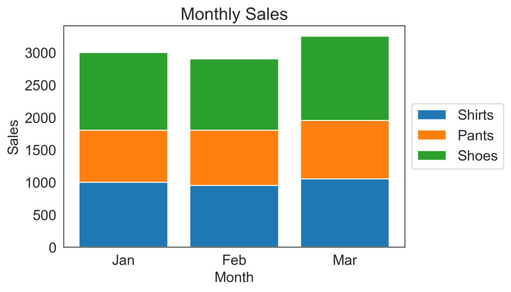
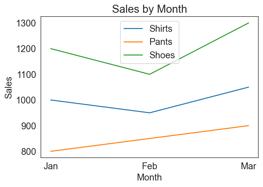
- Multi-series Line Charts are great for showing trends over time. Using our clothing store example once again, let’s say we want to see how the sales of each clothing type have evolved over the years. We can use a multi-series line chart to compare the trends of shirts, pants, and shoes side by side.
To create this chart, organize your data in columns as before, with your time values (month or year) in the first column, and then select the line chart option in your charting tool. Make sure to choose a separate line for each clothing type.
All three chart types—grouped bar, stacked bar, and multi-series line charts—are effective for visualizing categorical-numeric data to make it easy for your audience to understand and interpret the information being presented. When designing these visuals, always keep your audience in mind and use clear labels, distinguishable colors, and a simple layout to make your data story as effective as possible.