Visualizing data helps you gain insights and communicate information more efficiently. Here are some effective charts to display categories that are dependent or independent.
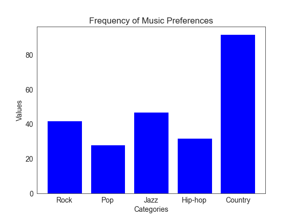
- Bar charts – These charts are great for comparing different categories independently. For instance, you can use a bar chart to compare the popularity of different music categories in a store. Each bar would represent a music category showing its popularity.
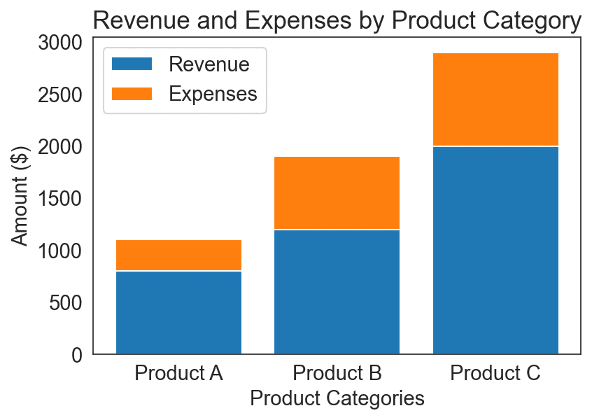
- Stacked bar charts – A variation of bar charts, stacked bar charts show dependent relationships between categories. Consider the example of a company’s sales of different product categories over several years. In this case, each bar would represent a category, and each segment within the bar would indicate revenue and expenses associated with that category.
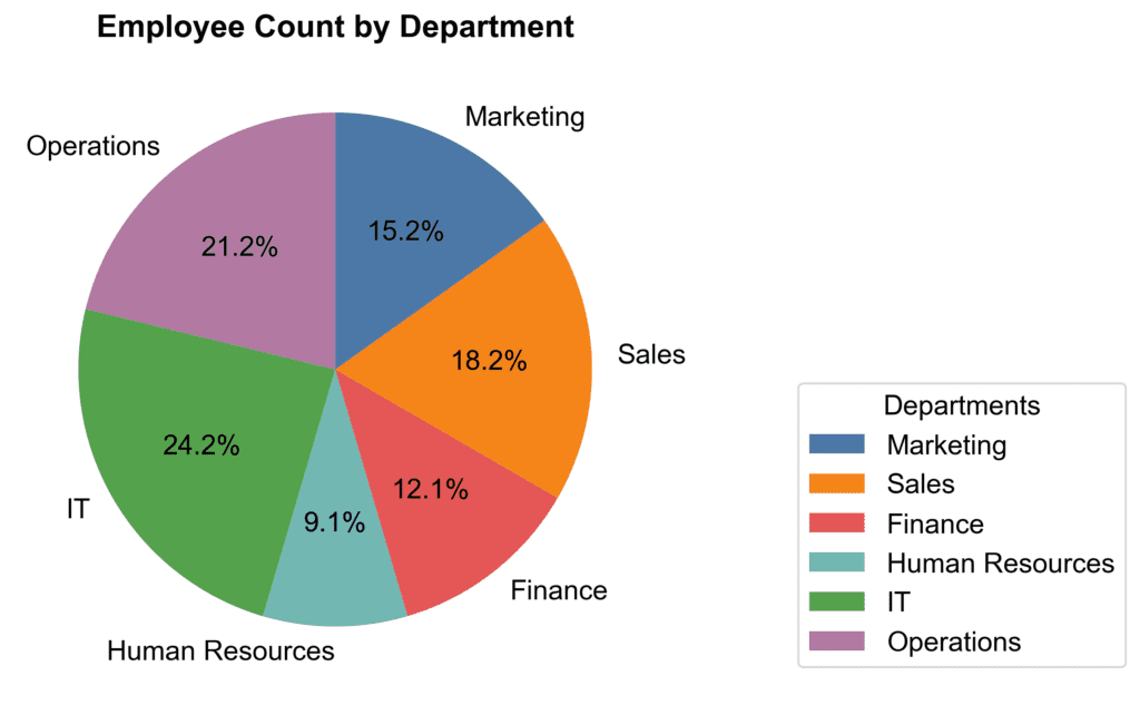
- Pie charts – Pie charts are useful for showing the relative composition of a whole. They effectively display independent categories. For example, you could use a pie chart to show what portion of a company’s employee count comes from different departments.
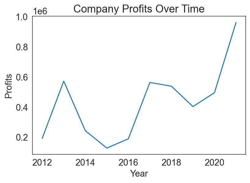
- Line charts – These charts help you track changes over time or visualize trends in data that are dependent. A line chart is ideal if you want to display the trend of daily temperatures over a month or the growth of a company’s profits over several years.
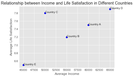
- Scatter plots – Scatter plots can display relationships between two continuous variables that may or may not be dependent. For example, if you want to analyze if there’s any relationship between the average income and average life satisfaction in different countries, you can use a scatter plot.
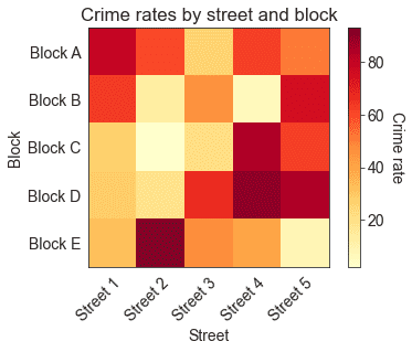
- Heat maps – These charts display two independent categorical variables and one continuous variable in the form of colors. For instance, if you want to show the crime rate across various locations, you can create a heat map with rows representing blocks, columns representing streets, and color intensity indicating the crime rate.
In summary, when designing visual information, it’s essential to think about the relationships between the data points and choose the most appropriate chart type to represent those relationships effectively.