Multidimensional data can be challenging to display, especially when you want to convey multiple aspects or layers of information simultaneously. Basic chart types like bar, line, and pie charts can only show limited dimensions. So, to account for additional dimensions and make the visualization more informative and engaging, we can use different techniques, such as incorporating series or adjusting encodings like color, size, or symbols.
Data Series
Let’s take a line chart, for instance, which often displays the time as the x-axis and a variable, let’s say sales, as the y-axis. If you want to add an additional dimension, like sales by product, you can create multiple series representing a different product. In this case, each line on the chart would have a unique color or pattern to help the viewer distinguish between products easily. 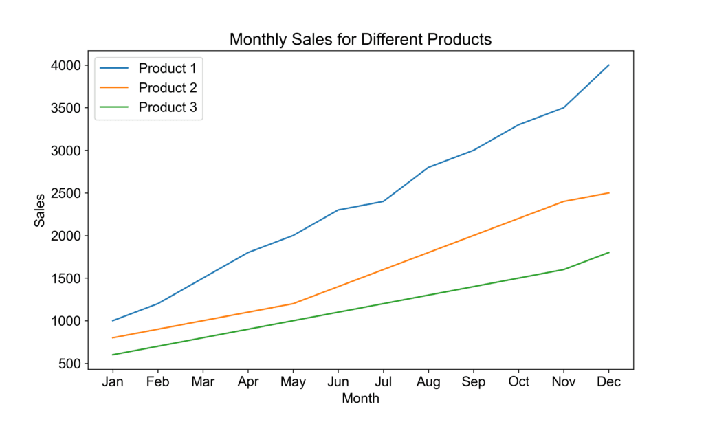
Data Encoding
Another approach to add dimensions is by using encodings. Let’s say you want to display sales in various product categories in addition to the region. You can encode product categories by using different shapes or colors for the data points. Each color, such as red, green, or blue, represents a specific product. This way, viewers can see both regional sales trends and the distribution across product categories.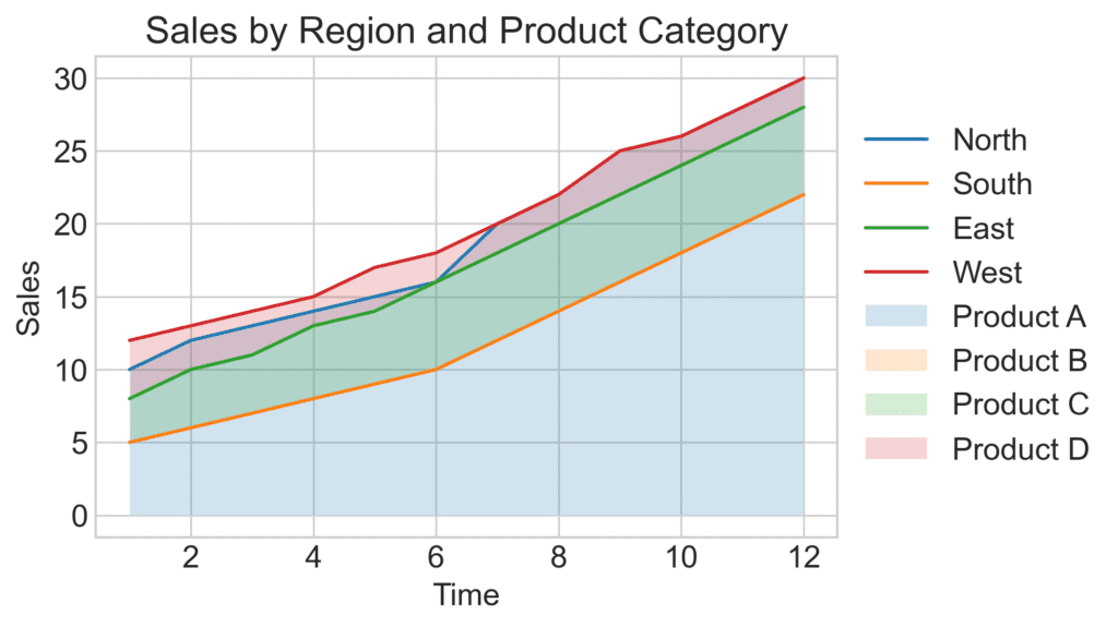
Interactive Visuals
Adding too many dimensions can make a chart overly complex and challenging to comprehend. To avoid this, consider using multiple charts or interactive visuals. For instance, you could create small multiple charts that display individual line charts for each region, with the additional dimension represented through color or shape. Alternatively, you could create an interactive chart allowing users to select a region or product category, revealing the relevant data.
Examples of Multidimensional Data Design
Let’s discuss some examples of designing visual information and how to convey multidimensional data effectively:
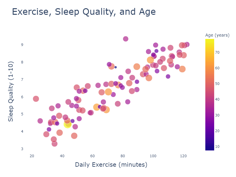
- In a health context, you can use a bubble chart to show the daily exercise, sleep, and age of different people in your study. Here, the x-axis represents daily exercise, the y-axis represents sleep quality, and the bubble size signifies age. You can further encode age groups using color.

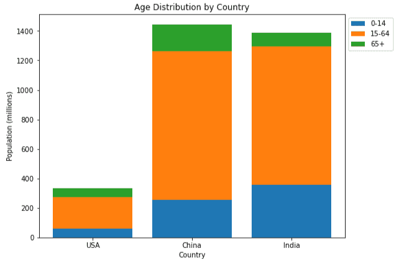
- You can use stacked bar graphs with age groups stacked side-by-side and countries as individual bars when displaying social data like population and age distribution across multiple countries. Color coding can represent age groups, with the size of each colored “stack” indicating the proportion of the population in that age group.
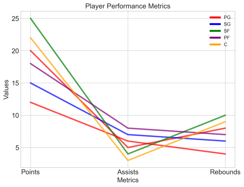
- In sports, you can use a parallel coordinates chart to analyze player performance using multiple metrics like points scored, assists, and rebounds. Each vertical axis represents a different metric, and a connected line represents each player’s data. You could even encode additional information like player position through color.
In summary, effectively displaying multidimensional data involves adding series, using encodings like color, size, or shape, and carefully considering the chart type. It’s essential to balance adding dimensions and maintaining simplicity to avoid overwhelming or confusing your audience.