Charts that show number data are really important for helping us see and understand information that involves numbers. These charts make it easier to figure out and study how numbers are related to each other, how they change over time, and what kind of patterns they make. Here are some effective charts and their attributes that support meaningful displays of numeric data.
Bar charts
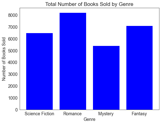
Bar charts are a great way to visualize data when comparing single or multiple data values across different categories. For instance, imagine you want to display the total number of books sold in different genres. A bar chart will break down the data per genre, making it easy to understand and compare the numbers.
Line Charts
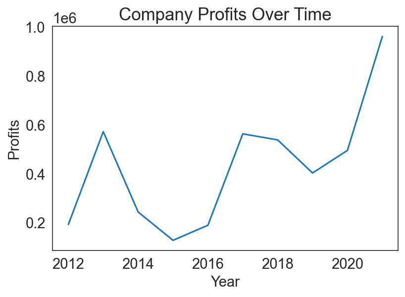
Lines are excellent for demonstrating trends or changes over time. Suppose you want to visualize a company’s profits for the past ten years. A line chart will illustrate the profits year by year, showing any patterns, such as consistent growth or fluctuations.
Pie Charts
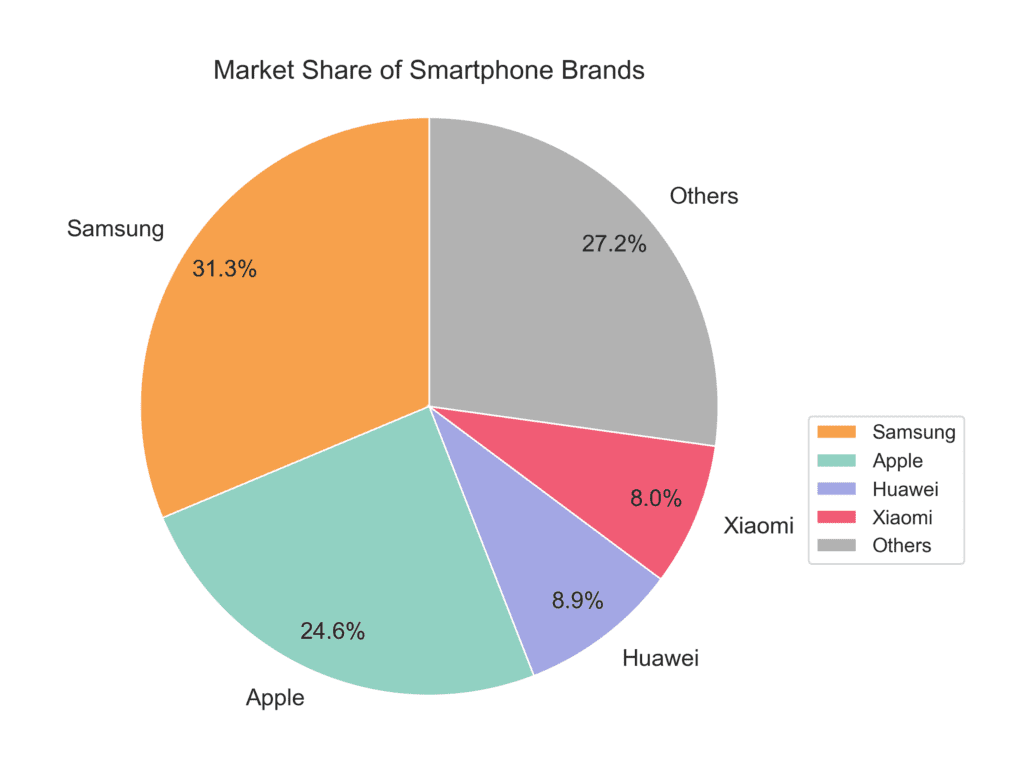
Pie charts are effective in showcasing proportions or percentage comparisons. Imagine you want to illustrate the market share of different smartphone brands. A pie chart will effectively show each brand’s market percentage, offering a clear image of their proportions compared to one another.
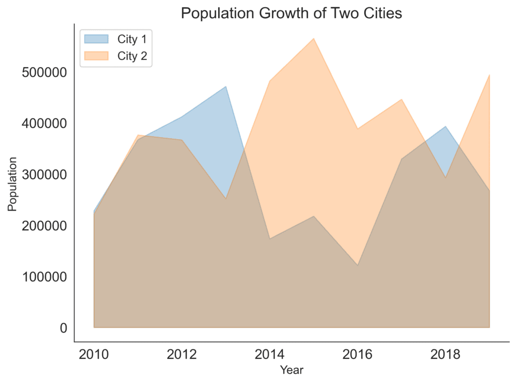
Area Charts
These are similar to line charts but with filled areas under the lines, representing accumulated totals. For example, visualize the population growth of two cities. An area chart will help you see not only the growth trends but also the difference in population size between the cities over time.
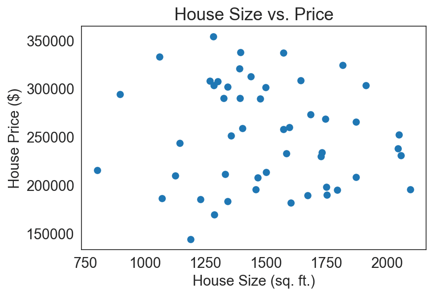
Scatter Plots (or Scatterplots)
Scatter plots are an excellent choice to reveal the relationship between two variables. Think of a real estate scenario where you want to visualize the price of houses in relation to their size (square footage). A scatter plot will show the correlation or trends between house size and price.
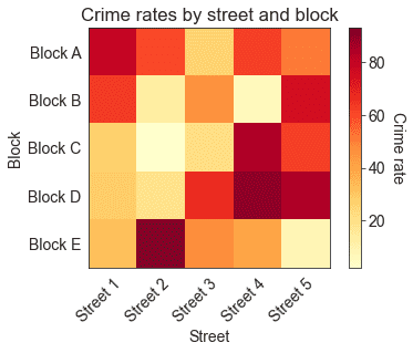
Heat Maps (or Heatmaps)
These colorful charts are an effective method to visualize data when you want to represent density or intensity. For example, suppose you wish to display the geographical concentration of crime occurrences in a city. In that case, using color-coded intensity levels, a heat map will effectively show the areas with high, medium, and low crime rates.
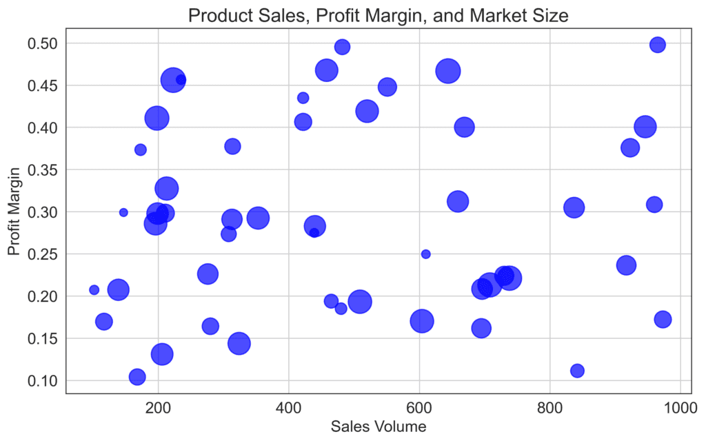
Bubble Charts
These are a variation of scatter plots, typically used for visualizing 3-variable data sets. The third variable is represented by the size of the bubble. Imagine you want to visualize different products’ sales volume, profit margin, and market size. A bubble chart can effectively show the relationships since the larger bubbles will indicate larger market sizes.