The following charts work best for displaying numeric-numeric data.
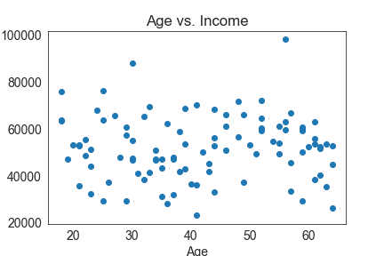
- Scatterplot: This type of chart displays data points on a Cartesian plane. Each data point has two numeric values: one providing the x-coordinate and the other the y-coordinate on the plot. Scatterplots are perfect for showcasing trends across two numeric variables, such as the relationship between a person’s age and their income.
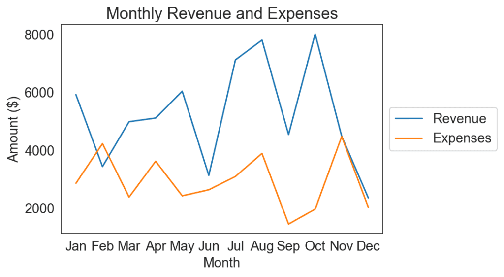
- Line chart: Line charts plot data points connected by lines. For example, you can use a line chart if you have monthly revenue and expenses. This type of chart works great for illustrating trends and movements over time.
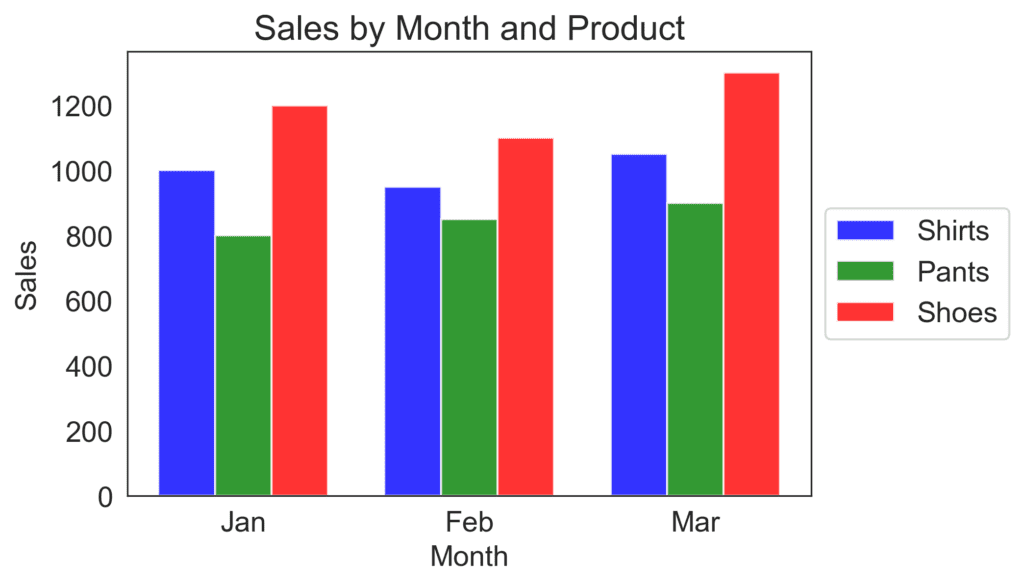
- Grouped bar chart: This variant of a bar chart displays multiple sets of data for each category on the x-axis. Imagine you want to compare the sale of three different products over three months. In this case, the x-axis would represent the months, and each month would have three bars representing the sales of each product.
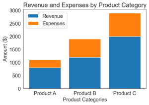
- Stacked bar chart: Stacked bar charts are similar to grouped bar charts, but they stack the bars on top of each other. This can help you compare the proportion of each category to the whole. For example, if you want to analyze the composition of a company’s revenue from different product categories, a stacked bar chart can show the proportion of each category contributing to the total revenue.
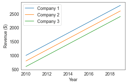
- Multi-series line chart: A multi-series line chart is essentially a line chart with multiple lines in the same plot. This is useful when you want to compare the trends of different data sets over time. Let’s say you want to compare the revenue growth of three different companies over ten years. A multi-series line chart will have three lines, each representing one company, and the x-axis will represent the years.
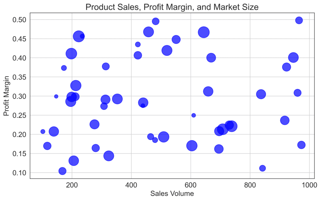
- Bubble chart: A bubble chart is like a scatter plot, but each data point is represented by a bubble. The size of the bubbles can represent a third numeric value, such as when illustrating the relationship between a company’s product sales, profit margin, and market size. Bigger bubbles would indicate a higher value for the third variable.
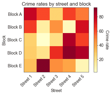
- Heatmap: A heatmap is a grid where each cell is colored based on a numeric value. This visualization can help you spot patterns in large datasets with higher ease. For instance, if you want to understand the correlation between location and crime rate, a heatmap can show you the data visually compellingly.
While there are many chart types for displaying numeric-numeric data, an effective choice depends on the story you want to tell with your data and the relationship you want to emphasize.