One-dimensional data simply means that we have a single variable or category we’d like to present visually. Here are some effective ways to display one-dimensional data using various chart types.
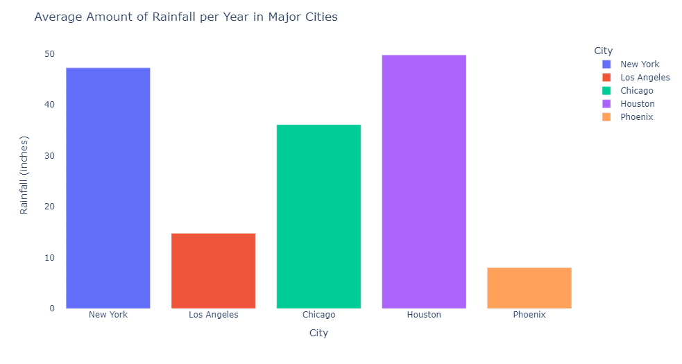
- Bar charts are an excellent way to display one-dimensional data, particularly when you have categorical or nominal data. In a bar chart, each category is represented by a separate bar, and the bar’s length (or height) is proportional to that category’s value or count. For example, imagine we wanted to display the average yearly rainfall in different cities. A bar chart would easily show which cities experience the most rainfall by having longer bars for those with higher rainfall.
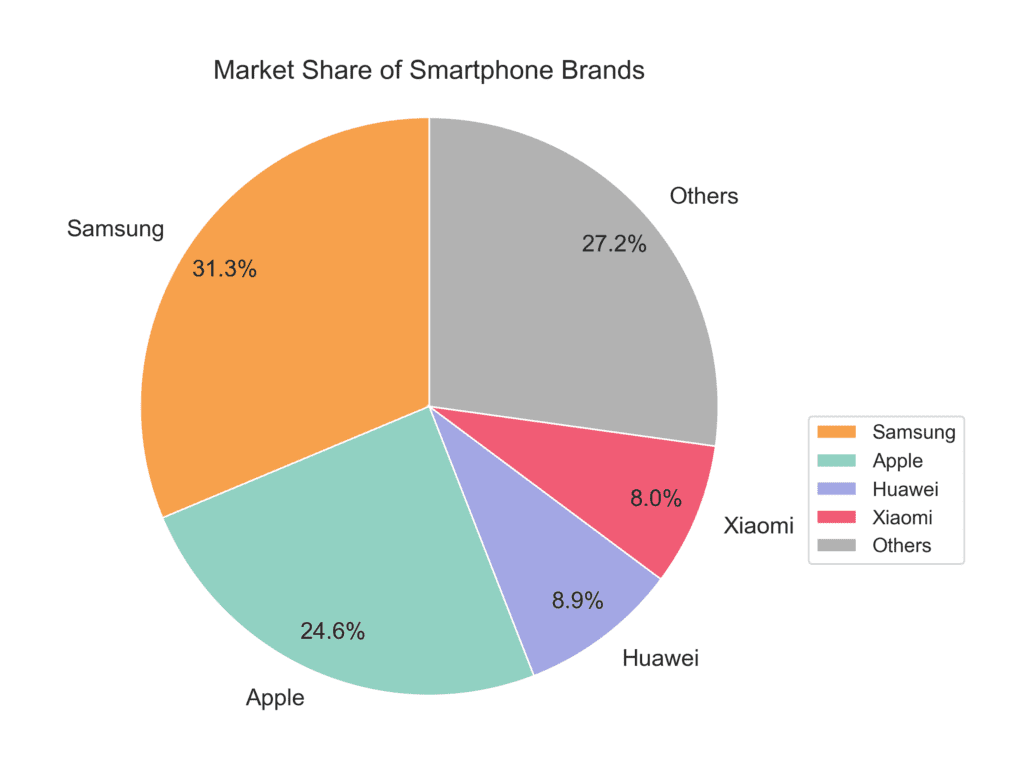
- Pie charts are another great option for displaying one-dimensional data. This type of chart works best when you want to show proportions or percentages within a whole. Each slice of the pie represents a category, and the size of each slice corresponds to its proportion in the total. For example, if you wanted to visualize the market share of different smartphone brands, a pie chart would clearly display each brand’s proportion within the total market.
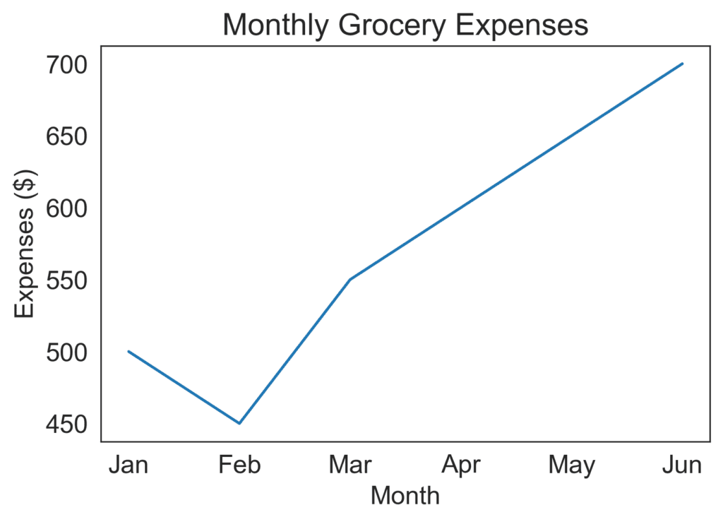
- Line charts are perfect for displaying one-dimensional data that has an organized sequence or a time component. In a line chart, data points are plotted at regular intervals and connected with a line to illustrate trends or patterns over time. For example, if you wanted to track your monthly spending on groceries, a line chart would help visualize any seasonal fluctuations or spending habits.
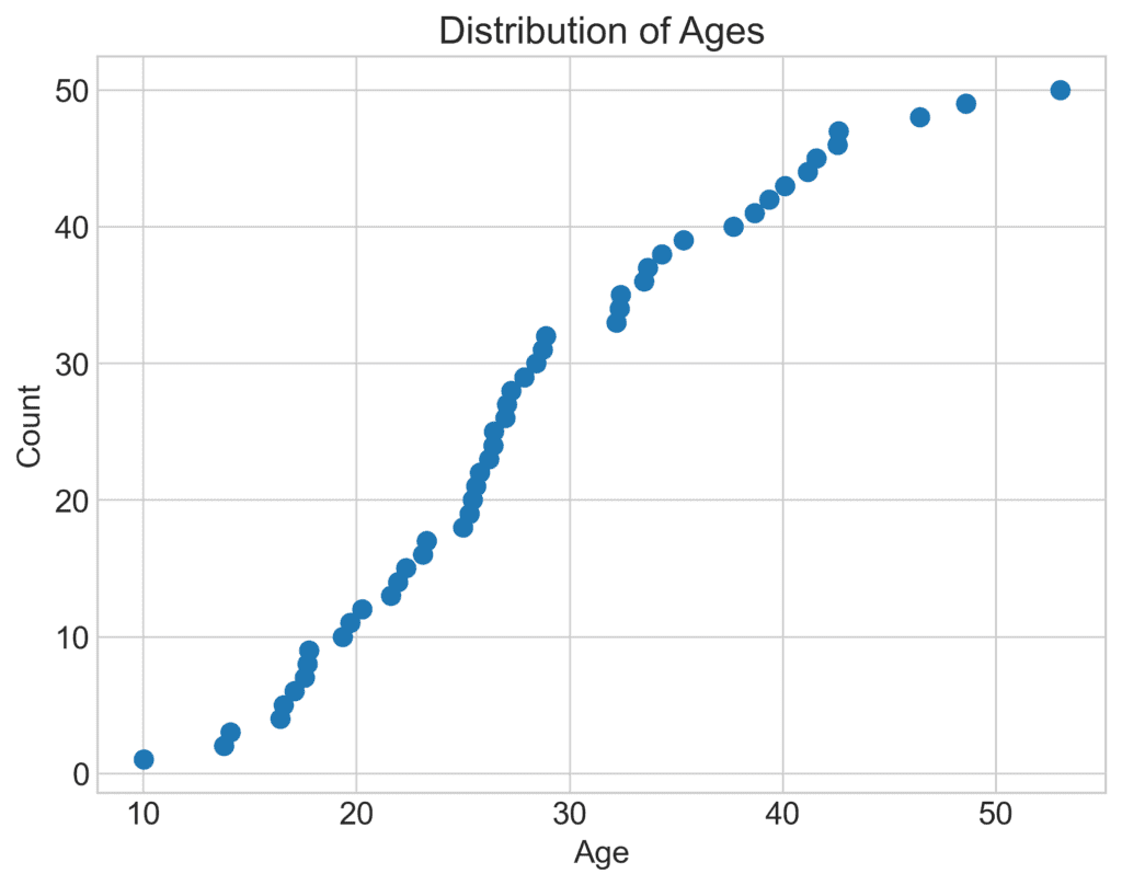
- Dot plots are a simple way to display one-dimensional data using dots or points to represent individual data points. This type of chart works well when you want to reveal the distribution or clustering of data points within a range. For example, if you wanted to display the ages of a group of people, a dot plot would show the individual ages as well as any clusters or gaps within the group.
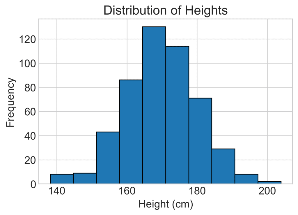
- Histograms are similar to bar charts in their appearance, but they are used to represent the distribution of continuous data instead of categorical data. In a histogram, the data is split into intervals or “bins,” and the height of each bar represents the frequency (or count) of data points within that bin. For example, if you wanted to present the distribution of height in a group of people, a histogram would help visualize any patterns or trends in the data, such as a bell-shaped curve.