Charts that display two dimensions allow for the comparison of two variables on two different axes, usually the x-axis (horizontal) and y-axis (vertical). This comparison helps in identifying relationships between the variables.Let’s explore some popular types of two-dimensional charts, with examples for each.
Scatter Plots
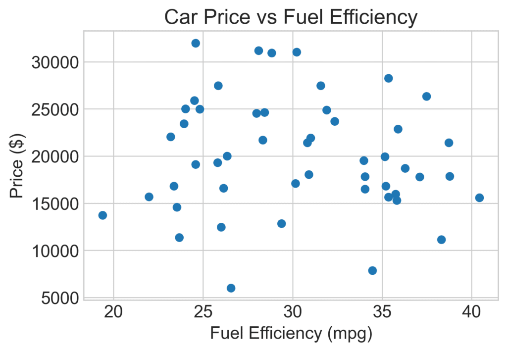
Scatter plots are a fantastic way to represent the relationship between two numerical variables. Imagine you want to display the correlation between the price of a car (along the Y-axis) and its fuel efficiency (along the X-axis). Each car model would be represented as a point on the scatter plot. With all the car models plotted, it’s easier to see trends and clusters in the data. You might notice, for example, that cars with higher fuel efficiency generally cost less.
Bar Charts
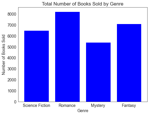
Bar charts are perfect for displaying categorical data. Let’s say you want to visualize the number of books sold by different genres. On the X-axis, you would list each genre(e.g., Science Fiction, Romance, etc.), and the height of each bar along the Y-axis would represent the number of books sold in that genre. Bar charts make it easy to read and compare values across different categories.
Line Charts
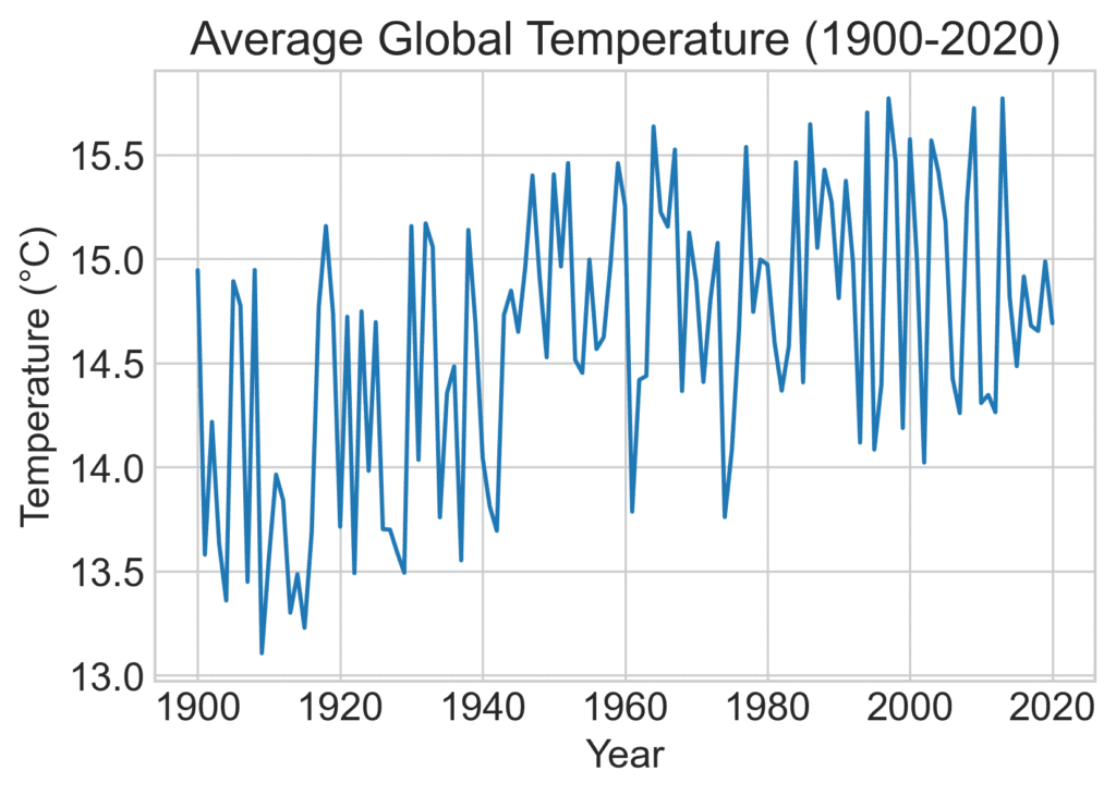
Line charts are ideal for visualizing the changes in a numerical value over time. For instance, you might want to plot changes in the average global temperature yearly over the past century. The X-axis would represent time (e.g., in years), and the Y-axis would represent the temperature. Connecting the data points with a line makes it simple to see trends and fluctuations over time.
Pie Charts
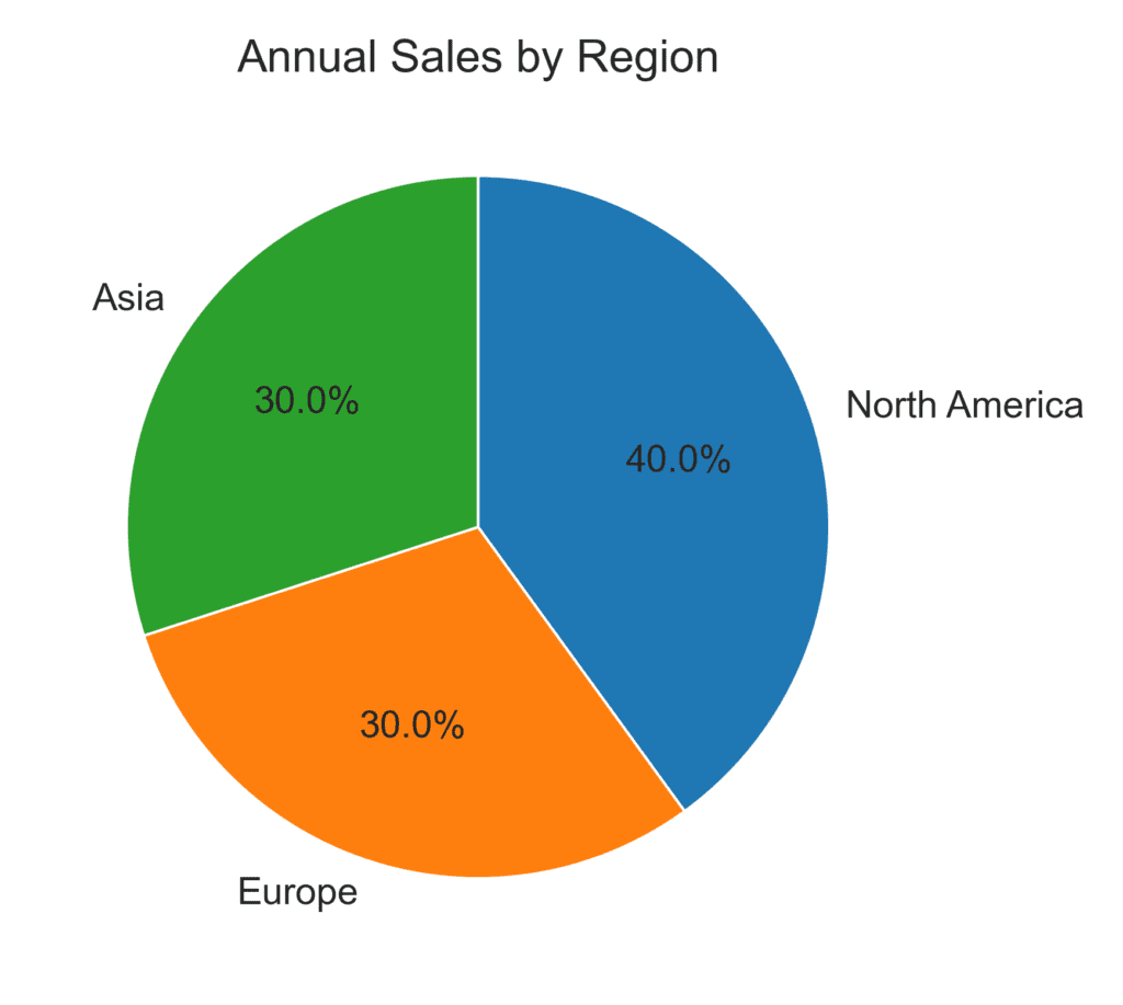
Pie charts help show the proportional relationships between categories. Consider a scenario where you want to visualize the percentage breakdown of annual sales by region (e.g., North America, Europe, Asia). Each segment of the pie represents a region, and the size of the segment is proportional to the region’s percentage of total sales. Pie charts provide a quick, visual way to gauge how the different categories compare proportionally.
Other Charts for Displaying Two Dimensions
- Histograms: A histogram is a graphical representation of the distribution of a dataset. It is an estimate of the probability distribution of a continuous variable. To construct a histogram, the first step is to “bin” the range of values—dividing the entire range of values into a series of intervals—and then count how many values fall into each interval. The bins are usually specified as consecutive, non-overlapping intervals of a variable. The bins (intervals) must be adjacent and are often (but not necessarily) of equal size. The primary purpose of a histogram is to provide a visual representation of the distribution of a dataset. It helps to see the shape, spread, and central tendency of the data and identify any potential outliers or unusual observations.
- Dot Plots: A dot plot is a statistical chart consisting of a group of data points plotted on a simple scale. Each data point is represented as a dot, and its position along the scale represents the value of that data point. Dot plots can be used for both univariate and multivariate data. A dot plot’s primary purpose is to show a dataset’s distribution and to easily compare different datasets or groups. It is particularly useful for small to moderate-sized datasets.
- Column Charts: A column chart is a type of bar chart where the bars are vertical. It is used to show comparisons among individual items or categories. The length of each bar represents the value of the item or category, and all bars are aligned along a common baseline. Column charts compare the values of items or categories across a single dimension. They are useful for showing patterns or trends in data and for quickly comparing the sizes of different items or categories.
- Area Charts: An area chart is similar to a line chart, but the area below the line is filled with a color or pattern. It is used to represent quantities over time and shows the cumulative effect of values. The x-axis represents the time period, and the y-axis represents the values. The main purpose of an area chart is to show trends over time and to highlight the total value across a series. It is useful for showing the relationship between parts and a whole, and for comparing multiple datasets.