Selecting the right chart for effective data storytelling is essential because it allows you to present information in a way that is easily understood by your audience, enabling them to grasp insights from the data quickly. In contrast, choosing the wrong chart type can mislead, confuse, and even fail to communicate the intended message to the audience. For this discussion, imagine you have a dataset of monthly sales data for different products in your store for an entire year.
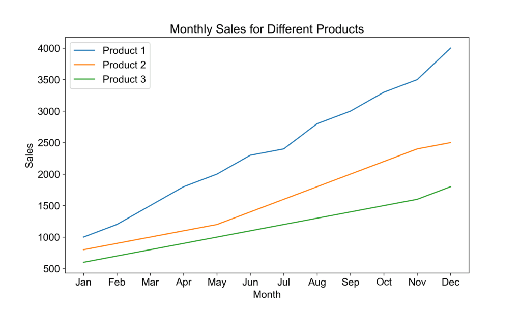
Line Chart
A line chart is an excellent choice to show how each product’s sales have evolved over time. The line chart visually represents the changes in sales for each product and makes it easy to see the overall trend, comparisons, fluctuations, and seasonality. The audience can gain insights from this chart quickly.
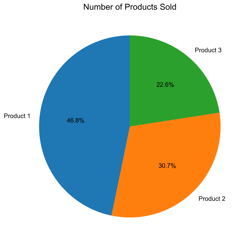
Pie Chart
Now, if you were to choose a pie chart for the same data, it would look cluttered and confusing. The pie chart is designed to show proportions and is not ideal for time series data. It would be challenging to interpret the chart, and your audience might not understand the message you want to deliver.
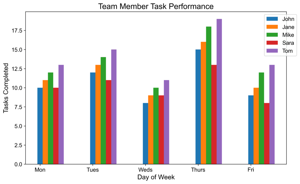
Bar Chart
Another real-world example is when you want to present the performance of your team members regarding their daily tasks. A bar chart would be a fitting choice to show the number of tasks each team member completed over a week. The bar chart facilitates an effortless comparison of team members, and the audience can quickly identify the high-performers and those who might need some support.
Scatterplot
On the other hand, using a scatterplot in this situation would not be efficient since it’s not suitable for comparing individual values directly. The scatterplot is designed to show relationships between two variables, which doesn’t apply to our intended message. As a result, the audience may have trouble comprehending the key insights from the data.
Choosing the right chart type can significantly impact how effectively you communicate the desired message to your audience. However, it’s always essential to consider what your audience wants to learn from the data, how they might use the information, and their familiarity with different chart types. By considering these factors, you can provide a clear, engaging, and effective data story that your audience can easily understand and remember for future reference.