I’d like you to take a moment and imagine that you’re going to make a journey, a road trip across the country. You’ve packed your bags, got your favorite playlist ready, and in your hands, you have a map – your trusty guide to get you to your destination. Now, what if I told you this map had no labels, no scale, no indication of direction – North, South, East, or West? How confident would you feel embarking on this journey? Would you feel lost even before you’ve started?
That’s what a chart without well-interpreted axes is like – a roadmap to an understanding that doesn’t quite get you there.
Every day, consciously or unconsciously, we interpret data in various forms – the gas gauge on your car, the temperature reading on your phone, or maybe the calories listed on the back of a food package. All these examples have a ‘chart’ with a horizontal axis (the x-axis) and a vertical axis (the y-axis), although you might not have ever considered them that way.
The ‘full’ and ’empty’ markers on your gas gauge? Those are essentially points on the x-axis, and the rising needle is a real-time graph plotting your fuel usage.
Chart Axes: The Unsung Heroes
Chart axes are like vertical and horizontal lines that mark the boundary of a soccer field. They help us measure and place data in a chart. They’re like rulers, giving a scale for us to see how big or small, high or low, our data points are.
Imagine you want to compare how much time you spend on making a presentation versus playing video games each week. The x-axis could represent the days of the week, while the y-axis could show the number of hours. This way, you could easily compare your gaming and working habits!
How to read the chart
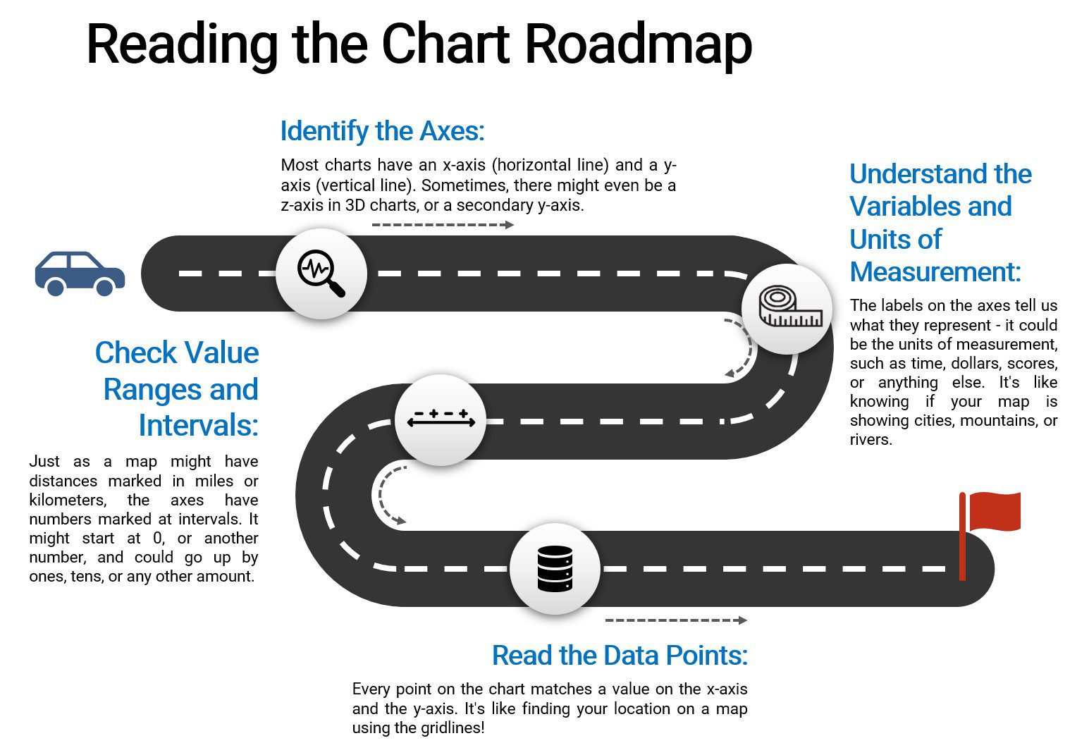
- Identify the chart axes
- Charts may have zero, one, or more axes, which provide scales to understand and compare data points.
- The horizontal line is called the x-axis, which usually represents independent variables. In a time-series chart, for instance, time is often plotted along the x-axis.
- The vertical line is called the y-axis, which usually represents dependent variables. In a sales chart, the sales amount might be plotted along the y-axis.
- The z-axis is only applicable to three-dimensional (3D) charts or graphs. The Z-axis adds depth, allowing us to visualize a third aspect of the data.
- A secondary y-axis is another vertical line placed on the right side of the graph with its own scale.
- Interpret the chart variables and units of measurement
- Use the axis labels to determine what variable it represents.
- The label might include the units of measurement, such as dollars, pounds, seconds, etc., and it may also indicate the time frame, like years, days, or months, if the chart is showing changes over time.
- Find the value ranges and intervals
- The chart range and intervals will tell you how the numbers or data points on the chart are spaced out.
- An axis might start at 0, or it might start at another number. It might also increase by regular intervals (like 1, 2, 3, etc.), or the intervals might increase in a different way (like 10, 100, 1000, etc.).
- Read the data points
- Each point on the chart corresponds to a value on the x-axis and a value on the y-axis.
- Use the gridlines to help you find exact values on the chart
- Interpret the information
- Identify the role of the axes (i.e., independent or dependent)
- Look for how values are distributed across each axis
- See how changes in the x variable correspond to changes in the y variable
Watch Out: The tricky bits!
Just as maps can sometimes be confusing, chart axes can sometimes mislead us. Here’s how you can become a pro at spotting these tricks and understanding charts better:
- Check the Axes First: Before you look at anything else, check the axes. If an axis doesn’t start at zero or if there are breaks in the axis, it can make differences seem bigger or smaller than they really are.
- Pay Attention to Units and Scales: If you’re comparing two charts, make sure they’re using the same units and scales. It’s like comparing two maps – one might show a whole country, while the other shows only one city!
- Understand the Variables: Knowing what the axes represent is key. If the x-axis represents time, for instance, the chart shows how something changes over time.
- Watch Out for Outliers: Sometimes, a single super-high or super-low data point can make the rest of the data look squeezed together. Spot these outliers to get a better understanding of your chart.
Navigating the Blogosphere: Decoding Chart Axes for Effective Content Strategy
In the fast-paced realm of corporate content creation, where words wield influence and engagement reigns supreme, Sarah Mitchell, a seasoned content strategist at Wordsmith Enterprises, embarked on an insightful journey to unravel the nuanced language of chart axes in pursuit of crafting compelling blog content. Armed with a flair for storytelling and a passion for deciphering data, Sarah delved into the world of chart interpretation, poised to extract meaningful insights to drive her blog strategy.
Wordsmith Enterprises, a prominent player in the content industry, was faced with a content conundrum. The executive team sought to amplify the effectiveness of their blog posts, but determining the most relevant topics and ideal posting frequency seemed like a puzzle without a solution. Sarah recognized that understanding chart axes – the often-overlooked compass of data visualizations – was key to demystifying user behavior and optimizing their blog strategy.
Sarah delved into an array of charts and graphs, each depicting metrics like reader engagement, social shares, and post frequency. This kaleidoscope of data served as the backdrop for her exploration into the realm of chart axes, highlighting the subtle cues that underpinned user behavior patterns and provided invaluable insights for her content approach.
One line chart tracked blog post frequency against reader engagement over time. Sarah discerned that the x-axis, representing time, was meticulously labeled with months, allowing her to pinpoint periods of heightened engagement. The y-axis, indicative of reader engagement, was intelligently scaled to capture fluctuations, guiding Sarah in identifying content themes that resonated most during peak engagement months. This interpretation opened the door to aligning content with audience preferences and capitalizing on optimal posting times.
Further along, Sarah encountered a bar chart detailing the distribution of social shares across different blog categories. The y-axis, displaying the number of shares, was thoughtfully scaled to showcase nuances in share counts, while the color-coded categories facilitated swift identification. This clever chart scaffolding empowered Sarah to tailor her content strategy, focusing on topics that garnered significant social traction and devising ways to amplify shareability across all categories.
Synthesizing these insights into a persuasive narrative, Sarah presented her findings to Wordsmith Enterprises’ content team. Her analysis underscored the pivotal role of chart axes in extracting actionable insights for blog strategy. Sarah’s exploration illustrated how the meticulous calibration of axes, coupled with precise labeling, provided a roadmap to enhancing engagement, optimizing posting frequency, and harnessing the power of social sharing.
Sarah’s adeptness in interpreting chart axes catalyzed a paradigm shift at Wordsmith Enterprises. The company embraced a data-driven approach that prioritized chart clarity, fostering collaboration between content creators and decision-makers. Guided by Sarah’s narrative, the team refined their content planning, crafting blog posts attuned to audience preferences and strategically timed for maximum engagement.
In the end, Sarah Mitchell’s journey into the world of chart axis interpretation not only illuminated the path to deciphering user behavior but also spotlighted the transformative potential of data visualization in revolutionizing corporate content strategy.