 I’d like you to take a moment and imagine that you’re going to make a journey, a road trip across the country. 🚗🏞️ You’ve packed your bags, got your favorite playlist ready,🎵 and in your hands, you have a map – your trusty guide to get you to your destination. 🗺️ Now, what if I told you this map had no labels, no scale, no indication of direction – North, South, East, or West? 🤯 How confident would you feel embarking on this journey? Would you feel lost even before you’ve started?
That’s what a chart without well-interpreted axes is like – a roadmap to an understanding that doesn’t quite get you there.
Every day, consciously or unconsciously, we interpret data in various forms – the gas gauge on your car,⛽ the temperature reading on your phone, or maybe the calories listed on the back of a food package. All these examples have a ‘chart’ with a horizontal axis (the x-axis) and a vertical axis (the y-axis), although you might not have ever considered them that way. 📊
The ‘full’ and ’empty’ markers on your gas gauge? Those are essentially points on the x-axis, and the rising needle is a real-time graph plotting your fuel usage.
Charts and their axes are all around us, silently shaping our understanding of the world and informing the decisions we make. We’ve all been reading them, interpreting them, using them, perhaps without even realizing it.
Chart Axes: The Unsung Heroes
Chart axes are like vertical and horizontal lines that mark the boundary of a soccer field. They help us measure and place data in a chart. They’re like rulers, giving a scale for us to see how big or small, high or low our data points are.
Imagine you want to compare how much time you spend on homework versus playing video games each week. The x-axis could represent the days of the week, while the y-axis could show the number of hours. This way, you could easily compare your gaming and studying habits!
Chart axes are also great at helping us spot trends. Say you keep track of your test scores throughout the year. By plotting the scores on a chart with the test dates on the x-axis and scores on the y-axis, you can see if your scores are improving, staying the same, or maybe even dipping a little.
How to Read the Chart
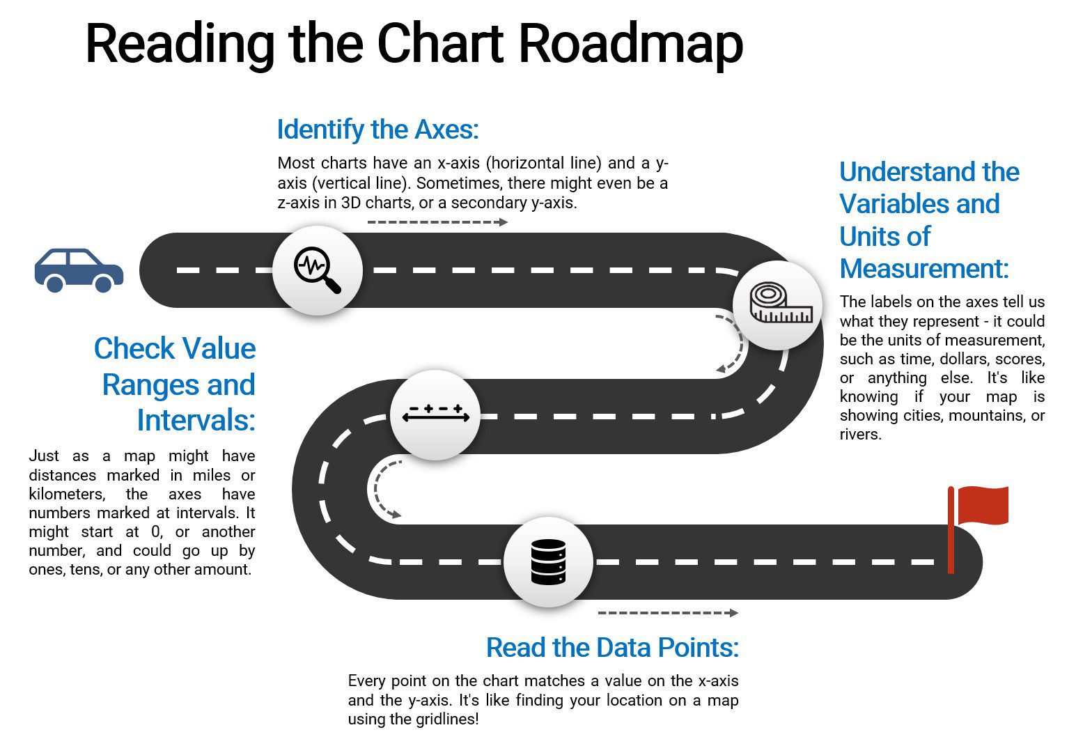
- Identify the chart axes
- Charts may have zero, one, or more axes, which provide scales to understand and compare data points.
- The horizontal line is called the x-axis, which usually represents independent variables. In a time-series chart, for instance, time is often plotted along the x-axis.
- The vertical line is called the y-axis, which usually represents dependent variables. In a sales chart, the sales amount might be plotted along the y-axis.
- The z-axis is only applicable to three-dimensional (3D) charts or graphs. The z-axis adds depth, allowing us to visualize a third aspect of the data.
- A secondary y-axis is another vertical line placed on the right side of the graph with its own scale.
- Interpret the chart variables and units of measurement
- Use the axis labels to determine what variable it represents.
- The label might include the units of measurement, such as dollars, pounds, seconds, etc., and it may also indicate the time frame, like years, days, or months if the chart is showing changes over time.
- Find the value ranges and intervals
- The chart range and intervals will tell you how the numbers or data points on the chart are spaced out.
- An axis might start at 0, or it might start at another number. It might also increase by regular intervals (like 1, 2, 3, etc.), or the intervals might increase in a different way (like 10, 100, 1000, etc.).
- Read the data points
- Each point on the chart corresponds to a value on the x-axis and a value on the y-axis.
- Use the gridlines to help you find exact values on the chart.
- Interpret the information
- Identify the role of the axes (i.e., independent or dependent).
- Look for how values are distributed across each axis.
- See how changes in the x variable correspond to changes in the y variable.
Watch Out: The tricky bits!
Just as maps can sometimes be confusing, chart axes can sometimes mislead us. Here’s how you can become a pro at spotting these tricks and understanding charts better:
- Check the Axes First. Before you look at anything else, check the axes. If an axis doesn’t start at zero or if there are breaks in the axis, it can make differences seem bigger or smaller than they really are.
- Pay Attention to Units and Scales. If you’re comparing two charts, make sure they’re using the same units and scales. It’s like comparing two maps – one might show a whole country, while the other shows only one city!
- Understand the Variables. Knowing what the axes represent is key. If the x-axis represents time, for instance, the chart shows how something changes over time.
- Watch Out for Outliers. Sometimes, a single super-high or super-low data point can make the rest of the data look squeezed together. Spot these outliers to get a better understanding of your chart.
Alex Hits the Right Note: The Symphony of Chart Axes
 A music enthusiast, Alex was known for his unique ability to blend his passion for music with his love for numbers. When he wasn’t busy strumming his guitar or belting out a tune, you would often find him poring over sheets of data.
One day, Alex’s music teacher announced a project – “Charting the Classics.” The students were tasked to analyze how the popularity of various genres of music has changed over the years. The project involved creating a presentation with charts that effectively conveyed their findings.
Excited, Alex decided to delve into the world of Jazz. He collected data about the popularity of jazz music over the last 50 years, sourced from music charts, album sales, and streaming statistics. With his data in hand, he was ready to create his chart.
Alex decided on a line graph to represent the data, as it would clearly show the trends over time. On the x-axis, he plotted the years, starting from 1970 and ending in 2020, marking each decade. The y-axis was a little trickier, as he needed to represent the popularity of Jazz. After much consideration, he chose to represent popularity as the total number of jazz album sales and streams per year, marking intervals of 10 million.
With the axes marked, Alex started plotting the data points. As he connected the dots, a story unfolded before his eyes – the golden age of Jazz in the late 70s, a significant dip in the 90s, and a gradual resurgence in the digital age.
When the day of the presentation arrived, Alex stepped onto the stage, chart in hand. He skillfully guided his classmates along the x-axis, inviting them on a journey through time. Moving onto the y-axis, he pointed out the peaks and troughs, representing the fluctuating popularity of Jazz.
He cautioned his audience to pay attention to the scale of the y-axis – reminding them that each unit represented 10 million album sales and streams. He pointed out how the choice of scale gave a more detailed view of the shifts in popularity. Without this, the dip in the 90s might have seemed less significant and the recent resurgence less impressive.
As he wrapped up, he reminded his classmates how interpreting the axes had been key to understanding the story of Jazz. His classmates, many of whom had considered chart interpretation a tedious task, were engaged and inspired. The music teacher, impressed by Alex’s nuanced understanding of chart axes, applauded his effort.
That day, Alex not only scored an A+ on his project but also taught his classmates the importance and relevance of interpreting chart axes. He turned an academic task into a symphony of numbers and music, creating a melody that would resonate with his peers for a long time to come.