Imagine for a moment, that you’re going on a vacation to a city you’ve never visited before. You’ve got your tickets, your luggage, and you’re absolutely thrilled. But here’s the catch – you’re not allowed to use a map or GPS. Sounds challenging, doesn’t it?
Well, in our everyday lives, we are constantly navigating complex systems and information landscapes. And just like in a new city, we often depend on maps to guide us. In this scenario, data charts are our maps. They give us a bird’s eye view of complex realities, illuminating paths and intersections of ideas, facts, figures, trends, and even predictions about the future.
But what if these maps, these charts, were written in a language that you couldn’t understand?
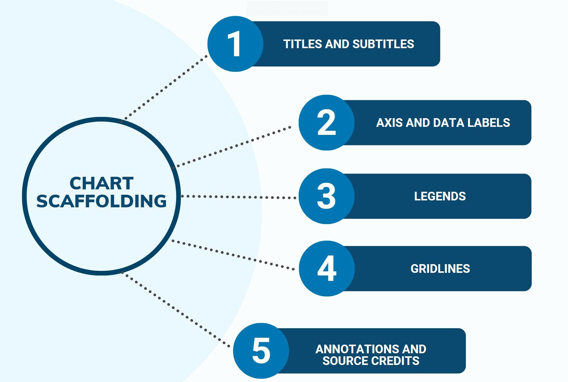
Chart scaffolding provides a structured approach to understanding and interpreting complex charts and graphs, enabling us to derive valuable insights and make informed decisions. Without understanding this scaffold, we may find ourselves as lost as we would be in an unfamiliar city without a map.
Understanding the role of chart scaffolding, therefore, is not just about becoming better at reading graphs and figures. It’s about honing our ability to navigate the world of information around us, making sense of complexity, and transforming raw data into knowledge and action. It’s about empowering ourselves in a world where data is as ubiquitous as the air we breathe.
So, what is chart scaffolding?
Picture a building under construction. Before the building starts to take shape, workers build a frame, or a scaffold, that outlines the shape of the building and supports it as it grows. That’s what chart scaffolding does for charts!
Charts come in all shapes and sizes, from bar charts and pie charts to line graphs and scatter plots. Each chart tells a different story, but they all use chart scaffolding to help us understand that story. This scaffolding gives us clues, like what the chart is about, the time period it covers, and the units being used.
Why is chart scaffolding important?
Just like knowing the rules of a video game helps you play better, understanding chart scaffolding helps you read charts more accurately. Let’s say you’re comparing scores with your friends in a new game you all started playing. If one friend shows you a bar chart of the scores, knowing how to read the axes will tell you who’s leading and who needs to catch up. Recognizing the scale and measurements will let you know just how much lead the top scorer has. And reading the legends and labels will let you compare different sets of data correctly. For example, the scores from last week compared to this week.
Without understanding chart scaffolding, you might miss out on important details. You might not spot trends and patterns in the data that could help you strategize better. Maybe there’s a time when most players’ scores dip? That’s valuable information that you could use to your advantage!
How do you read chart scaffolding?
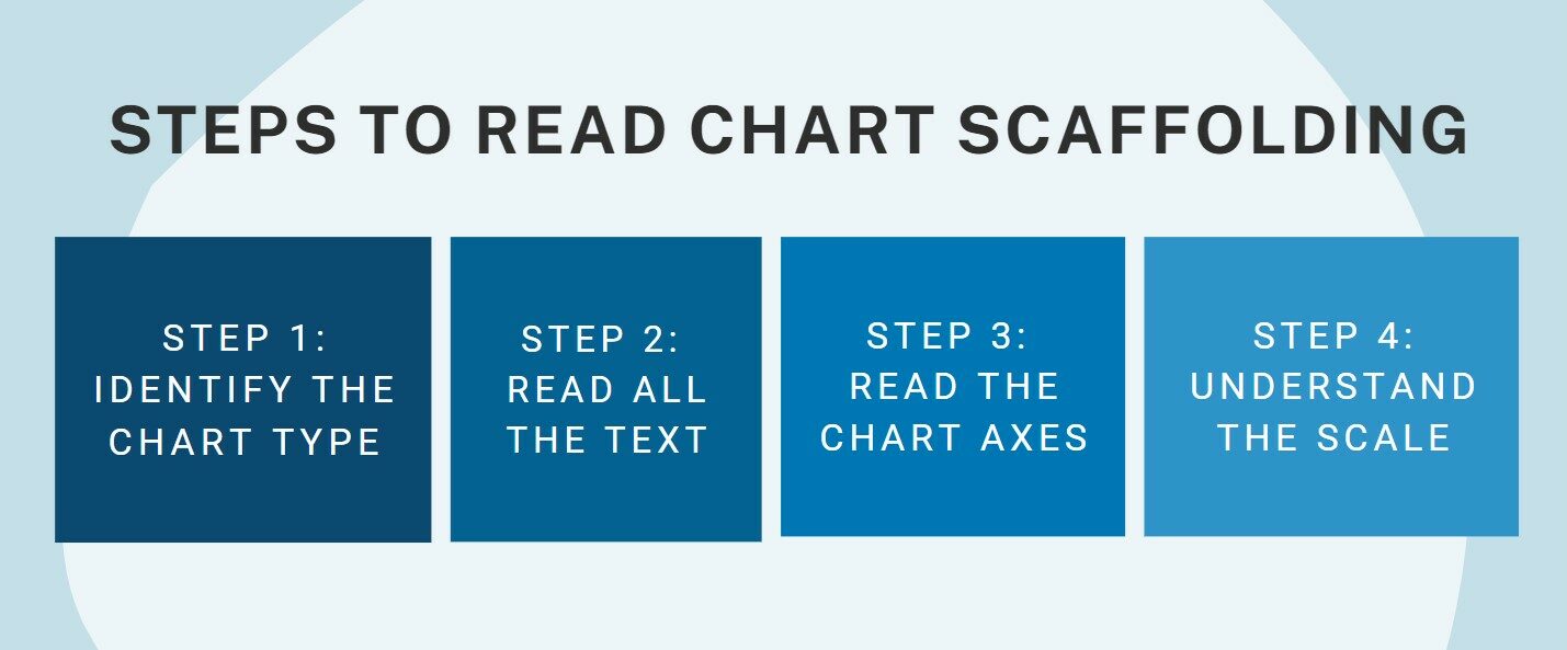
- Identify the chart type: This is like knowing what kind of game you’re playing. Are you looking at a bar chart, a line graph, or a pie chart? The type of chart will give you a clue about what kind of scaffolding to look for.
- Read all the text: This includes chart titles, labels, footnotes, and other text related to the chart. This is the background story of your data – it’s like the backstory of your game’s main character!
- Read the chart axes: These lines show the values and range of the data, much like the health and magic points in your game.
- Understand the scale: The scale is like the difficulty level in your game. It helps you make sense of the patterns in the data and tells you how much each point or bar in the chart is worth.
Remember, the more you practice, the better you’ll get at understanding chart scaffolding, just like getting better at a video game. So, grab some charts and start practicing! In no time, you’ll be spotting trends and patterns like a pro, impressing your friends, and acing your math and science homework!
Case Study: Mastering Chart Scaffolding in Bakery Operations
Meet David Martinez, a dedicated corporate professional with a passion for baking. David currently holds the position of Bakery Operations Manager at CrustDelights, a popular artisanal bakery. David’s role involves overseeing the production of a wide variety of bread and pastry products. To make informed decisions and drive process improvements, David recognized the importance of understanding chart scaffolding and its role in analyzing bakery data.
One day, David received a comprehensive report detailing the yield and quality of different bread and pastry recipes produced over the past six months. The report included several charts with intricate scaffolding, displaying data in a visually compelling manner. David knew that deciphering these charts was crucial for gaining insights into production trends and identifying opportunities for enhancement.
David began by examining a chart that displayed the yield percentages of various bread recipes over time. The chart was scaffolded with annotations, lines, and shaded regions. He understood that the scaffolding elements played a significant role in enhancing his understanding of the data:
- Annotations: Annotations provided context to specific data points. For instance, a spike in yield percentage was accompanied by a note explaining that a new flour supplier had been introduced during that period. This annotation helped David correlate the change in yield with an external factor.
- Lines and Trends: The chart’s scaffolding included trend lines that highlighted the overall direction of yield percentages. David was able to identify a gradual decline in yield for certain pastry recipes, prompting him to investigate further into potential process issues or ingredient inconsistencies.
- Shaded Regions: The chart also had shaded regions indicating the introduction of a new baking technique. This visual aid helped David quickly assess the impact of the technique on yield, enabling him to evaluate its effectiveness.
- Comparative Elements: David noticed that certain parts of the chart were shaded differently to distinguish periods of recipe experimentation. This made it easier for him to compare the performance of traditional recipes with newly developed ones.
Understanding the role of chart scaffolding allowed David to glean valuable insights from the data:
- Trend Identification: The trend lines helped him identify patterns in yield fluctuations and assess the overall performance of different recipes. This enabled him to make informed decisions about production adjustments.
- Root Cause Analysis: By correlating annotations with changes in yield, David could pinpoint the root causes of variations. For example, he identified that shifts in ingredient suppliers directly affected yield percentages.
- Experiment Evaluation: The shaded regions and distinct visual elements helped David evaluate the success of recipe experiments. He could easily compare the yield of experimental recipes against established ones.
- Decision-Making: Armed with a comprehensive understanding of the chart’s scaffolding, David was able to make data-driven decisions regarding ingredient sourcing, process modifications, and product development.
David’s ability to interpret chart scaffolding allowed him to harness the power of visual data representation. By delving into the nuances of the charts, he successfully optimized bakery operations, maintained product quality, and drove innovation in CrustDelights’ bread and pastry offerings. His skillful analysis showcased the importance of chart scaffolding in translating complex data into actionable insights within the context of the bakery industry.