Imagine for a moment that you’re going on a vacation to a city you’ve never visited before. You’ve got your tickets and luggage, and you’re absolutely thrilled. But here’s the catch – you’re not allowed to use a map or GPS. Sounds challenging, doesn’t it?
Well, in our everyday lives, we are constantly navigating complex systems and information landscapes. And just like in a new city, we often depend on maps to guide us. In this scenario, data charts are our maps. They give us a bird’s eye view of complex realities, illuminating paths and intersections of ideas, facts, figures, trends, and even predictions about the future.
But what if these maps, these charts, were written in a language that you couldn’t understand? 🤔
Chart scaffolding provides a structured approach to understanding and interpreting complex charts and graphs, enabling us to derive valuable insights and make informed decisions. Without understanding this scaffold, we may find ourselves as lost as we would be in an unfamiliar city without a map. 🧭🔍
Understanding the role of chart scaffolding, therefore, is not just about becoming better at reading graphs and figures. It’s about honing our ability to navigate the world of information around us, making sense of complexity, and transforming raw data into knowledge and action. It’s about empowering ourselves in a world where data is as ubiquitous as the air we breathe. 💪📈📚
So, let’s embrace the power of chart scaffolding and equip ourselves with the skills to read and interpret these visual representations. Just like a well-crafted map guides us through a new city, understanding chart scaffolding will help us navigate the vast oceans of data, unlock hidden insights, and embark on a journey of knowledge and discovery.
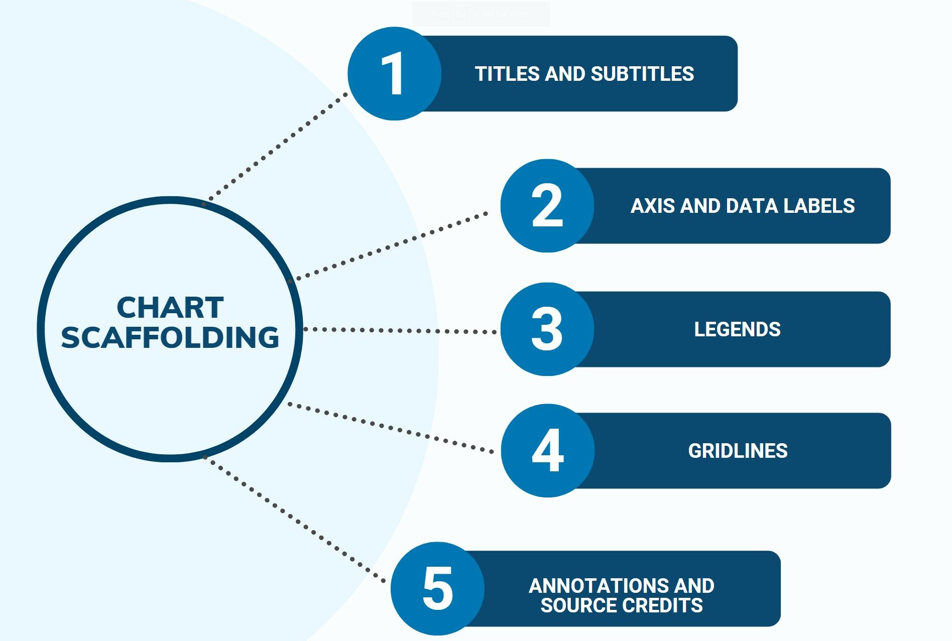
So, What is Chart Scaffolding?
Picture a building under construction. Before the building starts to take shape, workers build a frame, or a scaffold, that outlines the shape of the building and supports it as it grows. That’s what chart scaffolding does for charts!
Charts come in all shapes and sizes, from bar charts and pie charts to line graphs and scatter plots. Each chart tells a different story, but they all use chart scaffolding to help us understand that story. This scaffolding gives us clues, like what the chart is about, the time period it covers, and the units being used.
Why is Chart Scaffolding Important?
Just like knowing the rules of a video game helps you play better, understanding chart scaffolding helps you read charts more accurately. Let’s say you’re comparing scores with your friends in a new game you all started playing. If one friend shows you a bar chart of the scores, knowing how to read the axes will tell you who’s leading and who needs to catch up. Recognizing the scale and measurements will let you know just how much lead the top scorer has. And reading the legends and labels will let you compare different sets of data correctly. For example, the scores from last week compared to this week.
Without understanding chart scaffolding, you might miss out on essential details. You might not spot trends and patterns in the data that could help you strategize better. Maybe there’s a time when most players’ scores dip? That’s valuable information that you could use to your advantage!
How Do You Read Chart Scaffolding?
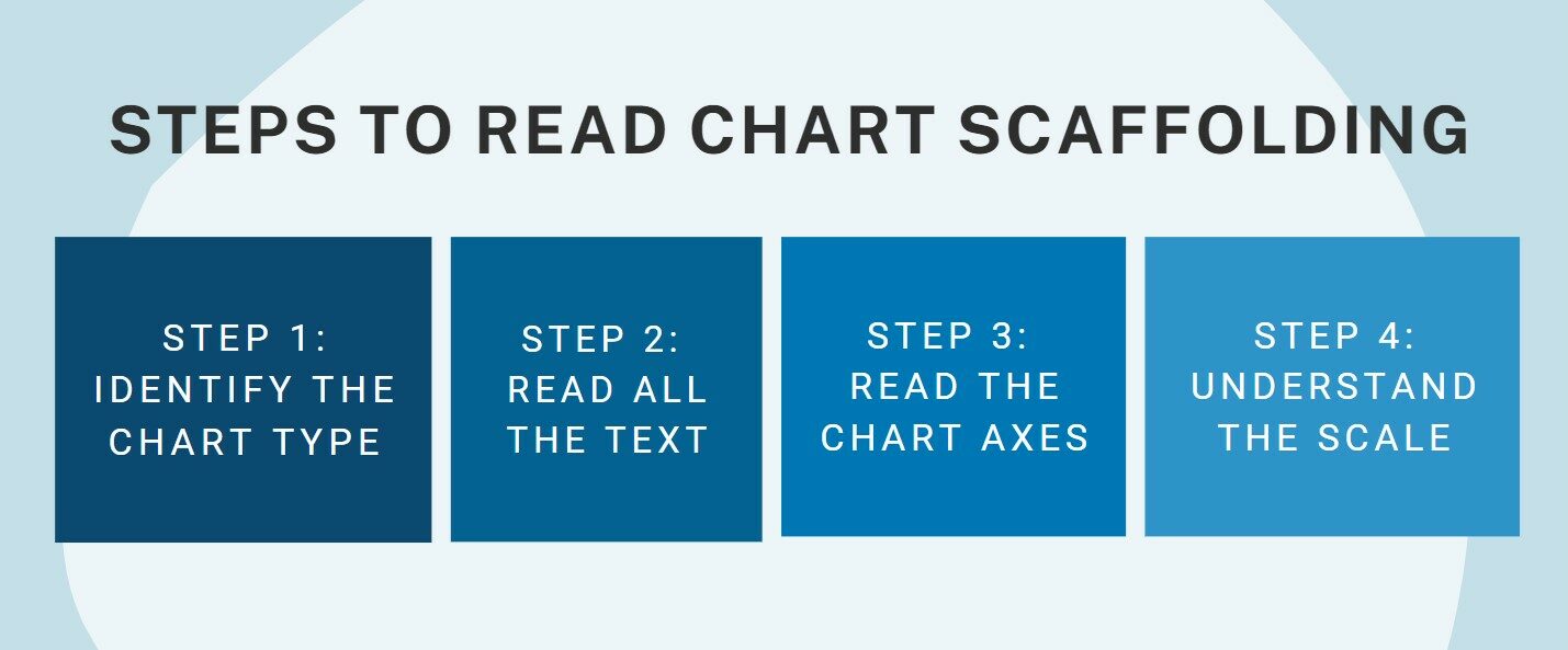
- Identify the chart type: This is like knowing what kind of game you’re playing. Are you looking at a bar chart, a line graph, or a pie chart? The type of chart will give you a clue about what kind of scaffolding to look for.
- Read all the text: This includes chart titles, labels, footnotes, and other text related to the chart. This is the background story of your data – it’s like the backstory of your game’s main character!
- Read the chart axes: These lines show the values and range of the data, much like the health and magic points in your game.
- Understand the scale: The scale is like the difficulty level in your game. It helps you make sense of the patterns in the data and tells you how much each point or bar in the chart is worth.
Remember, the more you practice, the better you’ll understand chart scaffolding, just like getting better at a video game. So, grab some charts and start practicing! In no time, you’ll be spotting trends and patterns like a pro, impressing your friends, and acing your math and science homework!
Game Plan: How Chart Scaffolding Scored Big for Sasha’s Basketball Team
 Sasha was an active, ambitious high school student and a passionate basketball player who recently joined the school’s basketball team. Apart from her love for sports, she also had a knack for statistics, a subject that often left her peers bewildered. Sasha had always been intrigued by numbers and patterns, and she enjoyed finding ways to combine her two interests: sports and statistics.
One day, her coach shared a chart showing the shooting percentages of all the teams in their league. She wanted to use this data to understand their team’s standing and plan their practice sessions effectively.
As Sasha looked at the chart, her understanding of chart scaffolding immediately kicked in. She identified it as a bar chart representing different teams and their shooting percentages. The y-axis showed the shooting percentage, and the x-axis listed the names of the teams in their league.
Reading the title, “Basketball Team Shooting Percentages,” Sasha realized this was an overall representation of each team’s shooting prowess. The units of measurement were clearly defined: the percentages represented the ratio of successful shots to total attempts. The legend differentiated between home and away games. She noted this context would be crucial to understanding the true performance of each team, considering the common belief that teams often perform better at home.
Sasha quickly noticed an important detail on the chart’s y-axis. The scale didn’t start at 0 but at 40%. This made the differences between the team percentages look more dramatic than they really were. This was an essential element of chart scaffolding – understanding the scale to correctly interpret the data’s magnitude. If she hadn’t recognized this, Sasha might have overestimated the differences in team performances.
Next, Sasha turned her attention to the x-axis, where the team names were listed. By accurately reading this part of the chart scaffold, she could now easily compare her team’s performance to their competitors. Sasha’s team was fourth on the list, but the gaps between the first four teams were small. This revealed that their team was quite competitive in terms of shooting percentage.
Furthermore, the color-coded bars representing home and away games showed a consistent pattern across all teams – the shooting percentages were generally higher for home games. Sasha shared this insight with her coach, suggesting they could potentially improve their away game strategies.
By understanding and interpreting the chart’s scaffolding correctly, Sasha could turn raw data into actionable insights, helping her team to strategize better and improve their performance. This story highlights the power of chart scaffolding, not just in academic or professional settings, but in everyday life and interests, such as sports, helping to make better decisions based on data.