I want you to take a moment and think back to the last time you bought a bag of your favorite chips or cookies.🍪 Now, have you 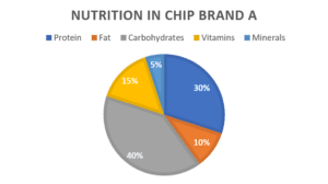 ever flipped that bag over to look at the nutritional information on the back? 📝 If you have, you might have seen a pie chart, a doughnut chart, 🍩or maybe a stacked bar chart illustrating the breakdown of fat, carbohydrates, and protein. That’s a chart showing composition right in your hand!
When we look at that chart, what do we see? A simple image? Sure. But beyond that, it’s a gateway, a tool to quickly understand how that delicious snack breaks down into its essential nutrients. It helps you understand at a glance that maybe, despite tasting so good, those chips are 40% carbohydrate and only 15% vitamins. 😞
That, my friends, is the power of charts showing composition, the power of data visualization. They give us a snapshot of the bigger picture condensed into a simple, easy-to-understand format. They are not just part of our diet but a crucial ingredient in the recipe for understanding our world in a more comprehensive, insightful way.
But how do we go about identifying these chart types? What if we are faced with a graph or chart that we have never seen before? Can we break down that information just as we did with our bag of chips? That’s what we will explore today.
 Pie Chart: The Pizza of Charts
A pie chart is like the pizza you’re ordering. Each topping (or category) gets a slice of the pizza (or pie chart). The whole pizza represents 100% of your friends’ preferences, and each slice shows the proportion that prefers a certain topping. Compared to other charts: It’s simple and tasty but not the best if there are too many toppings (or categories) to choose from.
Watch out for: Too many toppings or toppings that are too similar can make the pie chart harder to read.
Important facts about pie charts:
- A pie chart shows the proportion of each part to the whole.
- The entire pie represents 100% of a value, and each slice is a proportional representation of the different categories within the total value.
- Pie charts are simple and intuitive but best for data sets with relatively few categories.
- They are not as good as other types of charts for showing comparisons between individual parts.
Watch out when there are many slices or when slices have very close sizes, as it becomes hard to visually differentiate their sizes.
Donut Chart: The Donut Delight
 Donut Chart: The Donut Delight
Similar to the pie chart but with a hole in the middle, this chart also shows how different categories contribute to the whole. Compared to other charts, the hole in the middle lets you add more data rings, but beware: too many rings might get confusing.
Important facts about pie charts:
- Donut charts are similar to pie charts but have a hole in the center.
- They show part-to-whole relationships and can also display multiple series by using concentric donuts.
- Donut charts can display slightly more complex data than pie charts due to the possibility of concentric rings, but they still face similar limitations.
Like pie charts, they are less effective when there are many categories or if values are similar.
Stacked Charts: The Layer Cake of Data
 Stacked Charts: The Layer Cake of D
These charts are like layer cakes. Each color represents a different category, and the size of each slice shows how much of the whole it represents. Compared to other charts, they’re great for showing changes over time, unlike pies and donuts.
Watch out for: Middle layers can be hard to compare, just like it’s tough to tell how much jam is in a sandwich!
Important facts about stacked charts:
- Stacked charts are good for displaying part-to-whole relationships and also showing the total across a series.
- Each category is represented by a different color.
- Stacked charts can display changes over time or comparisons across different groups effectively.
It can be hard to compare the sizes of individual sections, particularly those in the middle of the stack.
100% Stacked Charts: An Even Bigger Piece of Cake
 100% Stacked Charts: An Even Bigger Piece of Cake
These are like regular stacked charts, but each cake is the same size. In the ever-evolving landscape of high school academics, a 100% stacked chart becomes a valuable tool for a student eager to analyze their study habits and performance across various subjects. By visualizing the percentage distribution of study time spent on each subject, the student gains insight into areas of strength and potential focus, empowering them to make informed decisions and excel academically.
Important facts about 100% stacked charts:
- 100% stacked charts are similar to stacked charts, but they normalize each stack to a total of 100%.
- They show the proportions of categories in each group.
- They highlight part-to-whole relationships over time or across different groups more clearly than stacked charts.
- 100% stacked charts can be more challenging to interpret.
The downside of the 100% stacked chart is the difficulty in interpreting the absolute size of each category because everything is normalized.
Pareto Chart: The Detective of Data
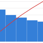 Pareto Chart: The Detective of Data
Pareto charts are like the Sherlock Holmes of charts. This chart becomes a game-changer in understanding the key factors that influence success on the baseball diamond. By visually analyzing the most prevalent areas of improvement, such as specific skills, training routines, or nutrition, an athlete can focus their training efforts strategically and elevate their athletic prowess to new heights.
Important facts about Pareto charts:
- Pareto charts display both bars (in descending order) and a line graph (cumulative percentage).
- They help identify the most significant factors in a data set and display a hierarchy of impact.
- They are better suited for identifying and prioritizing different factors, which is not typical of most composition charts.
Be aware, they require careful interpretation as the line graph indicates the cumulative percentage of the categories, not a trend over time.
Sunburst Chart: The Solar System of Data
 Sunburst Chart: The Solar System of Data
It displays hierarchical relationships and the proportions of different categories within a larger whole. As a tech-savvy generation, students can leverage the mesmerizing power of a sunburst chart to explore their favorite pastime, such as tracking their social media engagement.
With its captivating visual representation, it can empower you to understand your social media activities better, make data-driven choices, and enhance your online interactions, all while having fun exploring your digital footprint.
Important facts about sunburst charts:
- Sunburst charts display hierarchical relationships through a series of concentric rings.
- The innermost circle is the top of the hierarchy, with each layer outwards adding a level of detail.
- They are excellent for representing hierarchical relationships visually and showing how parts contribute to a whole.
- Sunbursts can be complex to interpret.
Watch out, as they can become confusing if there are too many layers or categories.
Tree Map: The Forest of Figures
 Tree Map: The Forest of Figures
A tree map is like a family tree but for data. It can become a valuable companion for visualizing spending habits and managing allowances or part-time job earnings effectively. By breaking down expenses into colorful, proportional blocks, the tree map empowers you to identify areas of spending, make informed budgeting decisions, and achieve financial independence with confidence. Great for showing a lot of data, but might get messy if there’s too much.
Important facts about tree maps:
- Tree maps display hierarchical data as a set of nested rectangles.
- Larger rectangles represent higher hierarchy levels, and smaller rectangles are part of these larger ones.
- They are more effective in displaying large amounts of hierarchical data.
- Tree maps may become cluttered or difficult to interpret.
The layout and the aspect ratios of rectangles can sometimes distort perception, especially with many categories.
Waffle Chart: A Breakfast of Data
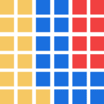 Waffle Chart: A Breakfast of Data
Each square represents a portion of the whole. They tell us how the data is distributed among different categories and provide a visual representation of their relative sizes or proportions. They’re fun, simple, and appealing, but not always the most accurate.
Important facts about waffle charts:
- Waffle charts use a grid of icons, typically squares, to represent quantities and percentages in a visually appealing way, making part-to-whole relationships easy to understand.
- They’re similar to pie or donut charts in terms of their simplicity but can be more engaging visually.
The accuracy of the waffle chart can be compromised if the total number doesn’t divide evenly into the grid size.
Marimekko Chart (Mosaic plot): A Patchwork Quilt of Data
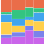 Marimekko Chart (Mosaic plot): A Patchwork Quilt of Data
They combine aspects of both a stacked bar chart and a 100% stacked bar chart. Have you ever thought about finances and entrepreneurship? By showcasing the proportion of different products across specific market segments, the Marimekko chart helps young entrepreneurs identify promising opportunities, make data-driven business decisions, and chart their path to success in their entrepreneurial ventures.
Important facts about Marimekko charts:
- They show the proportions of multiple categories on both axes.
- They help to understand the composition of the whole across two dimensions.
- They can represent complex relationships between categories.
- They can be harder to read than simpler charts.
Watch out as the width and height of the boxes can distort the perception of the part-to-whole relationship. The scale of both axes needs to be understood to interpret the chart correctly.
Remember, charts aren’t just for class; they’re tools we use in the real world. So, the next time you have a pizza party to plan, consider using one of these chart types to figure out the perfect order. Happy data decoding!