I want you to think about your everyday experiences. You’re on your phone, scrolling through social media, when a graph catches your eye – something about climate change, or population growth, or perhaps the rising cost of avocados. You pause, intrigued, but quickly move on because, well, it looks complex, and you’re not quite sure what it’s trying to say.
Or maybe it’s the evening news, the stock market updates with their bewildering array of lines and numbers; it might as well be hieroglyphics. You tune out because you’ve never really ‘got’ charts, right?
Now, imagine a different scenario. You come across that same chart or graph, but this time, you understand what it’s saying. You can decipher its language, its patterns, and its hidden message. You can even use it to make informed decisions or predictions. Suddenly, a whole world of information is at your fingertips, a world that was always there but you couldn’t quite see. Sounds empowering, doesn’t it?
What are Charts and Graphs, and Why Do We Need to Know How to Read Them?
- Charts and graphs are like pictures that help us understand a lot of information quickly and easily.
Imagine you’ve just completed a poll at the office, asking 100 employees about their favorite lunch. Writing out every individual’s answer can be pretty boring and time-consuming to read. But what if you could turn all those responses into a picture that shows the most and least popular meals? That’s exactly what charts and graphs do!
- Charts show us patterns and connections that we might not see if we just looked at a list of numbers.
Let’s say you’re the company HR, and you’re looking at a bar graph of employee attendance over the year. You might notice a dip in attendance during the winter months. Maybe that’s because people are more likely to get sick when it’s cold outside.
- Knowing how to read charts and graphs allows us to make better choices.
Now, more than ever, we’re swimming in data. It’s on websites, social media, and even the weather app on our phones. Knowing how to read charts and graphs can help us navigate this data ocean. It can help us make better choices, like deciding whether to pack an umbrella based on a weather forecast graph or choosing the fastest route to the beach based on a traffic chart.
- Being able to read charts and graphs protects us from misinformation.
Reading charts and graphs correctly can also shield us from getting tricked by wrong or misleading information. It’s like having a secret decoder ring that can cut through the confusion!
Steps For Reading a Chart
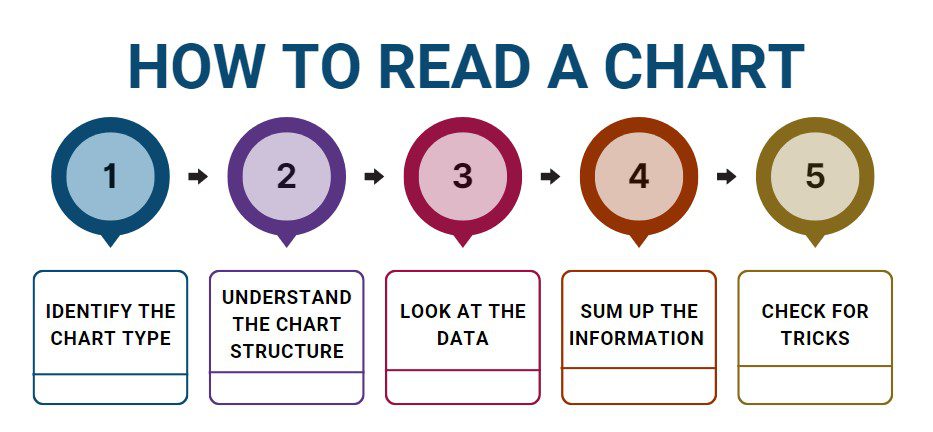
Now, let’s dive into the steps you should take when reading a chart.
Case Study: Evaluating Sardine Manufacturing Process
Meet Alex Mitchell, a dedicated corporate professional who has spent years in the seafood industry. Alex is currently the Quality Assurance Manager at OceanHarvest, a leading company specializing in canned seafood products. OceanHarvest recently conducted a statistical analysis to assess the factors affecting the quality of their canned sardine production. Alex’s role involved critically examining the analysis results to make informed decisions for process improvement.
As Alex delved into the statistical analysis report, he understood the importance of not taking the results at face value. He recognized that while statistical insights could provide valuable guidance, they needed to be considered alongside real-world complexities. With a keen eye for detail, Alex identified several limitations that needed to be addressed before making any operational changes:
- Sampling Bias: The statistical analysis focused on a specific subset of production batches, potentially introducing sampling bias. Alex was aware that if the chosen batches were not representative of the overall manufacturing process, the conclusions drawn from the analysis could be misleading.
- Limited Variables: The analysis primarily considered variables such as cooking time and canning temperature as key contributors to sardine quality. However, Alex knew that other factors, such as the freshness of the sardines, the quality of the oil or brine used, and the adequacy of cleaning processes, could also significantly impact the final product quality.
- Seasonal Variability: Sardine quality can vary depending on the time of year, migration patterns, and environmental conditions. The analysis might not have accounted for these seasonal fluctuations, potentially leading to inaccurate recommendations for process adjustments.
- External Factors: Alex recognized that external factors, like changes in regulatory standards, market demand, or supply chain disruptions, could influence the manufacturing process. These factors were not considered in the analysis and could impact the practicality of implementing suggested changes.
- Unintended Consequences: Adjusting the cooking time and canning temperature based solely on statistical findings might have unintended consequences. Alex understood that altering these parameters without a comprehensive understanding of the broader implications could lead to undesirable outcomes, such as changes in taste, texture, or shelf life.
Armed with an awareness of these limitations, Alex convened a cross-functional team to discuss the analysis results. He emphasized the importance of supplementing statistical insights with on-the-ground knowledge and practical experience. Alex recommended conducting additional tests across different production batches and seasons, incorporating a wider range of variables, and considering the potential ripple effects of process adjustments.
By addressing these limitations, Alex ensured that OceanHarvest’s decisions were well-informed and balanced. His holistic approach demonstrated his commitment to enhancing the quality of canned sardine products while minimizing the risks associated with making changes based solely on statistical findings. Alex’s ability to navigate the complexities of the statistical analysis and translate them into actionable steps showcased his dedication to maintaining OceanHarvest’s reputation for delivering top-notch seafood products to consumers.