 I want you to think about your everyday experiences. You’re on your phone, scrolling through social media, when a graph catches your eye – something about climate change, population growth, or perhaps the rising cost of avocados. You pause, intrigued, but quickly move on because, well, it looks complex, and you’re not quite sure what it’s trying to say.
Or maybe it’s the evening news, the stock market updates with their bewildering array of lines and numbers; it might as well be hieroglyphics. You tune out because you’ve never really ‘got’ charts, right?
Now, imagine a different scenario. You come across that same chart or graph, but this time, you understand what it’s saying. You can decipher its language, its patterns, and its hidden message. You can even use it to make informed decisions or predictions. Suddenly, a whole world of information is at your fingertips, a world that was always there but you couldn’t quite see. Sounds empowering, doesn’t it?
Welcome to the world of charts and statistical information, the language of the 21st century. The ability to understand this language isn’t just for statisticians or economists. It’s a fundamental literacy that can empower each one of us to make better decisions, understand our world more deeply, and navigate the information-dense landscape of our digital lives.
What are Charts and Graphs, and Why Do We Need to Know How to Read Them?
 Charts and graphs are like pictures that help us understand a lot of information quickly and easily.
Imagine you’ve just completed a poll at school, asking 100 students about their favorite school lunch. Writing out every individual’s answer can be pretty tedious and time-consuming to read. But what if you could turn all those responses into a picture that shows the most and least popular meals? That’s precisely what charts and graphs do!
- Charts show us patterns and connections that we might not see if we just looked at a list of numbers.
 Charts show us patterns and connections that we might not see if we just looked at a list of numbers.
Let’s say you’re the class president, and you’re looking at a bar graph of student attendance over the school year. You might notice a dip in attendance during the winter months. Maybe that’s because students are likelier to get sick when it’s cold outside.
- Knowing how to read charts and graphs allows us to make better choices.
 Knowing how to read charts and graphs allows us to make better choices.
Now, more than ever, we’re swimming in data. It’s on websites, social media, and even the weather app on our phones. Knowing how to read charts and graphs can help us navigate this data ocean. It can help us make better choices, like deciding whether to pack an umbrella based on a weather forecast graph or choosing the fastest route to the beach based on a traffic chart.
- Being able to read charts and graphs protects us from misinformation.
 Being able to read charts and graphs protects us from misinformation.
Reading charts and graphs correctly can also shield us from getting tricked by wrong or misleading information. It’s like having a secret decoder ring that can cut through the confusion!
Steps For Reading a Chart
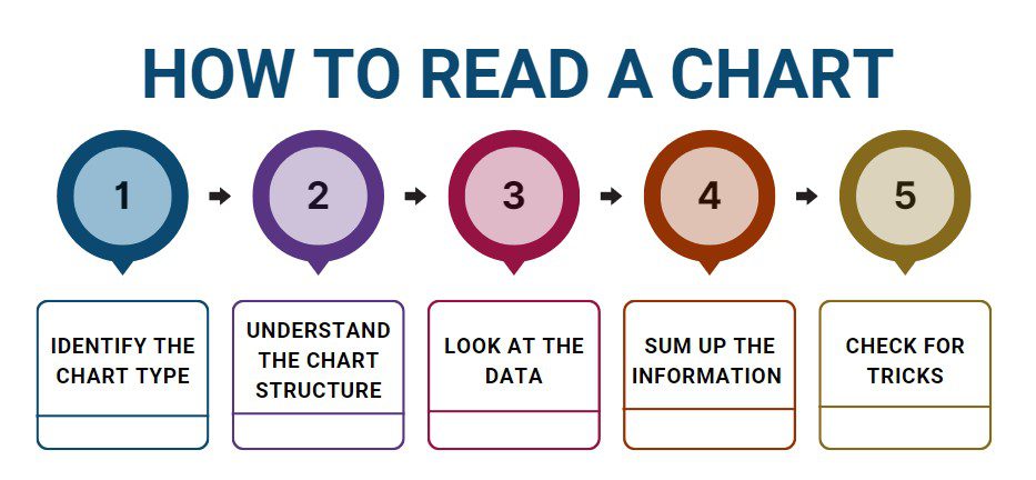
Now, let’s dive into the steps you should take when reading a chart.
Step 1: Identify the chart type. Charts and graphs come in many shapes and sizes. You might see bar graphs, line graphs, pie charts, and many more. Knowing the type can give you a head start in understanding the information it holds.
Step 2: Understand the chart structure. Like a building, every chart has a structure or ‘scaffolding.’ Look for the title, labels, scales, and legends (the keys that explain symbols and colors). These can tell you what the chart is about, like whether a line graph is showing the number of home runs your school’s baseball team has hit over a season.
Step 3: Look at the data. Once you understand the structure, it’s time to dive into the data, or ‘data encoding.’ This is where the actual numbers, percentages, or units come into play. For example, in a pie chart showing the most popular music genres in your school, the larger slices represent the genres more students prefer.
Step 4: Sum up the information. Next, try to sum up what the chart is telling you. If you’re looking at a bar graph of test scores in your class and you see most of the bars are high, that’s a good sign that most students did well on the test.
Step 5: Check for tricks. Lastly, make sure the chart isn’t misleading. Sometimes, people use charts to twist the truth. For instance, a graph might make it seem like your favorite basketball team is doing poorly by only showing games they’ve lost. Always take a close look to make sure you’re getting the full story.
In conclusion, charts and graphs are incredibly useful tools for understanding and interpreting the world around us. Whether we’re deciding the best time to study or the quickest route to the beach, being able to read and understand these number superheroes can help us make smarter decisions and protect us from being fooled. Let’s become data detectives and unlock the stories hidden in the charts and graphs around us!
Winning with Charts: A Case Study
 Chris, a high school junior, had recently become interested in joining the student council. With elections just a month away, Chris knew he needed a strategy that appealed to his fellow students to stand a chance. One day, he came across a pie chart in the school newsletter. The chart was titled “School Event Participation.” This was exactly the kind of information Chris was looking for.
At first glance, the chart seemed like a complex puzzle of colors and percentages. But Chris remembered the steps he’d learned in his statistics class.
He quickly identified the pie chart, a familiar circular diagram with colored slices. As he shifted his focus to the chart’s structure, he found clear labels indicating various events like the science fair, school dances, and sports events, with corresponding percentages.
Examining the data closely, Chris noticed that the biggest slice was the school dances at 35%, followed by sports events at 30%. The science fair, poetry reading, and debate competition had smaller portions, each below 15%.
Taking a moment to sum up the chart, Chris realized that more students participated in dances and sports events than any other school activities. This gave him a critical insight into the interests of the student body.
However, he also remembered the last step—looking out for tricks. He noticed the chart only represented the participation from the last school year. He considered this factor in his analysis and decided he would still focus on improving the school dances and sports events since those had a consistently high participation rate in previous years as well.
This chart became the foundation for Chris’s election campaign. He proposed ideas for making the school dances and sports events even more engaging, including unique dance themes and a friendly inter-class tournament system for sports. His data-driven approach was a hit, and Chris was elected to the student council by a healthy margin.
Reading and understanding the pie chart had allowed Chris to get a quick insight into the interests of his fellow students. He could make informed decisions about his campaign strategy, and in the end, it helped him win the election. Chris’s story showed that being able to read charts and graphs can have real benefits, even in a high school setting.