Consider when you’re trying to make sense of something complex, like choosing between two different part-time jobs. You weigh the pros and cons, the financial rewards, the location, the ability to balance having fun with your friends.. all these factors become variables, and you’re essentially creating a mental chart, a visualization, that tries to capture and quantify the uncertainty you’re facing.
We might not realize it, but we are already using data encoding to evaluate different job offers and uncertainties in our everyday lives. But what if we could do it more effectively? What if we could take the information presented in two job offers and decode it, to better understand the potential outcomes and uncertainties associated with each opportunity?
Why Understanding Uncertainty in Charts Matters
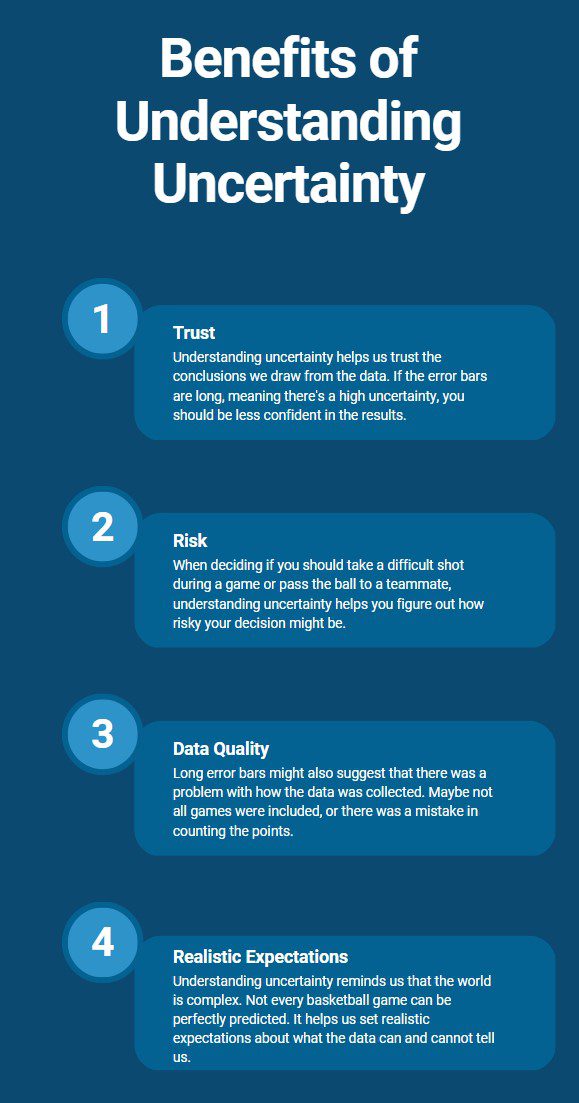
Imagine you’re part of the corporate strategy team. In a crucial presentation, your leader reveals a bar chart depicting average quarterly sales for the past year. Each bar represents a quarter’s sales, and a subtle extension above each bar, known as an error bar, hints at the potential sales data variability. Much like in data analysis, these error bars offer subtle signals of performance uncertainty, prompting a deeper exploration. Just as true business impact can hide behind surface figures, error bars remind us that sales outcomes are influenced by multiple factors. Analyzing error bars can guide us in adapting strategies, interpreting data, and optimizing corporate decision-making.
Decoding Uncertainty in Charts
So, how can we spot uncertainty when looking at charts? Here are some helpful tips:
 Look for Error Bars: Remember the lines on the quarterly sales chart? Those are called error bars. They show either the range within which the true value is likely to fall (confidence intervals) or the degree of variability in the data (standard deviation). The longer the error bars, the greater the uncertainty.
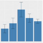
 Find Shaded Regions: Sometimes, in line or area charts, you’ll see a shaded region around the main line. This region shows the variability of the data. If it’s wide, that means there’s a lot of uncertainty.
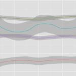
 Spot the Dotted Line: On line charts, a dotted line is often used to show projected data. These projections come with uncertainty because they’re trying to guess the future. Be sure to understand that these predictions are not certainties.
Navigating Ambiguity in Food Manufacturing: A Data-Driven Odyssey
In the realm of corporate food manufacturing, where precision and safety intertwine, Rachel Bennett, a seasoned quality assurance analyst at NutriSys Inc., embarked on an intriguing data-driven journey to unravel the enigmatic fluctuations within charts depicting the company’s production processes. Armed with her analytical acumen and a tenacious spirit, Rachel set out to decode the subtle nuances concealed within the data visualizations.
NutriSys Inc. was on the cusp of launching a groundbreaking product line, but the executives were met with a perplexing puzzle. The charts representing the production yields of their flagship cereal bar revealed irregular patterns and occasional dips. The company needed a comprehensive understanding of these fluctuations to ensure consistent product quality and adherence to safety standards. Rachel took the reins, ready to dive into the data labyrinth.
Rachel delved into an extensive dataset that chronicled production processes, ingredient sourcing, and quality assessments spanning several years. This treasure trove of data offered a panoramic view of the cereal bar manufacturing journey, from raw materials to final product packaging. It was within this intricate tapestry of information that Rachel sought to unearth the story behind the seemingly mysterious fluctuations.
With a meticulous eye for detail, Rachel delved into the dataset’s array of charts and visualizations. One particular line chart showcased production yield over time, exhibiting peaks and valleys that piqued Rachel’s curiosity. Amidst this complexity, a scatter plot comparing ingredient variations with production yield variations surfaced as a gem of insight. It revealed a distinct correlation between certain ingredient fluctuations and subsequent production dips, hinting at a connection between raw materials and manufacturing outcomes.
Rachel’s exploration continued as she encountered a bar chart displaying production success rates across different manufacturing sites. She noticed error bars atop each bar, indicative of variability. Closer scrutiny revealed that sites with consistently lower error bars demonstrated higher production consistency. This observation, while seemingly subtle, unlocked a path to understanding the impact of site-specific conditions on product consistency and quality.
Synthesizing her findings into a coherent narrative, Rachel presented her insights to NutriSys Inc.’s executive team. Her analysis showcased how data encoding and interpretation could untangle the intricate web of uncertainty within food manufacturing processes. Rachel highlighted the correlation between ingredient variations and production fluctuations, underscoring the importance of meticulous ingredient sourcing. Additionally, she emphasized the significance of site-specific conditions in achieving uniform production yields and maintaining quality standards.
Rachel’s data-driven revelations left an indelible mark on NutriSys Inc.’s decision-making process. Armed with a deeper comprehension of data encoding, the company fortified its commitment to precision in ingredient sourcing and site-specific optimization. The leadership team, inspired by Rachel’s narrative, steered the company toward a manufacturing approach that prioritized consistency and quality across production sites.
In the end, Rachel Bennett’s odyssey into the world of data-driven food manufacturing not only illuminated the path to deciphering uncertainty within complex charts but also spotlighted the transformative potential of data interpretation in guiding corporate strategies.