Consider when you’re trying to make sense of something complex, like choosing between two different summer jobs. 🏖️👨💼 You weigh the pros and cons, the financial rewards💰, the location 🗺️, the ability to balance having fun with your friends👫.. all these factors become variables, and you’re essentially creating a mental chart, a visualization, that tries to capture and quantify the uncertainty you’re facing.
We might not realize it, but we are already using data encoding to evaluate different job offers and uncertainties in our everyday lives. But what if we could do it more effectively? What if we could take the information presented in two job offers and decode it, to better understand the potential outcomes and uncertainties associated with each opportunity? 🤔📈
Understanding uncertainty, and how to represent it visually, is a crucial skill, not just for data scientists or statisticians, but for anyone living in our data-driven world. Today, we’re going to explore the fascinating intersection of data, uncertainty, and visualization, and in doing so, I hope we’ll gain a new appreciation for the charts and graphs that surround us. So, let’s delve into this world of data encoding and uncertainty together!
Why Understanding Uncertainty in Charts Matters
Let’s say you’re part of the school basketball team. Your coach shows you a chart about your team’s performance. It’s a bar chart, showing the average points scored by your team in each game this season. The higher the bar, the more points. But there’s more to the story. There’s a little line sticking out at the top of each bar. This line is called an error bar, and it’s a clue about the uncertainty of your team’s performance.
Decoding Uncertainty in Charts
So, how can we spot uncertainty when looking at charts? Here are some helpful tips:
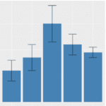 Look for Error Bars: Remember the lines on the basketball chart? Those are called error bars. They show either the range within which the true value is likely to fall (confidence intervals) or the degree of variability in the data (standard deviation). The longer the error bars, the greater the uncertainty.
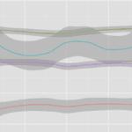 Find Shaded Regions: Sometimes, in line or area charts, you’ll see a shaded region around the main line. This region shows the variability of the data. If it’s wide, that means there’s a lot of uncertainty.
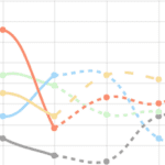 Spot the Dotted Line: On line charts, a dotted line is often used to show projected data. These projections come with uncertainty because they’re trying to guess the future. Be sure to understand that these predictions are not certainties.
Rockin’ with Uncertainty: Alex’s Harmonious Dive into Data Encoding
 Alex had always been a music aficionado, a devoted patron of all things rhythm and melody. One day during his AP Statistics class, his teacher introduced a project. The task: to analyze a dataset and present findings about a topic of their choice. Alex’s face lit up as he decided to meld his love of music and numbers. He chose to explore patterns in music preferences among his schoolmates.
He started by collecting data through a school-wide survey, asking fellow students about their favorite music genres, artists, and the number of hours they spent listening to music daily. His survey received an overwhelming response, and soon, he had a rich dataset that was as diverse as the school’s population itself.
Alex then started his analysis. He decided to use bar charts and line graphs to visualize the data because they were simple to understand yet powerful in revealing patterns.
As he plotted the average daily listening hours for each music genre, he added error bars to show the variability in the data. For instance, while Pop music showed an average of three hours, the error bars showed a range from one to five hours. This represented the uncertainty in his data – not every Pop music listener stuck to the three-hour average. Some were hardcore fans, while others were casual listeners.
Next, Alex decided to investigate trends in music preference over time. He plotted line graphs showing the popularity of various music genres over the school year. He added a shaded region around each line representing the variation in responses month-to-month. A wider shaded region around the Rock music line, for instance, indicated a higher degree of uncertainty about its steady popularity.
Finally, Alex decided to make some predictions. He created a line chart projecting the future popularity of different music genres based on past trends. Here, he used a dotted line to represent his forecasts, subtly indicating the inherent uncertainty in predicting the fickle tastes of high school music listeners.
When the day came to present his project, Alex confidently explained his charts and graphs, pointing out the error bars, shaded regions, and dotted lines to his classmates. His presentation was a symphony of data and uncertainty, revealing not only the trends in music preference but also the beautiful variability and uncertainty inherent in it.
Everyone, including his teacher, was impressed with Alex’s thorough analysis. But more importantly, they gained a deeper understanding of uncertainty in data. From that day on, Alex wasn’t just known as the music guy; he became the data guy who rocked uncertainty.