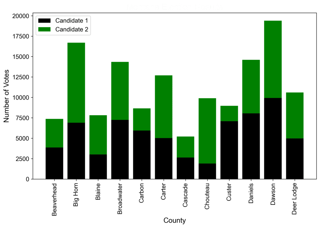
When creating charts, it’s important to ensure that the text is legible on various media like computer screens and print. Here are some tips and examples to ensure that your chart text is clear and easy to read.
- Choose the right font: Choose a simple, clean, and legible font for your charts. Sans-serif fonts like Arial or Helvetica work well for on-screen presentations, while serif fonts like Times New Roman or Georgia are suitable for print.
- Use appropriate font size: Make sure your text is large enough to read clearly on various media. For on-screen presentations, 18-24 points is a good size range. For print, 10-12 points should work well. Don’t forget to check how the text looks when it’s printed or zoomed in/out.
- Example: Health organizations use appropriate font sizes in their reports to ensure their data is accessible to a wide range of readers, including those with visual impairments.
- Be mindful of color choices: Choose colors that provide sufficient contrast between your text and the background. This will help make your text more readable. For example, dark text on a light background or light text on a dark background.
- Example: CNN’s election map uses dark text on a light background to help voters easily read county names and statistics for each candidate.
- Utilize white space: Give your text breathing room by using white space effectively; this will help provide clarity when viewing the chart. Don’t crowd your chart with too much information, as this may make it difficult for readers to absorb the data.
- Example: Google Analytics uses ample white space in their dashboards, helping readers quickly grasp the information they need.
- Test on multiple devices and formats: After designing your chart, view it on different screens and devices (laptops, smartphones, tablets), and try printing it out to ensure it looks clear and legible in various formats.

