Setting axis intervals or bin sizes for charts is essential in creating effective and engaging data visualizations. They are used to determine how data is grouped and displayed on a chart’s axes. You can create a clear and meaningful visualization that tells a compelling data story by carefully selecting the appropriate intervals or bin sizes.
How to Set Axis Intervals and Bin Sizes
- Understand your data: The first step is to have a grasp of your data set. Look for patterns, trends, and any outliers. This will help you decide what kind of chart to use and how to appropriately set the axis intervals or bin sizes.
- Choose a chart type: Based on your understanding of the data, choose a suitable chart type. For example, if you’re looking at the distribution of values, you might consider a histogram. If you’re comparing categories, you may want to use a bar chart.
- Determine an appropriate range for your axis: The range of your axis should cover the minimum and maximum values of your data. This can be easily calculated using spreadsheet tools like Excel or programming languages like Python or R.
- Set the interval or bin size: The interval (for continuous data) or bin size (for categorical data) should be chosen in a way that the data points are not too congested or scattered. For example, if you were plotting the daily temperature data for an entire year, you might choose an interval of one day or one week.
- Consider using meaningful intervals: Sometimes, it’s useful to set axis intervals or bin sizes based on meaningful milestones. For instance, when looking at the population of different age groups, you might choose bins of “0-9 years”, “10-19 years”, “20-29 years”, and so on. These intervals provide context and help viewers quickly understand the data.
- Fine-tune your intervals: Based on the initial visualization, you may need to make some adjustments to your axis intervals or bin sizes. If your chart appears cluttered or difficult to read, try increasing the intervals or bin sizes. If the data points seem too dispersed, try decreasing them. Iterate until you achieve a clear and informative visualization.
- Label your axes: Make sure to label your axes appropriately, including the units of measurement. This will help your audience understand what is being displayed on the chart.
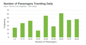
Example
Suppose you want to create a histogram to display the number of passengers travelling daily on a specific flight route. You have collected data for 365 days. To create a visually appealing and informative histogram, follow these steps:
- Analyze your data and determine the minimum and maximum passenger counts.
- Choose a suitable chart type, like a histogram.
- Calculate the range by taking the difference between the maximum and minimum passenger counts.
- Decide an appropriate bin size, considering the context of the data – perhaps bins of 10 passengers (e.g., 0-9 passengers, 10-19 passengers).
- Create your histogram and fine-tune the bin size based on the visualization. If needed, adjust the bin size for a clearer story (e.g., bins of 5 or 20 passengers).
The goal is to create a clear and informative visualization that effectively communicates your data story to your audience. By carefully setting axis intervals and bin sizes, you can achieve this goal and create impactful visualizations.