As you consider how to design charts, it is important to consider cognitive load – the amount of mental effort required to understand and interpret the information. Reducing chart complexity can minimize cognitive load and enhance readers’ ability to grasp key insights. Let’s explore the key concepts and techniques for achieving this goal.
Understanding Chart Complexity
Chart complexity refers to the level of detail and visual clutter present in a chart. A complex chart with excessive elements and unnecessary decoration can overwhelm viewers, making it difficult to extract meaningful information.
Aim to Maximize the Data-to-Ink Ratio
Eliminate chart clutter, elements that distract from the key insights, and chart junk, elements that do not contribute to understanding the data. Removing these elements makes the chart more focused, streamlined, and easier to interpret. Additionally, it reduces the reader’s perceived cognitive load.
Examples of chart clutter or chart junk that should be minimized or eliminated:
- Gridlines: Gridlines are often used to aid in reading data points. However, too many gridlines can clutter the chart and make it visually overwhelming. Consider reducing the number of gridlines to only those that are necessary for clear reference. Another technique includes applying grayscale to the gridlines as they become less visually prominent, allowing the viewer to focus more on the data itself. This technique helps reduce unnecessary visual noise and improves the overall readability of the chart.

- Unnecessary borders and frames: Decorative borders or frames around the chart can distract and add unnecessary visual elements. Unless they serve a specific purpose or enhance the understanding of the data, it is best to remove them.
- Redundant labels: Labels should be clear, concise, and placed strategically to provide information about data points or categories. Avoid redundant or excessive labeling that repeats the same information, especially when it does not add any additional insights.
- Non-strategic use of color: Color can be a powerful tool in chart design, but it should be used strategically. Avoid using excessive colors or unnecessary gradients that do not serve a specific purpose in conveying the data. Instead, use color selectively to highlight important elements or to differentiate categories. The emphasis is directed toward the key information by desaturating the color on all but the most important bars or data points. This technique helps the viewer quickly identify the most significant elements in the chart while reducing visual distractions.
- 3D effects: While 3D effects might appear visually appealing, they can distort the perception of data and make it harder to interpret the chart accurately. Eliminate unnecessary 3D effects and opt for a clean, flat design that focuses on the data itself.
- Unimportant data points or annotations: If certain data points or annotations do not contribute to the overall understanding of the chart or if they clutter the visual space, consider removing or reducing their prominence. Only include the essential elements that support the main message or insights of the chart.
Techniques to Reduce Cognitive Load
- Design charts that are clear and intuitive:
To create charts that are easy to understand, use common conventions that readers are already familiar with. For example, use standard chart types such as bar, line, or pie charts, as readers are accustomed to interpreting these visuals. Additionally, establish a clear hierarchy of visual elements, prioritizing the most important information and guiding the viewer’s attention accordingly.
Consider the impact of number precision and the strategic use of color on reducing chart complexity. Making numbers more precise than necessary can indeed lead readers to believe that the values are more accurate than they are and increase the cognitive load in the process. This phenomenon is known as the “illusion of precision.” When numbers are presented with excessive precision, such as displaying decimal places that are not relevant or meaningful in the given context, it can create a false sense of accuracy or significance.

- Include visual affordances in your chart design:
Visual affordances are cues that help viewers understand how to interact with or interpret the chart. Strategically use color to convey meaning or highlight important data points. For instance, use different colors to represent different categories or emphasize significant trends. Additionally, order data logically, such as arranging categories in ascending or descending order, making it easier for readers to compare and analyze the data.
- Push unimportant chart elements to the background:
To reduce cognitive load, minimize the visual prominence of unimportant chart elements. Apply grayscale or desaturation to elements that are less critical, allowing the primary data points to stand out. Utilize whitespace effectively by grouping related elements and removing unnecessary elements from the chart margins, giving the chart a clean and uncluttered appearance.
- Reduce complexity:
Complexity can be overwhelming for readers. Consider breaking it into separate panels or individual charts if you have a chart with multiple data series or comparisons. This simplifies the visual presentation and allows readers to focus on one aspect at a time, reducing cognitive load and improving comprehension.
An important aspect to consider is avoiding competing chart colors. Competing colors occur when multiple colors within a chart are visually overpowering or conflicting with each other, creating confusion and hindering the viewer’s ability to interpret the data effectively.
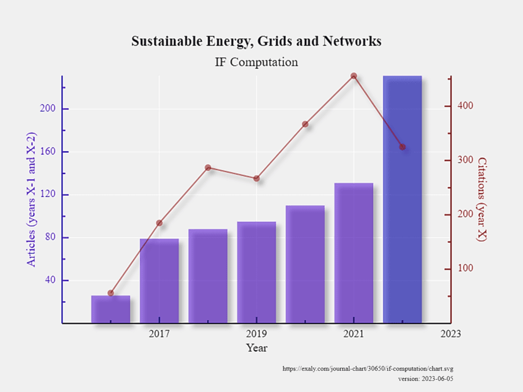
Complex charts with multiple data series and dual axes are another example where readers can be visually overwhelmed, and it is difficult to identify the desired insights. Separating the layers and displaying them in separate panels allows for better clarity and understanding of each individual data set. By separating the layers into different panels, viewers can concentrate on specific metrics or data points of interest, and it becomes easier to compare and analyze the data within each layer independently.
- Avoid overplotting:
Overplotting occurs when data points overlap, making it challenging to discern individual values. To address this, employ techniques such as jittering data points to spread them out, sampling data points to reduce density, increasing transparency, reducing point size, or even choosing a different chart type that better represents the data. For less important data, consider aggregating it into an “Other” category, simplifying the chart without sacrificing important information.
Consider a dataset with two continuous variables, such as the age and income of a group of individuals. You want to create a scatter plot to explore the relationship between these variables. However, due to the nature of the data, many individuals have the same age and income values, resulting in numerous data points overlapping on the plot. Adding a small random displacement to each data point—jittering data points— creates separation between the overlapping observations. This makes distinguishing individual points easier and identifying patterns or trends within the data.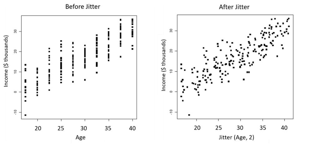
Pro Tips for Reducing Chart Clutter
Reducing chart clutter enhances clarity and promotes cognitive ease. Consider the following:
- Avoid non-strategic use of color: Use color purposefully and avoid using it solely for decorative purposes. Choose colors that convey meaning or highlight key elements in the chart.
- Avoid excessive precision in numbers: Displaying overly precise values can create unnecessary complexity. Instead, round numbers to a meaningful level of precision that aligns with the context and the intended message.
- Ensure proper alignment of chart elements: Alignment helps create visual order and coherence. Align labels, axes, and other elements to create a harmonious and organized chart layout.
- Remove background images or color: Background images or vibrant backgrounds can distract from the data. Opt for a clean and neutral background to minimize distractions and maintain focus on the information being presented.
- Avoid competing elements: Remove unnecessary decorative elements, gridlines, or excessive annotations that may compete for attention. Simplify the chart to highlight the most relevant information.
- Remove effects like 3D or drop shadows: While these effects may appear visually appealing, they can add unnecessary complexity and distort the perception of the data. Stick to a flat design to maintain clarity.
- Reduce the number of elements: Limit the number of data series, categories, or legends to avoid overwhelming readers. Focus on the essential information and eliminate non-essential elements that do not contribute significantly to understanding the chart.
- Limit the number of colors: Minimize color variations to enhance consistency and reduce visual distractions. Select a limited color palette that complements the data and supports clear differentiation between categories or data points.