Defining relative and absolute measurements
- Relative (percentage) measurements: These show proportional differences, representing data as a percentage of a whole or a common baseline. Common chart types that use relative measurements include pie charts and stacked bar charts.
- Absolute measurements: These show the actual values or differences, displaying raw data without comparison to a baseline or another value. Typical chart types that use absolute measurements include bar charts, line charts, and scatter plots.
When it’s appropriate to use relative or absolute measurements:
- If you need to demonstrate actual values or subtle differences, use absolute measurements.
- If you want to emphasize proportions, trends, or how data points relate to a common baseline, use relative (percentage) measurements.
Comparing different categories
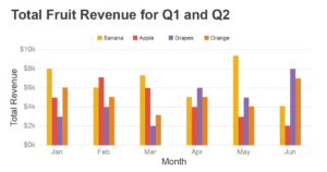
Suppose we have data on the number of apples, bananas, and oranges sold in a grocery store. If we want to show each fruit’s sales numbers, we can use a bar chart with an absolute scale. This chart will let us see the genuine differences in sales for each fruit without considering the total sales.
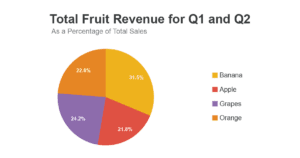
However, if we’re more interested in comparing how each fruit contributes to the overall sales of fruits, we could use a pie chart with relative measurements (percentages). This way, we can visualize the proportion of apples, bananas, and oranges that make up the total fruit sales.
Analyzing trends over time
Suppose we’re looking at the revenue of a small business over several years. We can use a line chart with an absolute scale to examine the exact revenue values for each year. This kind of chart will show the actual revenue amounts, allowing us to see if the company is making more money or not.
However, if we want to understand how the business’s revenue has changed relative to a specific baseline, such as the first year, we could use a line chart with a percentage scale. This approach involves converting each year’s revenue to a percentage relative to the baseline year, and it lets us observe the magnitude of change on a consistent, proportional scale.
In summary, choosing between relative (percentage) and absolute measurements for chart scales depends on the purpose of your analysis and what aspect of the data you want to highlight.