When choosing between single-division and alternating scale bars, it’s all about understanding the purpose of these two types of scales and how they impact the effectiveness and readability of your data visualization.
Single-division scale bars, also known as uniform scale bars, consistently display a single unit of measurement throughout the scale. They are relatively simple to read and understand, making them a great option when your goal is to present information that allows for quick comparisons and minimal visual disruptions. For example, let’s say you wanted to create a bar chart comparing the population of different cities. A single-division scale bar would be perfect for this scenario since you could compare populations easily using the same unit measurement.

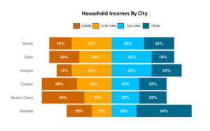
On the other hand, alternating scale bars, also known as non-uniform or divergent scale bars, show variations in their intervals or units, which can help highlight specific data points or showcase differences in proportions. This can be beneficial when you want to emphasize a particular trend or to compare datasets with disproportionate values. For example, suppose you were comparing the income distribution across various income brackets. In that case, an alternating scale bar might provide a more accurate representation of the differences between lower-income and higher-income data sets.
Here are a few tips to help you make the right choice:
- Use single-division scale bars when you want to present simple comparisons, and a uniform scale is sufficient.
- Use alternating scale bars when you need to emphasize trends or proportion differences between datasets or when a uniform scale is not suitable.