Ensuring that axis tick marks, labels, and time intervals are consistent and evenly spaced is crucial for creating effective and easy-to-understand data visualizations.
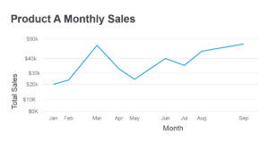
First, let’s look at an example that does not pay attention to spacing:
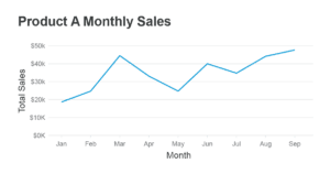
As you can tell, it is challenging to truly understand what is going on. Now, we can see this chart when it is properly spaced:
Proper spacing is important for several reasons:
- Accurate representation of data: Consistency in tick marks and intervals helps maintain the correct proportions of data points, which allows viewers to make valid comparisons and draw appropriate conclusions. For example, if you were comparing the sales of a product over time, and the tick marks were uneven, the viewers might misinterpret the growth rate, ultimately affecting their decisions.
- Ease of understanding: Consistency makes it easier for viewers to comprehend the information presented, as they can quickly identify patterns and trends in the data. Let’s say you are presenting the population growth of a city over a span of 10 years. Suppose the tick marks and time intervals are inconsistent and irregular. In that case, it can be difficult for viewers to discern if there was a steady increase or fluctuation in the population numbers.
- Aesthetics: Consistent and evenly spaced tick marks, labels, and time intervals contribute to the overall professional appearance of the data visualization. Besides capturing viewers’ attention, elegant designs make understanding and interpreting the data easier. Imagine you are showcasing monthly sales figures for a product in a bar chart. If the bars have varying widths, it may distract the viewers and create a sense of confusion.
- Reduce cognitive load: Inconsistent tick marks and intervals can increase the cognitive load required to process the information, making it challenging for viewers to understand the data quickly. Imagine watching a line chart with uneven intervals between months; it would force the viewer to spend extra time figuring out the distance between data points, taking the focus away from the actual information conveyed.
- Comparability: Consistent and evenly spaced axes make it easier to compare different data sets. Suppose you want to showcase the performances of two different products over a year. If both charts’ time intervals and tick marks are consistent, viewers can make a direct comparison more effectively without any distortion or misleading interpretation.
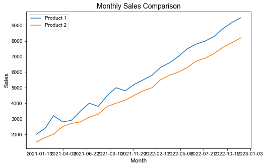
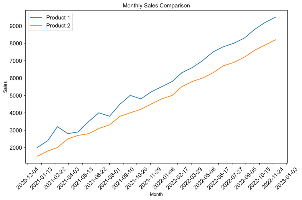
Consider the readability of these two charts and the impact of proper spacing: