A critical aspect of creating clear and informative visuals is making sure that we demonstrate the extent of the correlation between two sets of data points. Correlation refers to the extent to which one variable’s changes are associated with changes in another variable. We can observe three primary types of correlation: positive, negative, and no correlation (when there’s no clear relationship between the variables).
Let’s dive into some examples of how to highlight correlation when designing charts effectively.
Scatter Plots
A scatter plot is one of the most effective ways to encode correlation between two continuous variables. In a scatter plot, data points are plotted on a two-dimensional plane, with one axis representing one variable and the other axis representing the second variable. Each point represents a unique combination of the two variables. The plot’s overall distribution and pattern give a quick visual snapshot of the nature and strength of the correlation.
For example, let’s say we have data about students’ number of hours studied and their exam scores. We could create a scatter plot displaying how increasing the hours studied generally results in higher exam scores (positive correlation).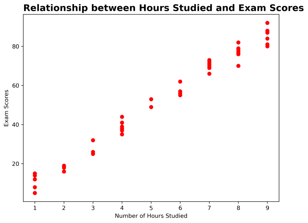
Line Charts
Line charts are another method of visualizing the correlation between two variables over time. Line charts use the time on the x-axis and the values of the variables on the y-axis, with solid lines connecting the data points to emphasize the relationship.
For instance, we can compare annual average temperatures to yearly ice cream sales. As temperature increases, so do ice cream sales (positive correlation). In contrast, if temperature were inversely related to sales (negative correlation), we might see decreased sales as temperatures rise.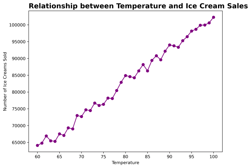
Stacked and Grouped Bar Charts
Stacked or grouped bar charts can be used to showcase the correlation between two categorical variables. When designing such charts, we group the bars representing the variables or stack them upon each other. The height (or length in the case of horizontal bars) represents the relative frequency of the variables.
For our example, we can observe how travel destination preferences are associated with different age groups. By stacking, for instance, we can effectively communicate the proportion of people in each age group who prefer specific destinations.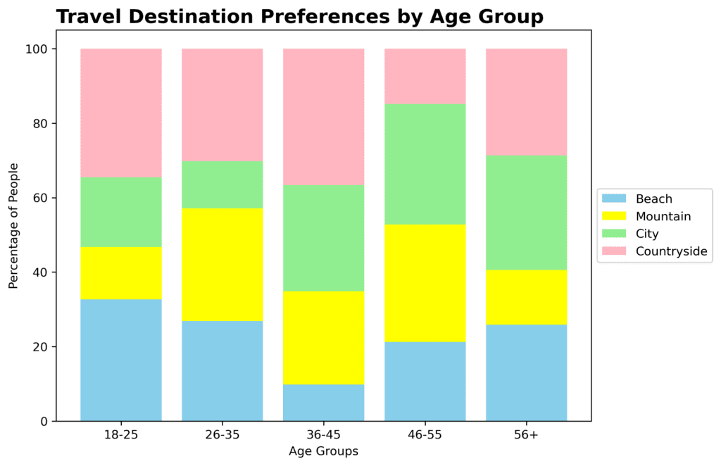
Bubble Charts
Similar to scatter plots, bubble charts effectively demonstrate the correlation between two variables. However, bubble charts also incorporate a third variable using bubble size. This added variable allows for an even deeper dive into uncovering relationships between data points.
For example, we can illustrate the relationships between the average income levels and life satisfaction scores of various countries, with the bubble size representing populations. We’d observe a positive correlation as income levels and life satisfaction scores generally rise together.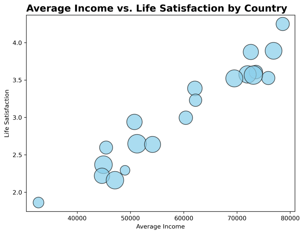
By utilizing scatter plots, line charts, stacked or grouped bar charts, and bubble charts, you can effectively showcase correlation in charts–crucial for visual storytelling and providing the audience with insights into data relationships.