There are several ways to encode data in tables to visualize data effectively. Let’s use the following example to discuss the techniques of text, color saturation, sparklines, and icons:
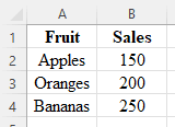
Imagine we have data on the sales of different types of fruits in a supermarket – apples, oranges, and bananas.
Text
The most straightforward way to represent data in a table is by using text. We could list the type of fruit in one column and their sales figures in another. For example:
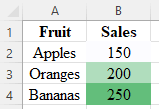
Color Saturation
An effective way to add more insight into your table is by using color saturation. By manipulating the saturation or intensity of colors, different values or categories of data can be visually distinguished. The higher the sales figure, the darker the cell background shade. This method allows for a quick visual comparison of values. For instance:
Sparklines
Another way to visually represent data in a table is by using sparklines. Sparklines are miniature line charts that are typically integrated within text, tables, or other visual elements, allowing for a quick and concise depiction of data without the need for a separate chart or graph. This method is particularly useful when you have multiple data points over time. For example, let’s consider the weekly sales of fruits in the past month:
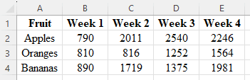 Here’s another example of the same data using sparklines:
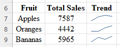
The Trend column with the sparkline chart that helps you visualize the sales trends quickly.
Icons
Visual elements, such as icons, can be used to enhance data tables. For instance, using up and down arrows to depict an increase or decrease in sales. Like:
![]()
In this table, the arrow icons communicate the change in sales from the previous day quickly and effectively.