The following essential scaffolding elements ensure a chart conveys information effectively and accurately and makes a significant difference in the design of data visuals.
Axis lines: These lines define the X-axis and Y-axis of your chart, setting boundaries and scale for the data. They help users understand the context and magnitude of the information displayed. For example, a line chart depicting a company’s sales growth over time would typically have time on the X-axis and sales on the Y-axis.
Gridlines: Gridlines are horizontal and vertical lines that extend from the axis lines, helping users see the data more clearly. For instance, if you are looking at a bar chart comparing the population of different countries, gridlines can help you visually gauge the differences in population sizes more easily.
Tick marks and labels: Tick marks and labels are placed along the axis lines to show specific values or categories. They clearly indicate the data points and help the audience accurately read the chart. In a pie chart representing the market share of different smartphone brands, labels would indicate the percentage each brand holds.
Legends: Legends help users identify different series or categories in a chart by using colors, patterns, or symbols. A good legend should be clear, concise, and easy to understand. For example, in a stacked bar chart displaying the age distribution of a city’s population, a legend would specify the colors representing different age groups.
Titles and subtitles: Titles and subtitles briefly describe the chart’s content and purpose. They should be clear and informative to guide the audience’s attention to key insights. If you’re creating a heatmap of the average temperature across various cities, the title might be “Average Temperature by City.”
Footers: A footer refers to a component or element typically located at the bottom of a chart, providing additional context or information about the data being presented.
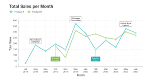
Annotations: Annotations are text or graphic elements added to the visualization to explain, emphasize, or highlight specific data points, trends, or insights. In a line chart showing a company’s stock price over a year, you might use an annotation to indicate an important event, such as a product launch or a merger announcement, that affected the stock price.
These scaffolding elements allow you to create visually appealing and informative data visualizations that effectively communicate your message. Remember, a well-designed chart scaffold will guide your audience through your data story, helping them uncover vital insights, patterns, and trends.